There’s a growing divide in the United States. No, I’m not talking about the Grand Canyon in Arizona. Or politics. But rather Wall Street, in the stock market, and it’s being driven by mega-cap stocks.
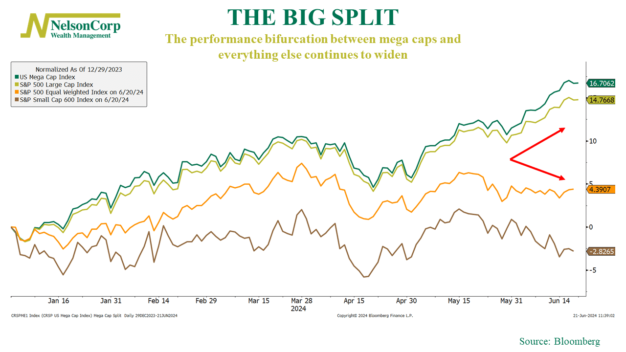
This week’s featured chart highlights the performance of four different stock market indices. The first two, shown in green and gold, represent mega-cap and large-cap U.S. stocks—the giants of the market. These behemoths have performed exceptionally well this year, up around 14% to 17%.
In contrast, the equal-weighted S&P 500 (orange line) and an index of small-cap stocks (brown line) tell a different story. The equal-weight S&P 500, which reflects the average stock, is up only a few percentage points this year. Meanwhile, small-cap stocks have lost nearly 3% year-to-date.
For investors, the key takeaway is the significant divergence in the market. This extreme concentration and narrow leadership could make the overall market more vulnerable to a pullback or even a correction. It’s crucial to understand what you own in this environment.