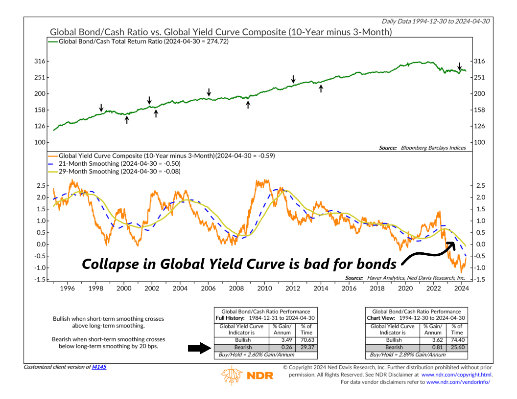
Let’s take a look at this week’s featured indicator, the global yield curve, and how we use it to figure out whether it’s better to invest in bonds or stick with cash.
This indicator’s primary metric is something called the Global Yield Curve Composite. It looks at the gap between 10-year and 3-month Government Bond Yields in several countries: the United States, Canada, Japan, Europe (excluding the UK), Switzerland, and the United Kingdom. You’ll see this on the chart as the orange line at the bottom. It’s also accompanied by its 29-month average (shown as a gold line) and its 21-month average (a blue dashed line).
Here’s how it works: When the 21-month average rises above the 29-month average, it’s a bullish sign. This means bonds are favored over cash. It suggests that long-term bonds offer a better return compared to short-term government bills. But if the 21-month average falls below the 29-month average by 20 basis points or more, indicating a flattening yield curve, it’s a bearish signal. This means cash is preferred over bonds.
Looking at the chart, you’ll notice that bonds have been the better choice for about the past decade. But recently, the global yield curve inverted (went negative), signaling a bearish outlook towards the end of last year. Now, the return from cash looks more appealing.
For investors, this suggests it might be wise to stick with shorter-duration bills and cash-like investments for the bond portion of their portfolio. Eventually, the yield curve will likely steepen again, making longer-term bonds more attractive. But until then, cash is likely the safer bet.
This is intended for informational purposes only and should not be used as the primary basis for an investment decision. Consult an advisor for your personal situation.
Indices mentioned are unmanaged, do not incur fees, and cannot be invested into directly.
Past performance does not guarantee future results.
