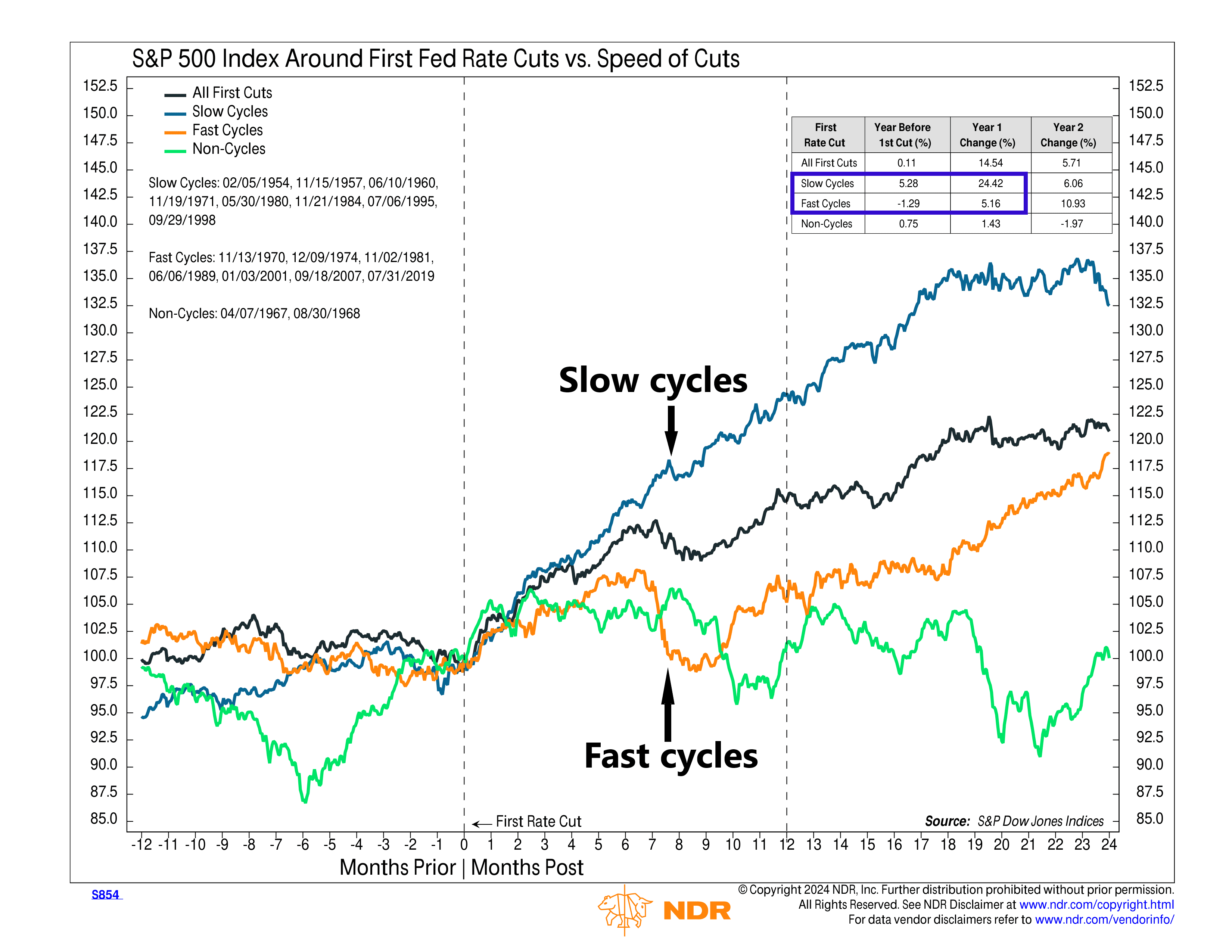
Fast or slow? When it comes to rate cuts, this week’s featured chart suggests that slower is better.
The chart shows how the S&P 500 has historically responded to different rate-cut speeds. There have been eight “slow cycles” where the Fed reduced rates fewer than five times in a year, seven “fast cycles” with five or more cuts, and two “non-cycles” where the Fed cut rates only once.
As the data reveals, fast cycles delivered average S&P 500 gains of just 5.2%, paired with significant volatility in the first year. In contrast, slow cycles saw a robust 24.4% gain with much less turbulence. Non-cycles resulted in a modest 1.4% increase.
The takeaway? Investors might want to hope for a more cautious, gradual approach from the Fed, as history shows the stock market responds much more favorably. With the first rate cut potentially coming next week, this is a critical point to consider.
This is intended for informational purposes only and should not be used as the primary basis for an investment decision. Consult an advisor for your personal situation.
Indices mentioned are unmanaged, do not incur fees, and cannot be invested into directly.
Past performance does not guarantee future results.
