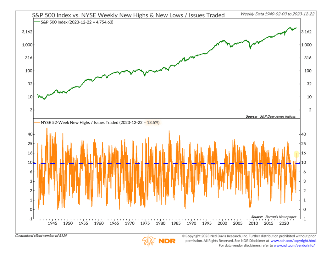
As I write this, the major U.S. stock indices are inching toward new all-time highs. On a total return basis (including dividends), the Dow and the S&P 500 are already there—the tech-heavy Nasdaq is right behind them. But for this week’s chart, I want to show how many individual stocks in the market are trading at new highs—or what we call “new-high breadth.”
The orange line at the bottom shows the percentage of stocks on the New York Stock Exchange (NYSE) that are currently trading at a new 52-week high. As you can see, it shot up in recent weeks and is now about 13.5%. That’s a good sign that more stocks are starting to participate in the stock market rally.
How does this compare to the historical average? The blue dashed line shows that the average over the past 80+ years has been roughly 9%. So, we are currently seeing about 50% more new-high breadth than is typical.
The bottom line? We generally only see a lot of new-high breadth in a positive (bullish) market environment. While this measure can change course quickly, for now, it’s flashing a green light for the market.
This is intended for informational purposes only and should not be used as the primary basis for an investment decision. Consult an advisor for your personal situation.
Indices mentioned are unmanaged, do not incur fees, and cannot be invested into directly.
Past performance does not guarantee future results.
The S&P 500 Index, or Standard & Poor’s 500 Index, is a market-capitalization-weighted index of 500 leading publicly traded companies in the U.S.
