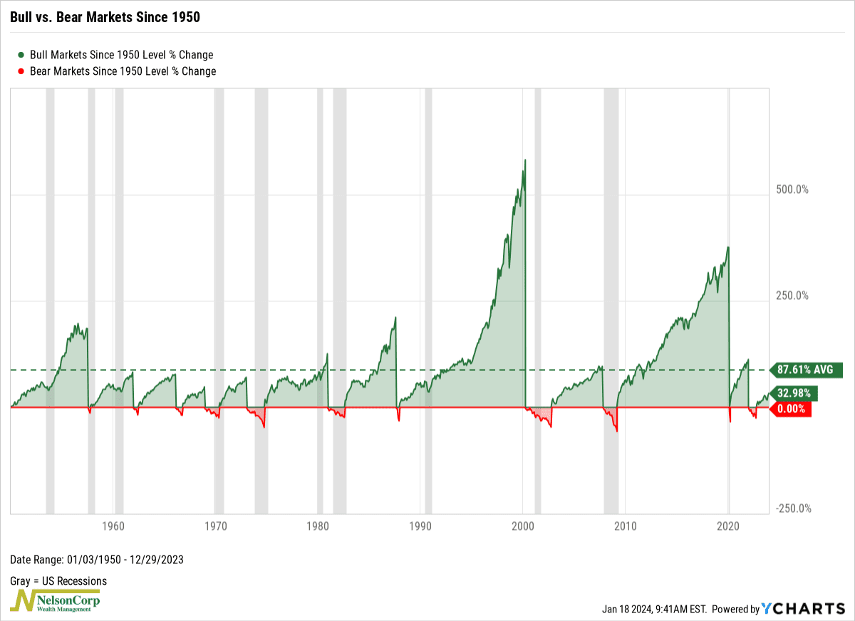
This week, we highlight a fun little chart showing bull vs bear markets since 1950.
What’s a bull market? It’s generally defined as a gain of 20% or more from a bear market bottom. Similarly, a bear market is a 20% or more loss from a bull market high. The green lines on the chart above represent bull markets for the S&P 500 Index going back to 1950, and the red lines represent bear markets.
What’s cool about this chart is that it illustrates the power of bull markets. The longest one since 1950 lasted a whopping 4,494 days (12.3 years) with a total gain of 582%! But even the average bull market typically lasts about 1,861 days (5.1 years), with an average gain of around 88%.
This is good news for the current market environment. Last year, we had a bear market that lasted 282 days, resulting in a 25% drawdown for the S&P 500 Index. Since the bottom, however, the S&P 500 has gained a little over 30%.
This means that if this bull market is anything like the average since 1950, we likely have plenty of years left in the tank—with plenty of more returns to go.
This is intended for informational purposes only and should not be used as the primary basis for an investment decision. Consult an advisor for your personal situation.
Indices mentioned are unmanaged, do not incur fees, and cannot be invested into directly.
Past performance does not guarantee future results.
The S&P 500 Index, or Standard & Poor’s 500 Index, is a market-capitalization-weighted index of 500 leading publicly traded companies in the U.S.
