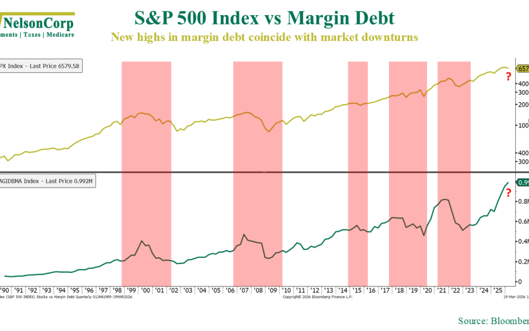
by NelsonCorp | Mar 20, 2026 | Chart of the Week
Too much debt can create problems. That’s true for individuals, corporations, and—it turns out—even the stock market. This week’s chart illustrates why. The chart above compares the S&P 500 stock index (gold line, top) to margin debt levels (green line,...
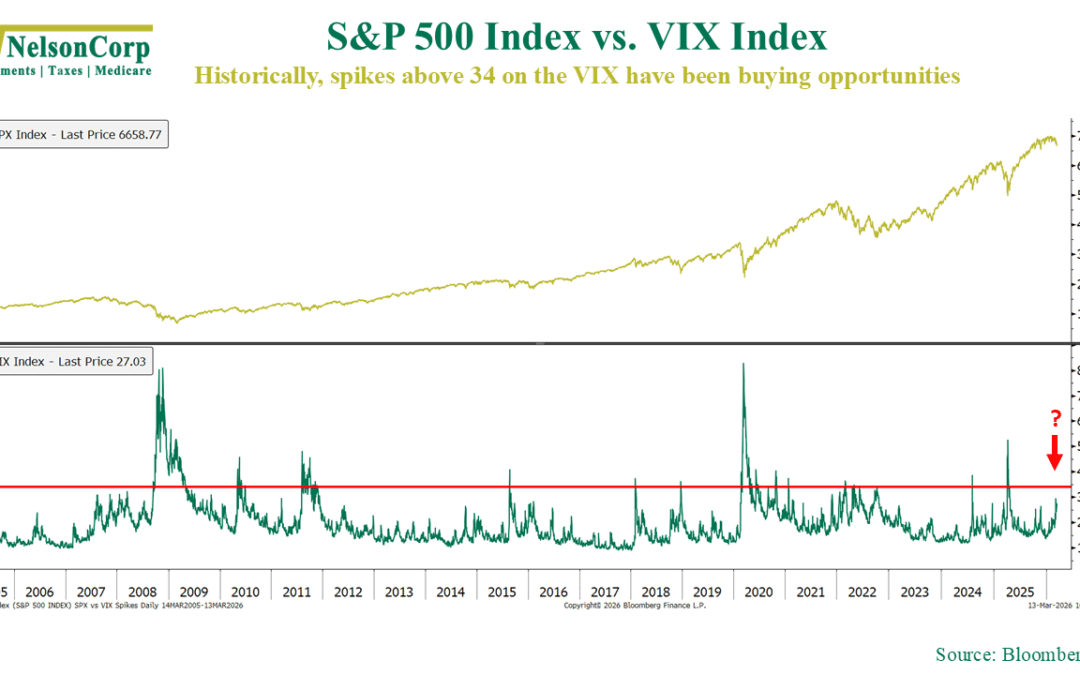
by NelsonCorp | Mar 13, 2026 | Chart of the Week
When markets come under pressure like they have in recent weeks, I always find it helpful to consult what we call the “VIX Playbook.” It’s based on the CBOE Volatility Index, or what you might have heard referred to as Wall Street’s “Fear Gauge.” It measures...
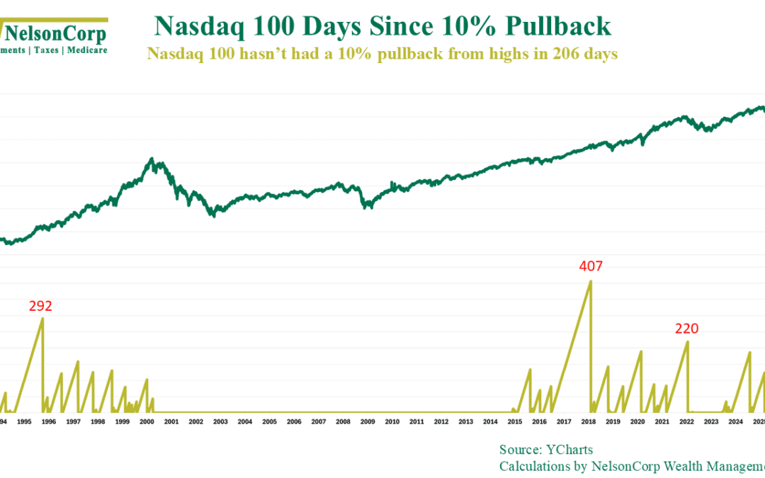
by NelsonCorp | Mar 6, 2026 | Chart of the Week
It’s been a while since we’ve seen a meaningful pullback in the stock market. Specifically, our chart above shows that it’s been 206 days since the last time the Nasdaq-100—the tech-heavy U.S. stock index—declined more than 10% from a high, the fourth longest...
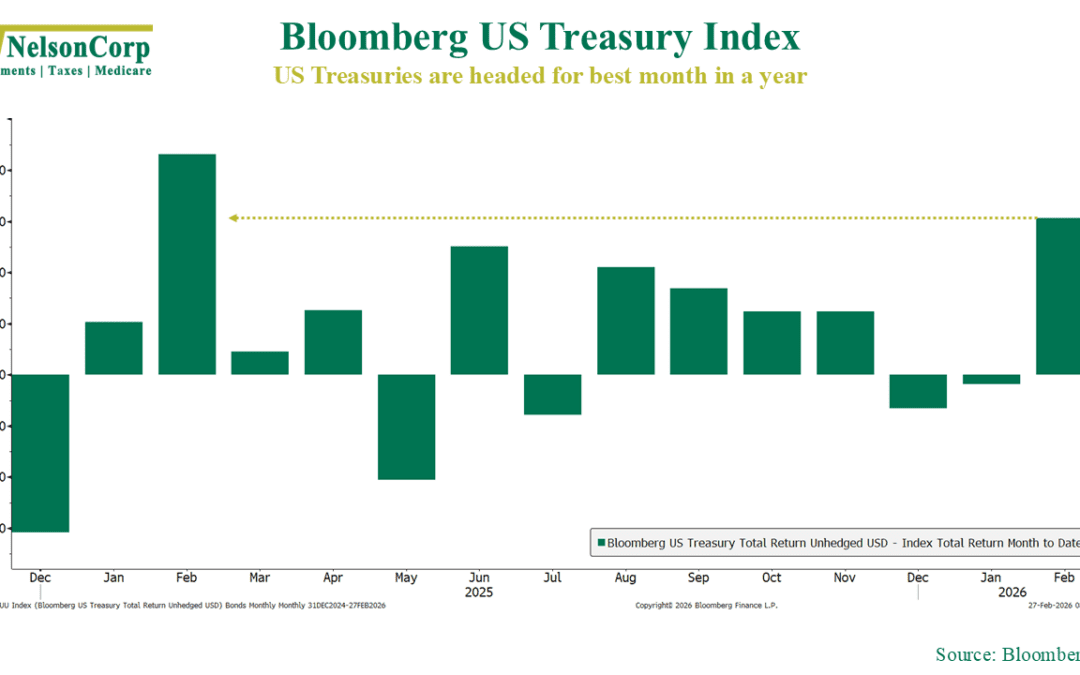
by NelsonCorp | Feb 27, 2026 | Chart of the Week
Despite all the consternation and hoopla surrounding the stock market, AI disruption, and all the rest, one asset class actually had a pretty good month: bonds. U.S. Treasury bonds, in particular, did well in February. As our Chart of the Week shows, the...
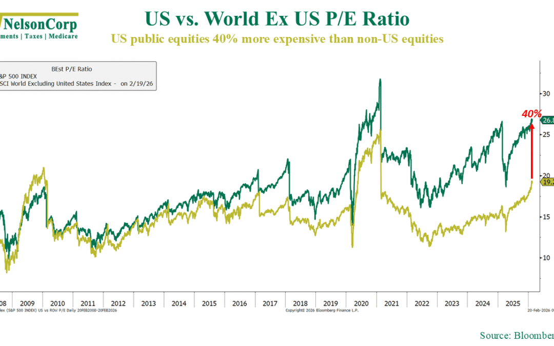
by NelsonCorp | Feb 20, 2026 | Chart of the Week
Over the last decade, investing has often felt like “just own U.S. stocks and move on.” This week’s chart shows why. After the Global Financial Crisis, U.S. and international stocks were valued pretty similarly. But then large-cap tech took off. Earnings were...
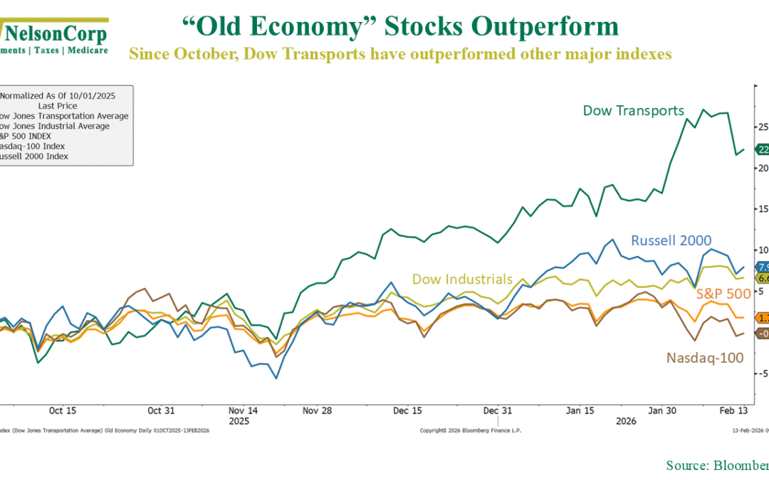
by NelsonCorp | Feb 13, 2026 | Chart of the Week
Over the past few months, we’ve seen an interesting shift happening in markets. As this week’s chart shows, the so-called “old economy” stocks have taken the lead. Since early October, the Dow Jones Transportation Average has surged more than 20%, decisively...