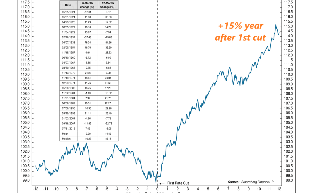
by NelsonCorp Wealth Management | Feb 2, 2024 | Chart of the Week
At this week’s FOMC meeting, the Fed threw cold water on the possibility of a rate cut in March. But investors anticipate that one is still coming—perhaps as soon as this summer. That raises an interesting question: how does the stock market typically respond...
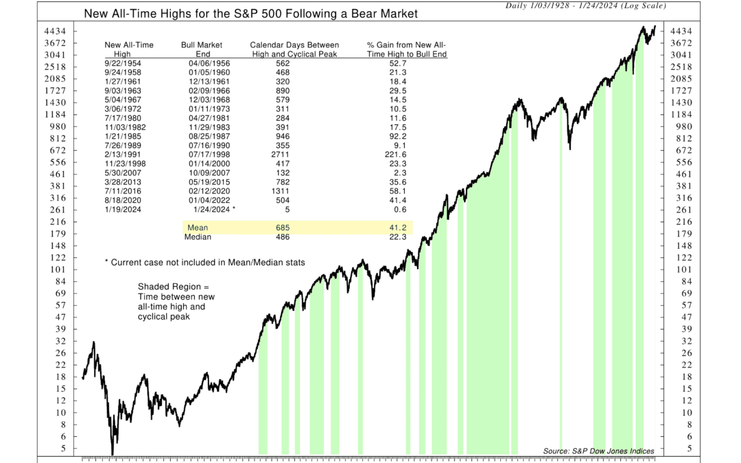
by NelsonCorp Wealth Management | Jan 26, 2024 | Chart of the Week
The U.S. stock market has climbed its way back to new all-time highs. But now that we’re at the summit, what does it mean for stocks going forward? If history is any guide, the outlook is likely positive. This week’s featured chart illustrates the S&P 500...
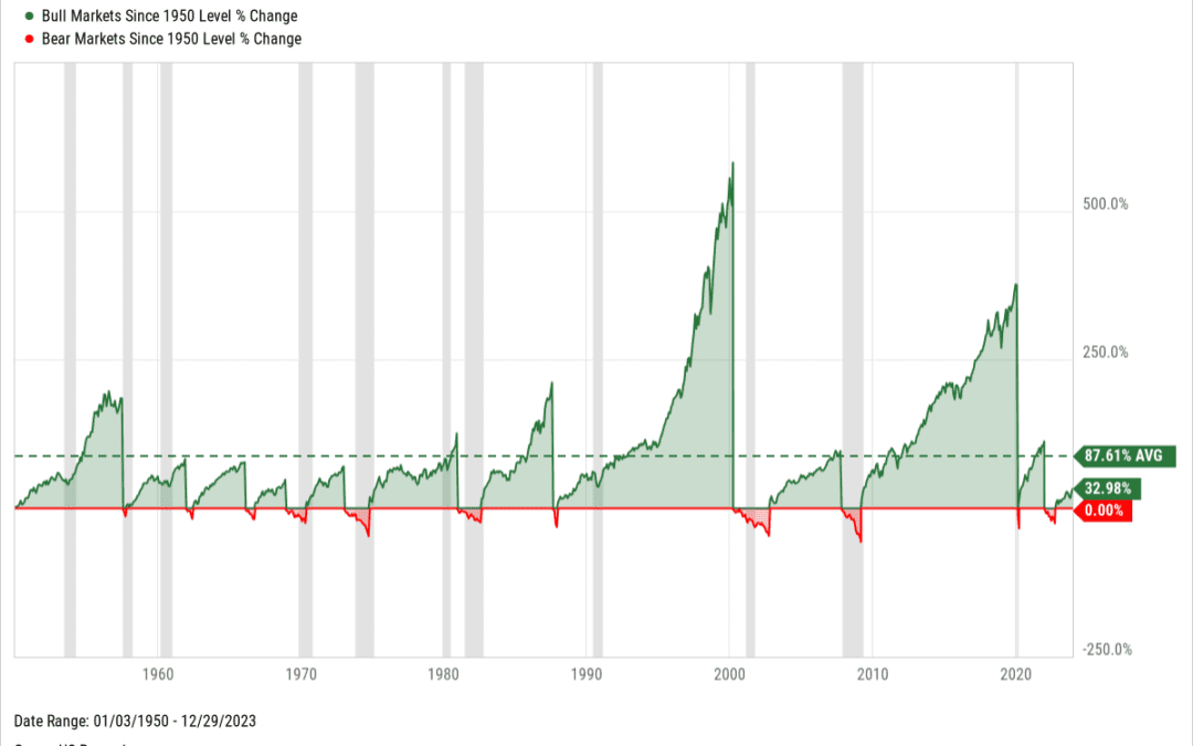
by NelsonCorp Wealth Management | Jan 19, 2024 | Chart of the Week
This week, we highlight a fun little chart showing bull vs bear markets since 1950. What’s a bull market? It’s generally defined as a gain of 20% or more from a bear market bottom. Similarly, a bear market is a 20% or more loss from a bull market high. The...
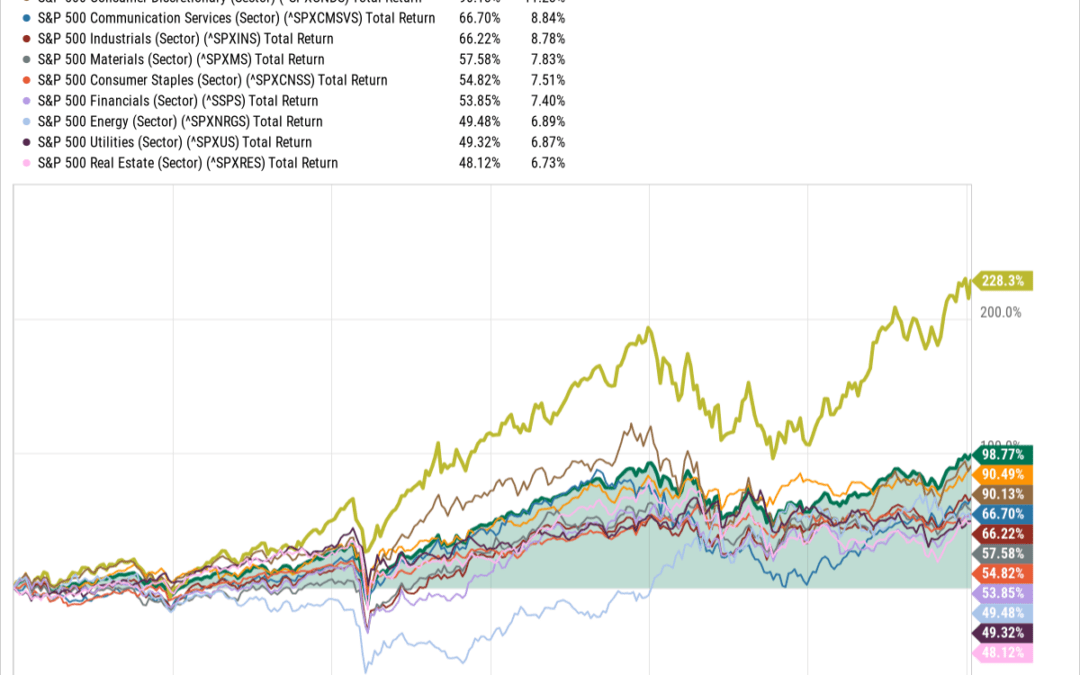
by NelsonCorp Wealth Management | Jan 16, 2024 | Chart of the Week
When people discuss “the stock market,” they often mean a big index like the S&P 500. But it’s sometimes more informative to break the index down into smaller sections, or sectors, that describe the underlying businesses. For example, 11 sectors...
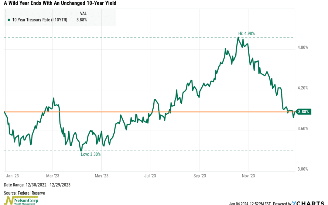
by NelsonCorp Wealth Management | Jan 5, 2024 | Chart of the Week
The bond market went on a rollercoaster ride in 2023. But, despite the wild gyrations, the 10-year Treasury rate ended the year exactly where it began. As you can see on the chart above, the 10-year Treasury rate—the benchmark U.S. interest rate—fell to a low...
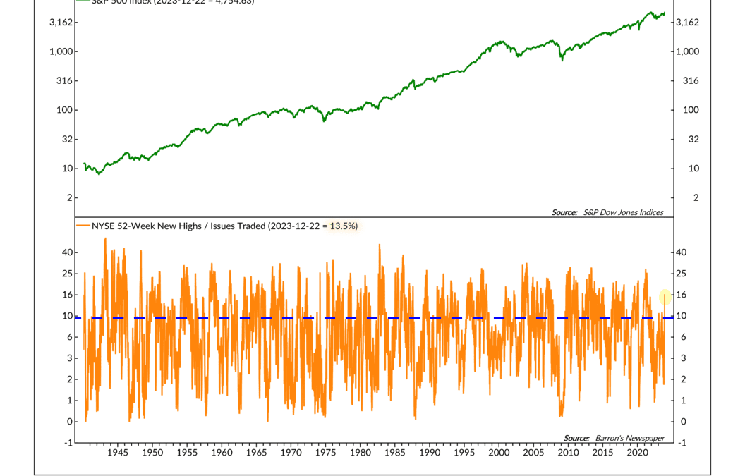
by NelsonCorp Wealth Management | Dec 29, 2023 | Chart of the Week
As I write this, the major U.S. stock indices are inching toward new all-time highs. On a total return basis (including dividends), the Dow and the S&P 500 are already there—the tech-heavy Nasdaq is right behind them. But for this week’s chart, I want to...