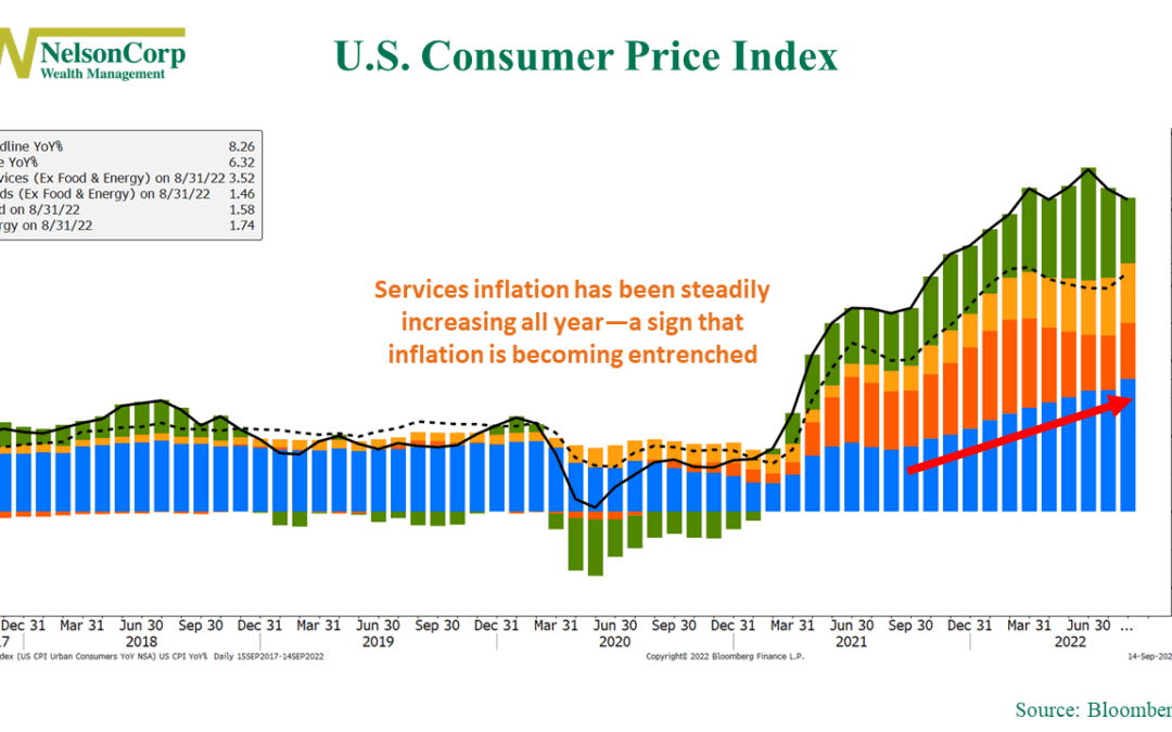
by NelsonCorp Wealth Management | Sep 16, 2022 | Chart of the Week
Inflation has been a thorn in the side of the stock market all year. This week, we found out that the Consumer Price Index (CPI)—a commonly used measure of inflation—dropped to an 8.3% year-over-year rate in August versus the 8.52% rate in July and the 9.06%...

by NelsonCorp Wealth Management | Sep 9, 2022 | Chart of the Week
This week’s chart shows the change in the U.S. federal budget going back to 1973. In the middle clip, we have the rolling 12-month total federal budget, with positive values indicating a budget surplus and negative values indicating a budget deficit. The red...

by NelsonCorp Wealth Management | Sep 2, 2022 | Chart of the Week
The 2-year Treasury note’s yield made the news this week when it rose to roughly 3.5%, its highest level since 2007. This is significant because it is currently one of the highest yielding bonds on the Treasury yield curve, shown as the green line on the chart...
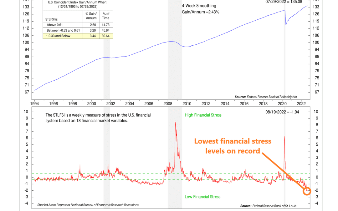
by NelsonCorp Wealth Management | Aug 26, 2022 | Chart of the Week
This week’s chart is the St. Louis Financial Stress Index. It was first published by the Federal Reserve Bank of St. Louis in 2010—with data going back to 1993—to better gauge levels of financial stress in the system in the aftermath of the 2008 financial...

by NelsonCorp Wealth Management | Aug 19, 2022 | Chart of the Week
This week’s chart shows existing home sales in the United Sales going back to 1999. It tells us how many homes were sold each month—but only for homes that were already owned and occupied before coming onto the market. As you can see, they have crashed this...

by NelsonCorp Wealth Management | Aug 12, 2022 | Chart of the Week
This week’s chart looks at job growth in the U.S. economy. Last month, we found out that U.S. employers added 528,000 new jobs. This was significant because it means the economy has now recovered all of the roughly 22 million jobs it lost in the early stages of...