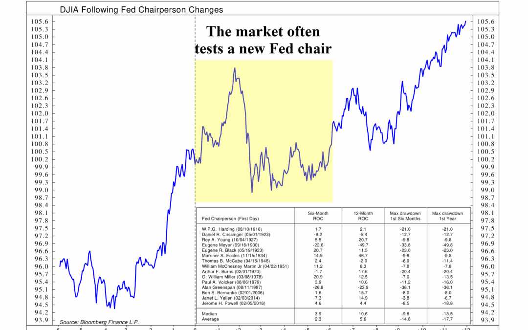
by NelsonCorp | Dec 12, 2025 | Chart of the Week
The Fed went ahead and cut rates again this week. It was mostly expected. The bigger question is what comes next. Looking into next year, it is not clear how many additional cuts are actually on the table. Inflation remains above the Fed’s comfort zone, and...
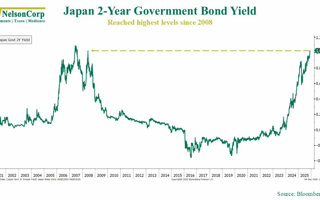
by NelsonCorp | Dec 5, 2025 | Chart of the Week
With financial markets under a bit of selling pressure recently, it’s natural to wonder what’s driving things. As always, there are plenty of factors at play. But there’s one important piece that may not be on your radar: Japanese monetary policy. This week’s...
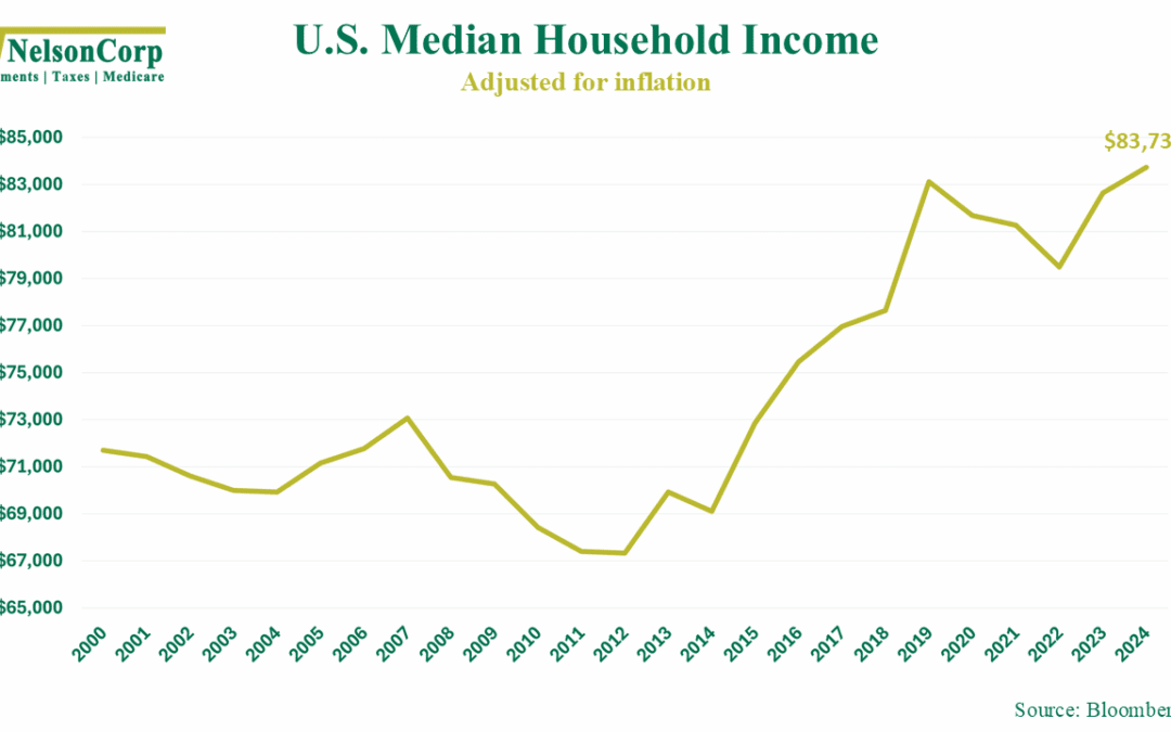
by NelsonCorp | Nov 28, 2025 | Chart of the Week
As we head into Thanksgiving and the holiday season, it’s worth pausing to look at a piece of good news that doesn’t always make the headlines. As this week’s chart shows, real median household income in the U.S. climbed to $83,730 last year, the highest level...
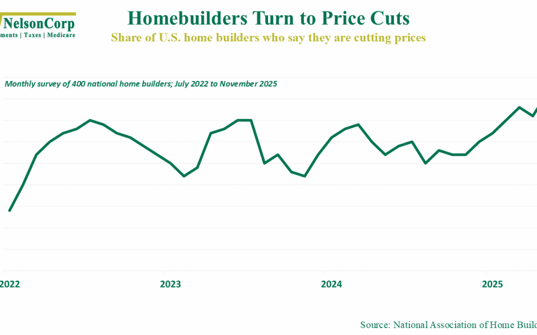
by NelsonCorp | Nov 21, 2025 | Chart of the Week
Let’s check in on the housing market this week. A new report from the National Association of Home Builders shows that a record 41 percent of builders are now cutting prices to bring buyers back into the market. That’s well above the roughly 30 percent...
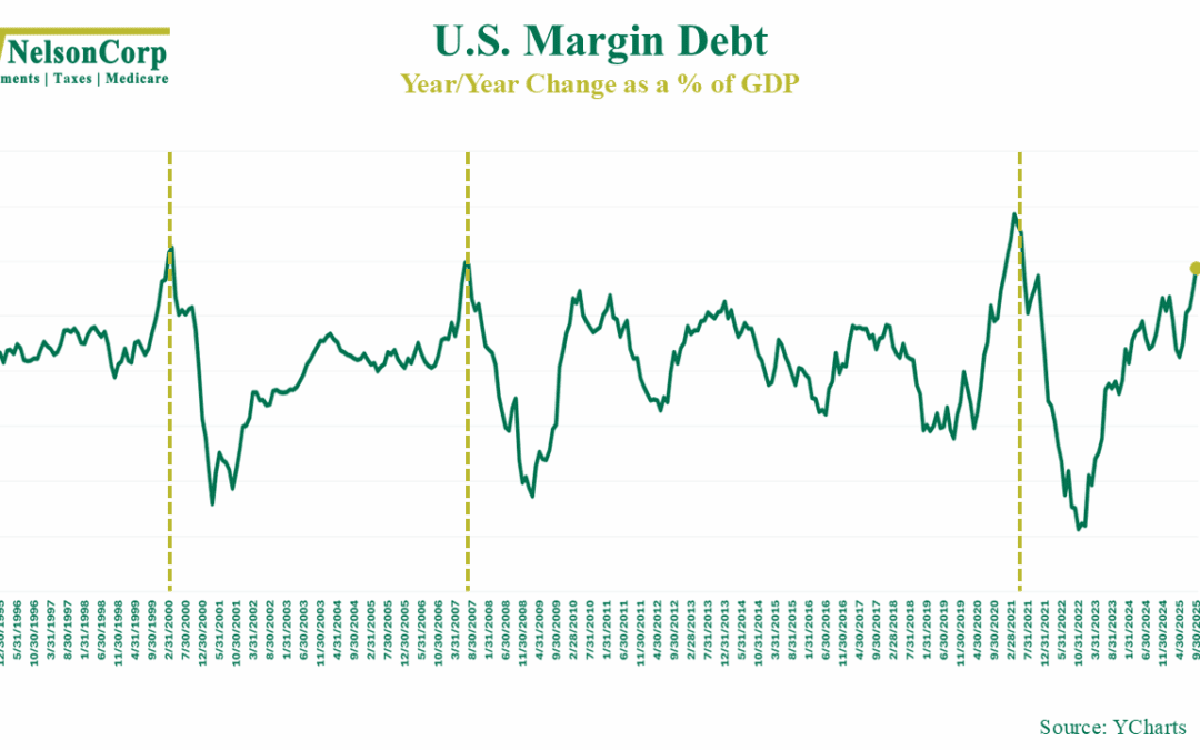
by NelsonCorp | Nov 14, 2025 | Chart of the Week
This week’s chart looks at margin debt, or how much money investors are borrowing to buy stock. In good times, it’s good. It’s a sign that investors are feeling confident and willing to lever up to buy stock. But, like anything, it can get out of hand—and when...
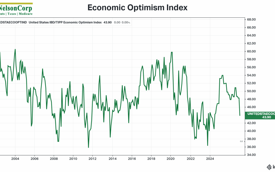
by NelsonCorp | Nov 7, 2025 | Chart of the Week
Well, we got some data last week that Americans are starting to feel less great about the status of the U.S. economy. It came in the form of the IBD/TIPP Economic Optimism Index, shown above. As you can see, it fell sharply in November, its biggest monthly drop...