
by NelsonCorp Wealth Management | Sep 10, 2021 | Chart of the Week
This week’s chart shows the United States’ Gross Domestic Product (GDP), adjusted for inflation. When people talk about the “economy,” it is generally the GDP they’re referring to. GDP measures the total market value of goods produced and services provided in a...

by NelsonCorp Wealth Management | Sep 3, 2021 | Chart of the Week
For this week’s featured chart, we show the Russell Top 50 Total Return Index. This index measures the 50 largest companies by market capitalization in the broad-based Russell 3000 Index. Despite tracking only 50 components, this index represents roughly 40% of...
by NelsonCorp Wealth Management | Aug 27, 2021 | Chart of the Week
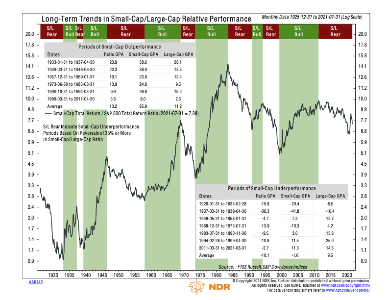
This week, we show a chart of the long-term relative performance of small-capitalization stocks versus large-capitalization stocks. A small-cap stock is one in which the underlying company has a market capitalization of under $2 billion. Whereas a company with...

by NelsonCorp Wealth Management | Aug 20, 2021 | Chart of the Week
Well, that was fast. On Monday, the S&P 500 stock index officially doubled in price from the pandemic low it touched on March 23, 2020. It took stocks only 354 trading days to get there, making it the fastest bull market doubling from a bottom in the...

by NelsonCorp Wealth Management | Aug 13, 2021 | Chart of the Week
The focus of our featured chart this week is world trade. Many countries rely on imports and/or exports in order to sustain economic growth, so monitoring world trade volumes is a great way to assess the overall health of the global economy. Every month, the...

by NelsonCorp Wealth Management | Aug 6, 2021 | Chart of the Week
Ok, Wall Street has come around to the fact that corporate earnings will be good for the companies in the S&P 500 this year. So surely, after a record-setting number of earnings surprises in the first quarter, expectations would be better adjusted for the...