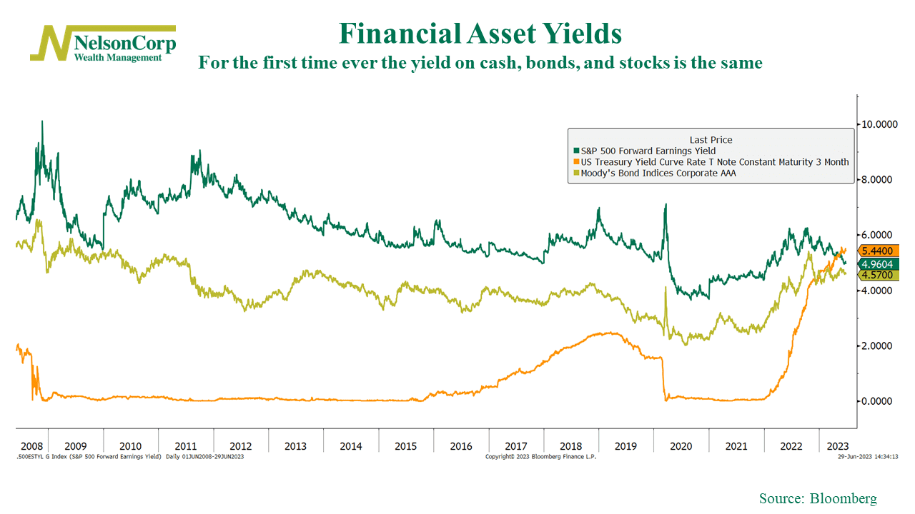
This week’s chart features the yields of the three primary financial assets investors focus on: cash, bonds, and stocks.
The green line represents the forward earnings yield for the S&P 500 (stocks), the gold line represents the yield on investment-grade corporate bonds, and the orange line represents the three-month Treasury rate (cash).
What’s significant is that, as the chart shows, the yields of all three assets are essentially the same for the first time ever. This is unusual. For the past two decades, stocks have typically yielded more than cash and bonds, making them a relatively more attractive asset. But now, the race has evened up, and an investor can essentially get the same yield from any or all three.
The takeaway? Sometimes it pays to buy and hold a financial asset like stocks, but other times the risk landscape changes and a more flexible strategy is needed. This chart is a great example of how things are constantly changing in the financial world, so it pays to know what you own and be willing to be adaptable in the face of an ever-changing environment.
This is intended for informational purposes only and should not be used as the primary basis for an investment decision. Consult an advisor for your personal situation.
Indices mentioned are unmanaged, do not incur fees, and cannot be invested into directly.
Past performance does not guarantee future results.
