Valuing the stock market can be tricky; creating an actionable signal from that exercise can be even trickier.
That’s because, as the famous saying attributed to the economist John Maynard Keynes goes, the stock market can remain irrational longer than you can stay solvent.
In other words, your assessment might conclude that the stock market is over/undervalued, but that doesn’t mean prices can’t still trend in the “wrong” direction for quite some time—sometimes much longer than expected.
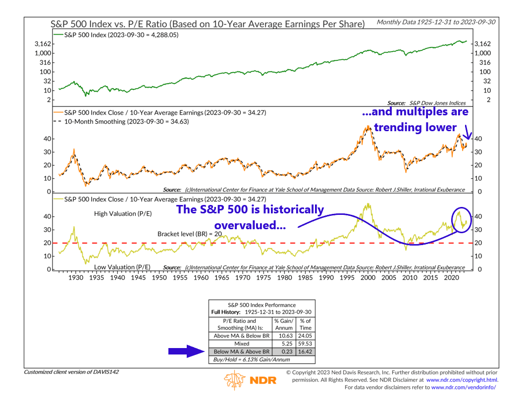
So, to account for this issue, we utilize a special type of valuation indicator, shown above, which adds a “trend” component to the analysis.
It starts like any other valuation metric. It compares the S&P 500 Index’s closing price to the stock market’s 10-year average earnings. This is your pretty typical price-to-earnings (P/E) ratio. The higher the P/E ratio, the more overvalued the market is, and vice versa. The cutoff line for this is the red dashed line on the bottom clip of the chart, which represents the average P/E ratio of the S&P 500 Index over the past 100 years.
But again, the problem with this specific metric is that the market can go on trending in whatever direction it happens to be trending despite its P/E ratio being higher/lower than average. So, for that reason, the indicator also applies a “trend” component to the metric, in which the current P/E ratio (orange line, middle clip) is compared to its 10-month moving average (black dashed line, middle clip). If the P/E ratio is above its 10-month moving average, it likely means stock prices are trending higher, and if it’s below, it likely means prices are trending downwards.
So, with these two key metrics in hand—the absolute level of the P/E ratio and its trend component—we can combine the two signals into one signal and get our overall indicator signal. As the performance box on the bottom of the chart reveals, the most favorable environment for stocks is one in which the P/E ratio is below its long-run average (undervalued) and trending higher than its 10-month moving average. In the most hostile environment, the P/E ratio is above its long-run average (overvalued) and trending lower than its 10-month moving average. In all other scenarios, the signal is considered “neutral,” where the S&P 500 tends to produce historically average returns.
That’s the indicator. It might seem complicated at first, but all we’re really doing is looking at how current stock prices compare to historical earnings (the P/E ratio or market multiple) and then determining if that multiple is trending higher or lower. If the market looks cheap (prices are low compared to average earnings) and multiples are expanding (the P/E ratio is trending higher), that’s probably a good time to own stocks. But if the market looks expensive (prices are high compared to average earnings) and multiples are contracting (the P/E ratio is trending lower), that might not be the best time to be “all-in” on the stock market.
That is the situation we find ourselves in currently. As you can see on the chart, the current P/E ratio of the market is about 34, which is well above the historical average of 20. So, right there, the stock market is already historically overvalued. But to make matters worse, after a brief surge earlier this year, the P/E ratio is once again trending downwards relative to its 10-month average.
The bottom line: the stock market could be in for a bumpy ride until either its valuation reaches a low enough level that it becomes undervalued or the P/E ratio reverses and starts trending higher again.
This is intended for informational purposes only and should not be used as the primary basis for an investment decision. Consult an advisor for your personal situation.
Indices mentioned are unmanaged, do not incur fees, and cannot be invested into directly.
Past performance does not guarantee future results.
The S&P 500 Index, or Standard & Poor’s 500 Index, is a market-capitalization-weighted index of 500 leading publicly traded companies in the U.S.
