The S&P 500 has been on a relentless climb, and today, it’s sitting far above its long-term historical trend. The market has a way of moving in cycles—sometimes running hot, sometimes cooling off—but over the long run, it tends to follow a fundamental trajectory. The chart above helps put that into perspective by showing where we are now compared to nearly a century of market history.
Let’s break it down.
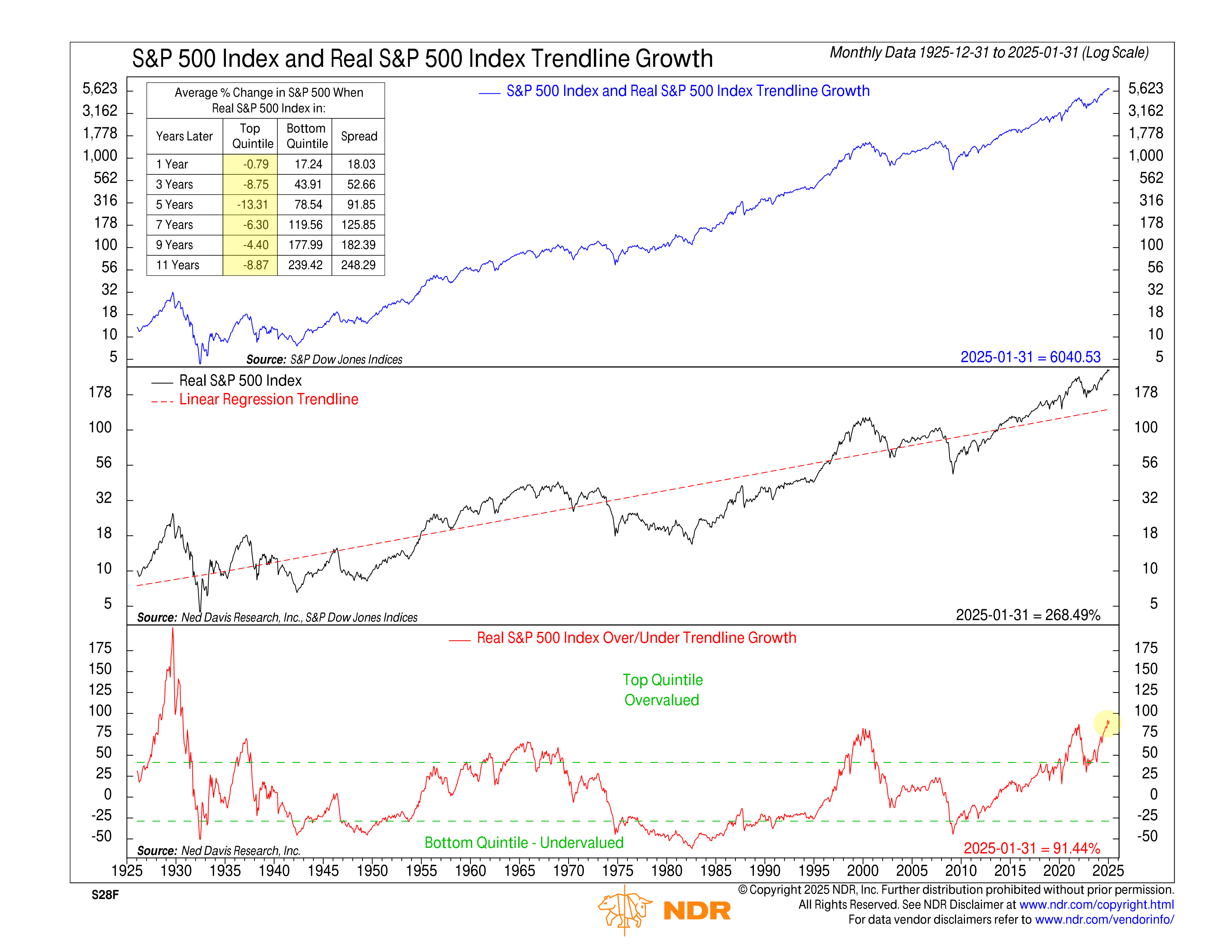
The top section of the chart shows the S&P 500’s nominal price growth. That’s the index as most people see it—just price levels over time. What stands out is the unmistakable long-term uptrend, but there’s a catch: this view doesn’t account for inflation. A dollar in 1925 isn’t the same as a dollar today, so if we want to compare apples to apples, we need to adjust for purchasing power over time.
That’s where the middle section comes in. Here, we see the real (inflation-adjusted) S&P 500 plotted against a linear regression trendline. The black line represents the inflation-adjusted index, while the red dashed line is a statistical trendline that shows the market’s long-term trajectory. The idea is simple: over long periods, the real S&P 500 has tended to revert toward this trend. Sometimes it runs ahead of it, sometimes it lags behind, but over time, it gravitates back to this fundamental path.
Right now, the S&P 500 isn’t just ahead of the trend—it’s way ahead. That brings us to the bottom section of the chart, which measures how far the real S&P 500 is above or below its historical trendline at any given time. When the red line is above zero, it means the market is trading at a premium to its long-term trend. When it’s below zero, the market is undervalued relative to history.
This indicator is crucial because it highlights just how stretched markets can get before eventually reverting to the mean. Today, the S&P 500 is 91% above its inflation-adjusted trendline, a level of overvaluation we’ve only seen once before—1929. That year should sound familiar. It marked the peak before the worst stock market crash in U.S. history.
What does that mean for investors? The table in the top left corner provides some clues. It shows how the S&P 500 has historically performed after reaching similar levels of overvaluation. When markets have been in the top quintile—like they are today—forward returns have been weak. On average, the index has struggled over the next one, three, five, and even eleven years. Compare that to the times when the market was deeply undervalued (the bottom quintile), and the difference is dramatic.
Of course, this doesn’t mean the market is about to crash tomorrow. Stocks can stay overvalued for long stretches, especially when momentum and optimism are running high. But history suggests that when prices get this far ahead of their long-term trajectory, they eventually come back down to earth—whether through a sharp correction or years of subpar returns.
Now, the market doesn’t have to crash to work off this excess. Sometimes, it just grinds sideways for years while earnings catch up. Other times, inflation quietly erodes real returns. But one way or another, the rubber band usually snaps back. Investors ignoring this historical pattern aren’t just making a bold bet—they’re betting that this time, the market has rewritten its own rules. That’s a wager history hasn’t been kind to.