OVERVIEW
Markets struggled this week, with most major indexes finishing in the red. The S&P 500 dropped 1.66%, while the Dow took a bigger hit, falling 2.51%. Tech stocks also stumbled, dragging the Nasdaq down 2.51%.
Small- and mid-cap stocks were hit even harder. The S&P 600 fell 3.58%, while mid-caps (S&P 400) slid 3.02%. The broader market followed suit, with the Russell 3000 dropping 2.01%, and its growth-focused counterpart tumbling 2.82%.
International markets held up better. Developed markets (EAFE) dipped just 0.18%, while emerging markets bucked the trend, rising 1.96%. Meanwhile, the U.S. dollar edged down 0.14%.
Bonds provided some stability. Long-term Treasuries gained 0.47%, while short- and intermediate-term Treasuries saw modest increases. Investment-grade bonds rose 0.26%, and high-yield bonds inched up 0.02%.
Commodities were mixed. Broad commodities advanced 0.89%, while oil slipped 0.62%. Gold had a solid week, rising 1.81%, but corn fell 0.74%.
KEY CONSIDERATIONS
Cracking the Consolidation Code – Stocks have been on a bit of a rollercoaster ride the past few months. In technical terms, this kind of sideways trading action is called a “consolidation.”
Beneath the surface, a quiet rotation is taking place—mega-cap growth stocks have been underperforming while smaller, less growth-oriented areas of the market have gained some traction.
The big question: Where do stocks go from here once this consolidation phase is resolved?
To help answer this, we can look at a neat little tool we have called a Pattern Matched Composite. This model identifies the 10 closest historical matches to the current consolidation and combines them into a single composite. Essentially, it shows how similar periods have played out in the past. As the chart below suggests, the market will likely remain in consolidation mode a bit longer before eventually breaking higher.
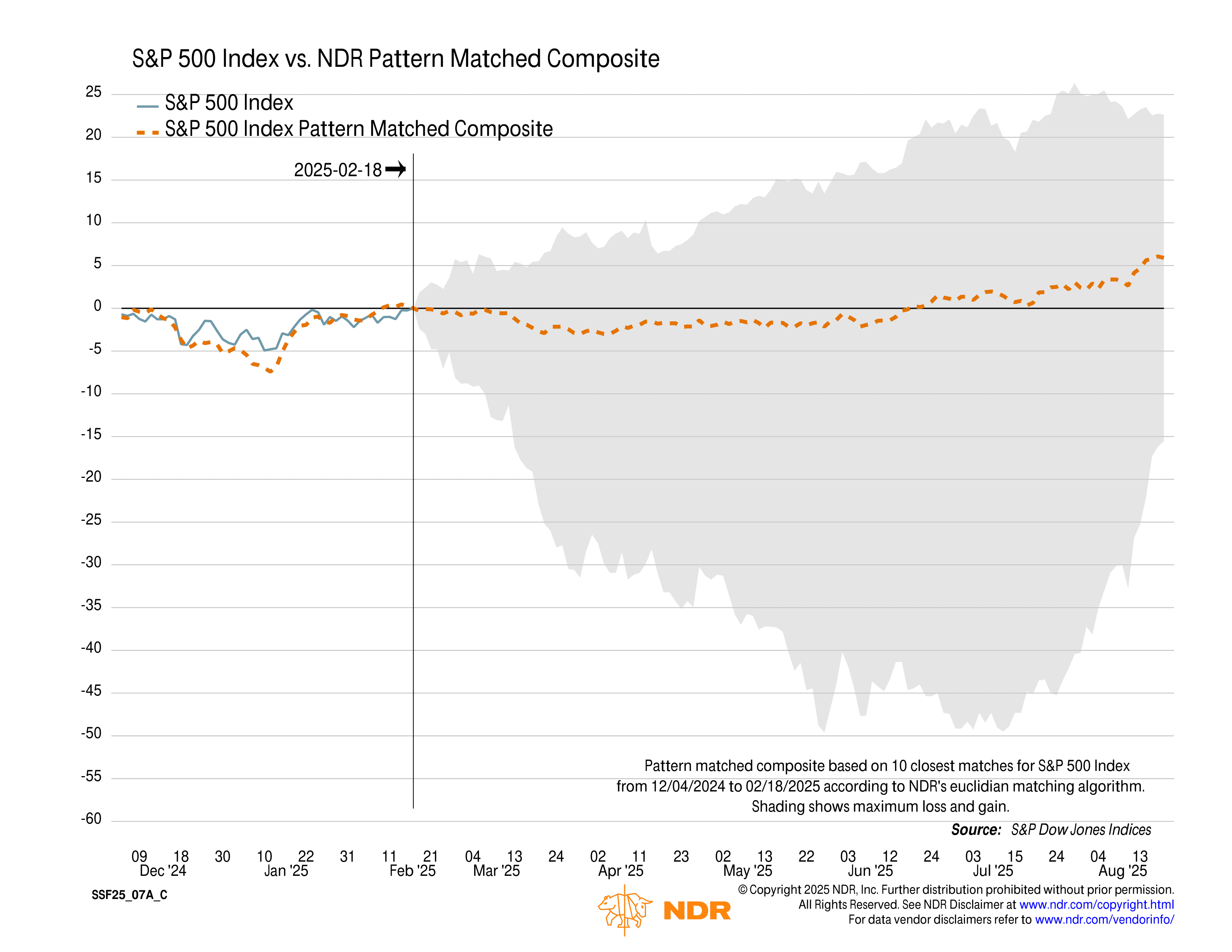
In other words, based on historical patterns, this looks more like a pause within an ongoing bull market—not the start of a major correction or bear market.
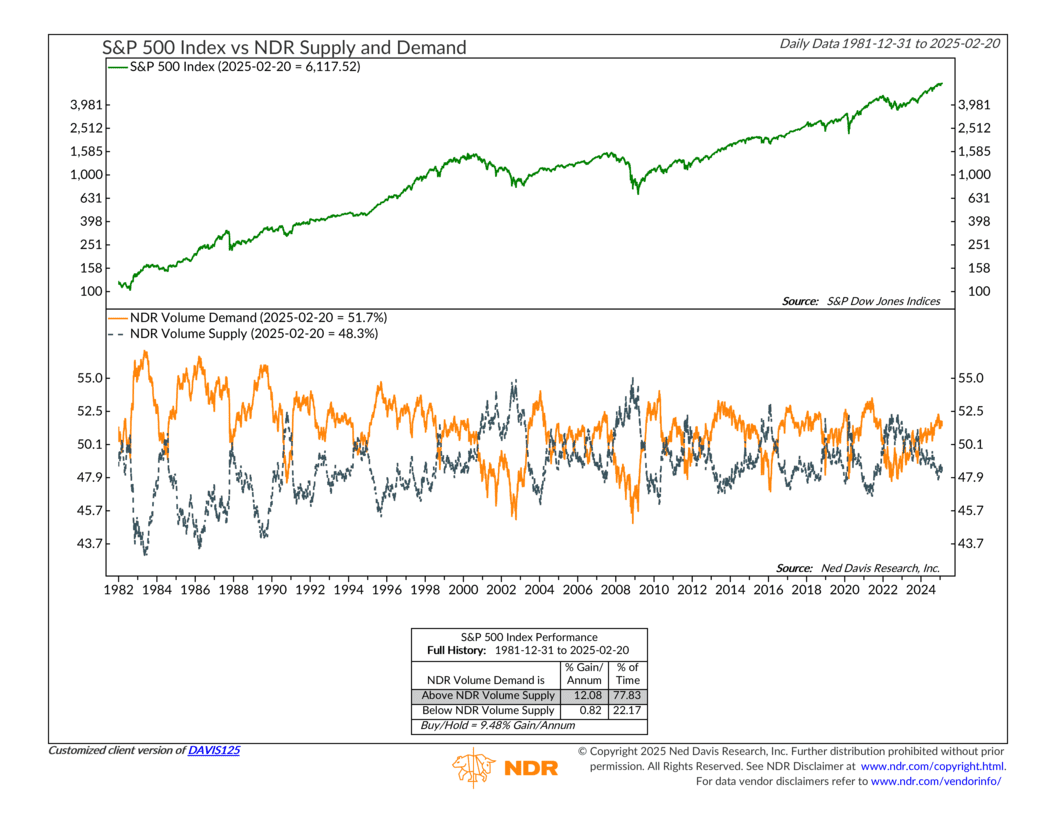
Of course, the range of outcomes in the chart is fairly wide, so we should take it with a grain of salt. However, another indicator adds confidence to the idea that the market could resolve this phase positively in the months ahead.
This indicator tracks volume supply and demand in the S&P 500. The orange line represents the total trading volume in stocks that are rising, while the dark blue line shows the total volume in stocks that are declining. Historically, when demand (orange) exceeds supply (blue), the S&P 500 has returned an average of 12.08% per year—not too shabby.
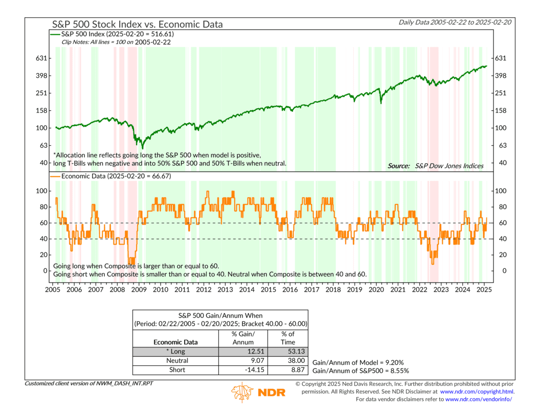
This kind of internal price strength has helped push our overall stock market risk model higher in recent weeks. Additionally, as the next chart highlights, the economic backdrop has improved significantly. In fact, our Economic Data Composite Model has now moved into positive territory, providing a strong tailwind for our broader outlook.
So, the bottom line is that the market is working to break out of its current consolidation phase. Historical precedents suggest it will likely resolve to the upside—and our underlying model outputs seem to agree.
This is intended for informational purposes only and should not be used as the primary basis for an investment decision. Consult an advisor for your personal situation.
Indices mentioned are unmanaged, do not incur fees, and cannot be invested into directly.
Past performance does not guarantee future results.
The S&P 500 Index, or Standard & Poor’s 500 Index, is a market-capitalization-weighted index of 500 leading publicly traded companies in the U.S.