OVERVIEW
It was a choppy week of trading for U.S. stocks last week. Both the S&P 500 and Dow fell 0.08%, whereas the Nasdaq gained 0.24%.
Growth shares rallied about 0.2%, and value stocks fell 0.1%. Small-cap stocks, however, did well and gained around 1.27%.
Foreign markets were mixed as well. While developed country markets rose 0.3%, emerging markets dipped 0.06%. The U.S. dollar strengthened about 0.1%.
Bonds declined as the 10-year Treasury yield rose to 4.4%. Overall, bonds were down about 0.65% in the aggregate.
It was also a tough week over in the real asset space. Commodities dipped 0.7%, and real estate dropped 0.25%. Corn saw the largest decline on the week, falling 7.5%.
KEY CONSIDERATIONS
Measuring Pace – After last week, we are officially halfway through 2024. And so far, it’s been a very good year for stocks. The S&P 500 Index is off to its best start to an election year in nearly a century.
In fact, it’s off to a great start for any year. As the chart below shows, if we annualize the S&P 500’s return, it’s on track to gain about 33% this year. That’s roughly 3x higher than the long-run average of 10.5% over the past 35 years!
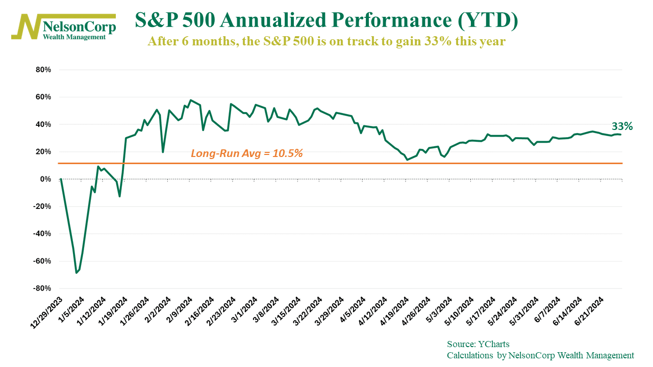
Is this sustainable? It’s hard to say. Very rarely does the market’s annual return match its long-run average. But if we look at the history of the S&P 500, you could count using just your fingers (and maybe your toes) the number of calendar years the index has returned more than 30%. It does happen; it’s just rarer.
But that analysis looks at calendar years, meaning the 12-month period from January to December. What if we look at every 12-month period? How do returns stack up then?
This next chart shows what is called a histogram of every 12-month return period for the S&P 500 over the past roughly 100 years. Each bar represents the frequency or number of times the S&P 500 returned a certain amount over any 12-month period.
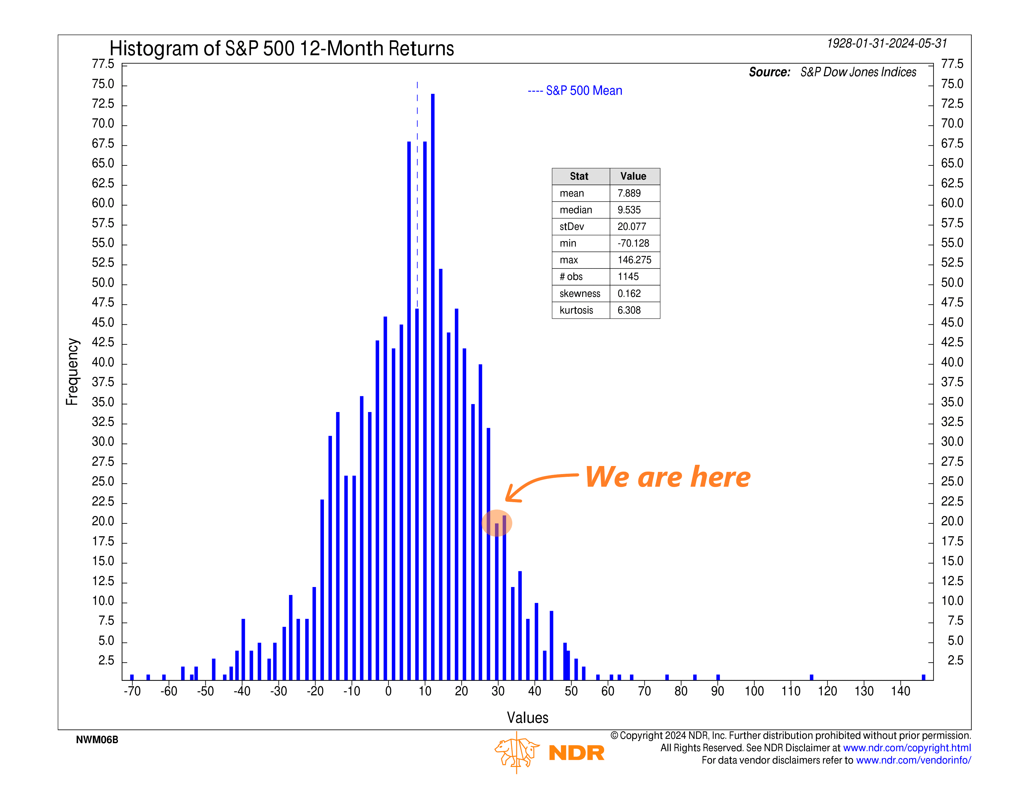
According to the chart, there have been about 1,145 different 12-month return periods since 1928. The average S&P 500 return (mean) has been nearly 8%, with a standard deviation of roughly 20%.
Currently, the S&P 500 is up roughly 27% over the past 12 months. I highlighted where that puts us on the chart. As you can see, it’s pretty far out to the right on the distribution, meaning it’s much higher than average. There have certainly been other periods where the market has returned much more, so it’s not that rare, but I think it’s safe to say that we have definitely just experienced one of the better 12-month return periods in the history of the stock market.
The bottom line? The stock market has done really well lately, no matter how you slice and dice the data. Does that mean it’s used up all its gas and it’s done going up? Certainly not. But the risk-reward dynamic looks less favorable for stocks today than it did maybe 6 or 12 months ago.
For investors, this could present an opportunity to lock in some of these recent gains, especially with bonds now offering decent income as an alternative investment.
This is intended for informational purposes only and should not be used as the primary basis for an investment decision. Consult an advisor for your personal situation.
Indices mentioned are unmanaged, do not incur fees, and cannot be invested into directly.
Past performance does not guarantee future results.
The S&P 500 Index, or Standard & Poor’s 500 Index, is a market-capitalization-weighted index of 500 leading publicly traded companies in the U.S.