There’s a reason oil prices dominate the headlines every time a geopolitical crisis breaks out. Oil touches almost everything. It fuels the trucks that move our goods, the factories that make them, and the planes that carry the people running the businesses. When oil moves sharply higher, the cost of doing just about everything follows close behind.
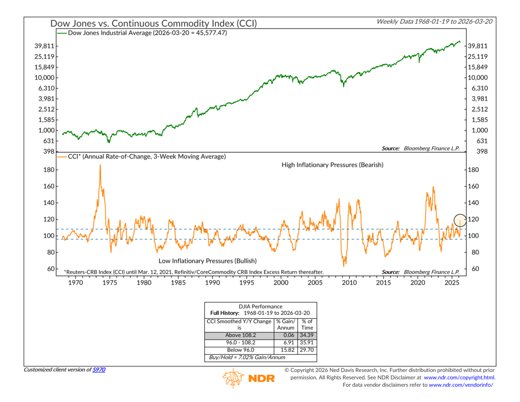
That’s what this week’s indicator is designed to capture. It takes the Reuters Continuous Commodity Index, a broad measure of commodity prices across energy, agriculture, and metals, and looks at it on a year-over-year basis. In other words, it answers a simple question: are commodity prices meaningfully higher or lower than they were twelve months ago? To smooth out the week-to-week noise, the reading is plotted as a three-week moving average.
The chart has two panels. The top panel shows the Dow Jones Industrial Average, your familiar read on the broad stock market. The bottom panel is where the commodity signal lives. The orange line tracks that year-over-year rate of change in commodity prices over time. Running across the panel are two horizontal dashed lines. The upper line sits at roughly 108. Think of that as the “danger zone” — when the orange line pushes above it, commodity prices are running hot on a year-over-year basis, and that has historically been a headwind for stocks. The lower line is near 96. When the orange line drops below that, commodity prices are easing or falling, and that environment has historically been much friendlier for equities.
The numbers back it up. Going back to 1968, when commodity prices are running above that upper threshold, the Dow has gained just 0.06% per year, on average. When they’re below the lower line, the Dow has averaged closer to 15.82 percent per year. That’s a pretty meaningful difference.
So where are we today?
Well, the orange line has been making a sharp, nearly vertical move higher over the past few months. As of mid-March, it crossed above that upper dashed line and now sits around 119, well into the danger zone.
I’m sure you can guess the reason why. The conflict in Iran has sent oil prices surging, and the broader commodity complex has gone along for the ride. Energy ripples through everything, which is why this reading has moved so quickly.
This creates what markets tend to dislike most: a stagflation setup. Rising commodity prices act like a tax on consumers and businesses, slowing growth. But at the same time, they keep inflation elevated, which limits what the Fed can do to help. That’s the corner the market finds itself in right now.
So, the bottom line is that this indicator just moved to a Sell signal, and it’s another piece of evidence in a model that has been gradually shifting in a more cautious direction. The key thing to watch from here is whether this orange line continues climbing, or whether some relief in energy prices allows it to roll back toward neutral territory.
But until that happens, this one stays in the red column.
This is intended for informational purposes only and should not be used as the primary basis for an investment decision. Consult an advisor for your personal situation.
Indices mentioned are unmanaged, do not incur fees, and cannot be invested into directly.
Past performance does not guarantee future results.
The Dow Jones Industrial Average is a price-weighted index of 30 large, publicly traded U.S. companies across major industries, widely used as a barometer of overall U.S. stock market performance.
The Reuters Continuous Commodity Index (CCI) is an equal-weighted index of 17 commodity futures contracts spanning energy, agriculture, and metals, designed to provide a broad measure of overall commodity price trends.