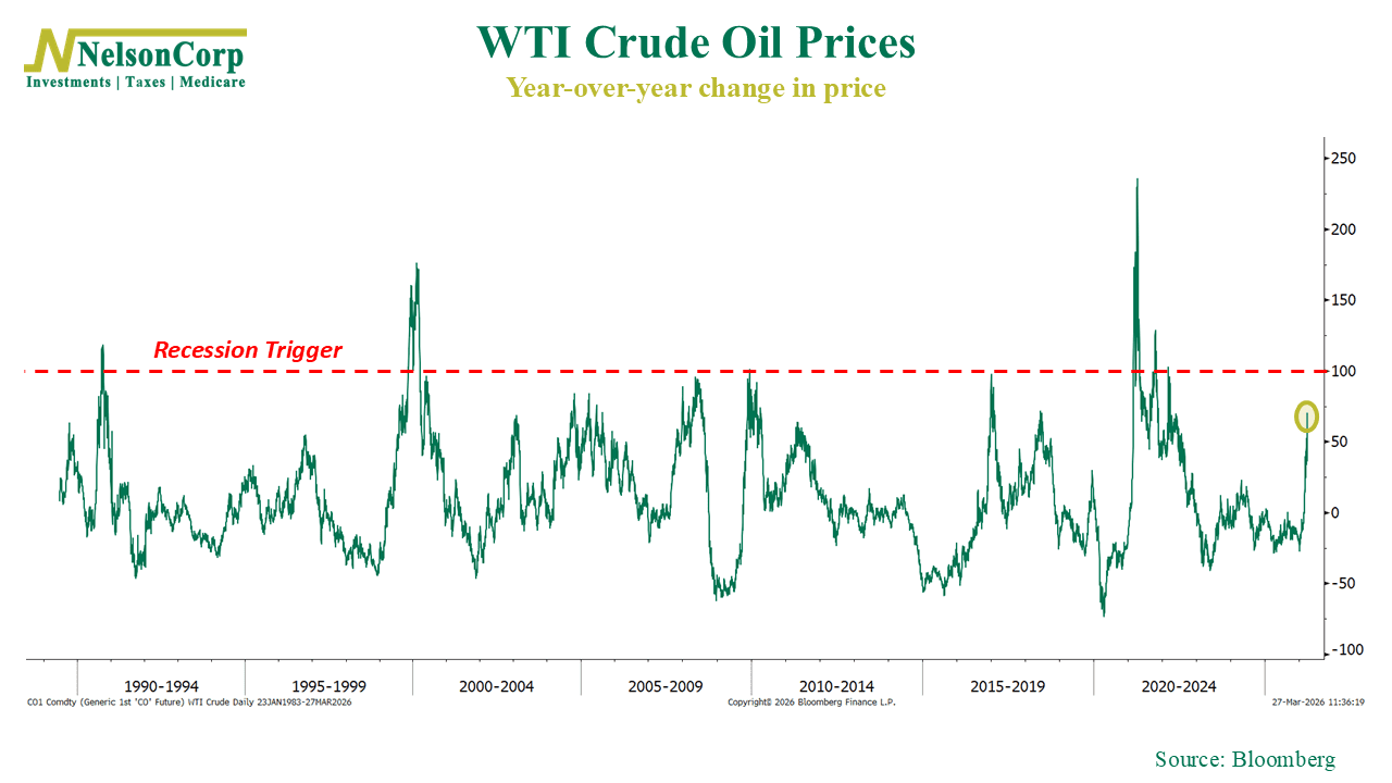
This week, I want to revisit a chart that we featured on the blog around this time last year. It shows the year-over-year change in WTI crude oil prices going back decades. In simple terms, it measures how much oil prices have risen over the past 12 months.
It’s an important chart because the key finding is that that, historically, when the rolling 1-year change in oil prices has exceeded 100%, it has often coincided with periods of economic stress, and in some cases, recessions.
That’s what has investors on edge right now, with the conflict in Iran driving oil prices higher globally. As you can see, the current 1-year change in oil is now up to about 70%. That’s quite the jump from where it was last year when we highlighted this chart.
Of course, nobody can say for certain whether this leads to a recession. But this is exactly the kind of chart that’s worth paying attention to right now, because it’s the primary catalyst for the current sell-off in stocks. With the economy already facing headwinds from tariffs and softer consumer spending, the key question is whether this continues higher toward that “recession trigger” level that has historically signaled broader economic stress.
This is intended for informational purposes only and should not be used as the primary basis for an investment decision. Consult an advisor for your personal situation.
Indices mentioned are unmanaged, do not incur fees, and cannot be invested into directly.
Past performance does not guarantee future results.