by NelsonCorp | Jul 10, 2026 | Chart of the Week
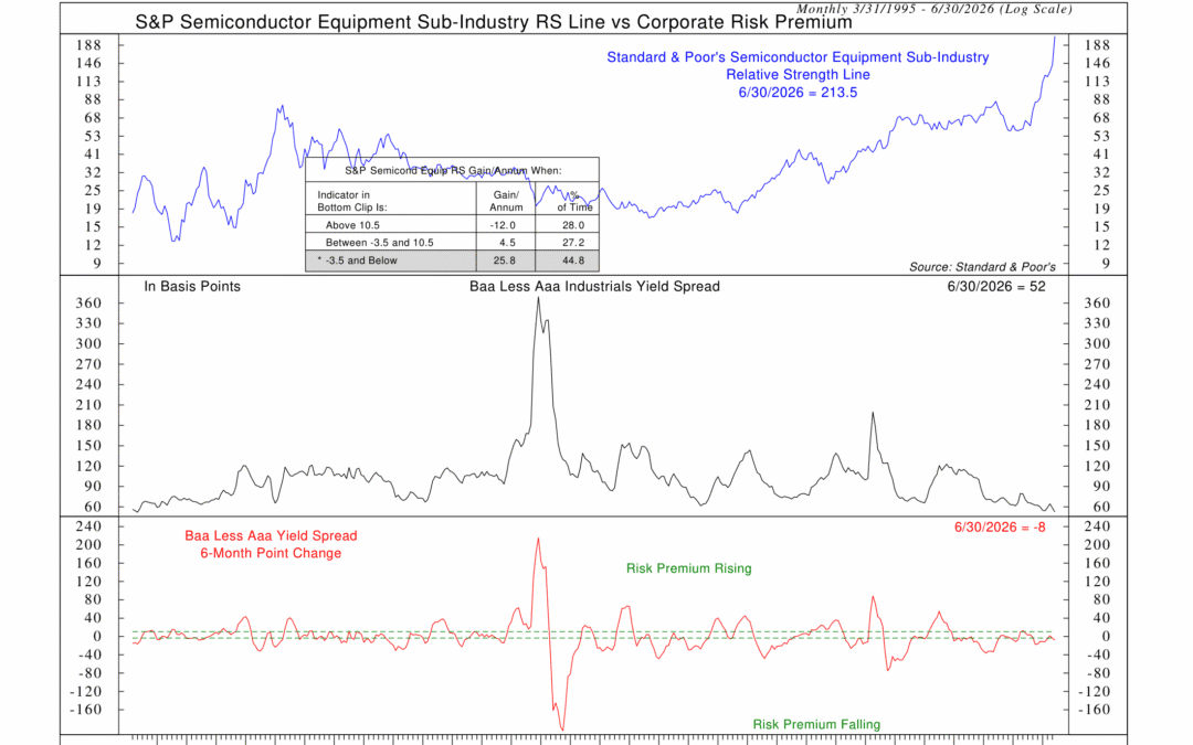
Artificial intelligence continues to dominate the market conversation, but here’s something you may not be thinking about: the companies that make the equipment used to manufacture advanced computer chips. This week’s chart shows an interesting...
by NelsonCorp | Jul 3, 2026 | Chart of the Week
I don’t really like comparing the stock market to a casino. They’re not the same thing. Over the long run, investing in productive businesses has been one of the most reliable ways to build wealth. That said, not everyone approaches the market like...
by NelsonCorp | Jun 29, 2026 | Chart of the Week
It’s the four most dangerous words in investing: This time is different. Sometimes, in the heat of a bull market, investors get into this habit of thinking that the old rules no longer apply. With each new market cycle, we get some new compelling story...
by NelsonCorp | Jun 19, 2026 | Chart of the Week
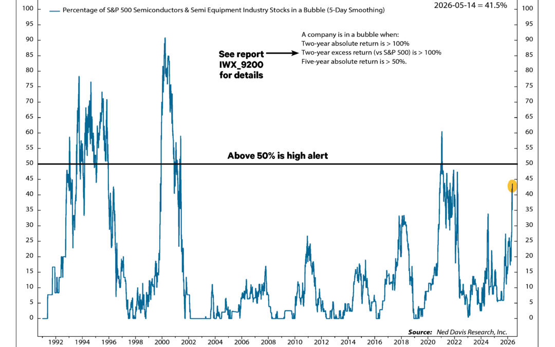
There’s no doubt about it; artificial intelligence has been a big driver of this bull market. Investors just can’t stop pouring money into semiconductor companies, making big bets on the AI revolution. That enthusiasm has helped push many chip stocks to extraordinary...
by NelsonCorp | Jun 12, 2026 | Chart of the Week
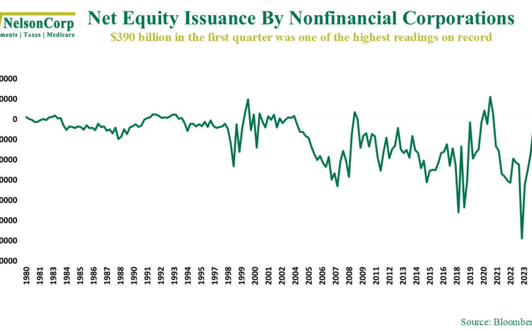
One of the biggest stories on Wall Street this week was a much-anticipated IPO. I won’t name names, but chances are you’ve heard about it. As our chart this week shows, though, it isn’t alone. There has been a noticeable resurgence in net...
by NelsonCorp | Jun 5, 2026 | Chart of the Week
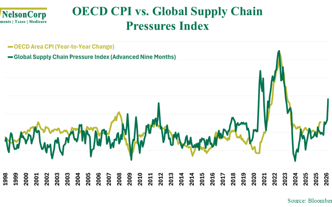
The stock market has been looking ahead, hoping for a peace agreement in the war involving Iran. While that would certainly be welcome news, this week’s chart suggests we likely aren’t out of the woods just yet. The problem lies with disruptions to global...