There’s a strange thing that happens in markets. The moments that feel the most uncomfortable — like when volatility is spiking and every headline seems worse than the last — are often the moments that have historically been the most rewarding for patient investors. It sounds backward, but the data is undeniable.
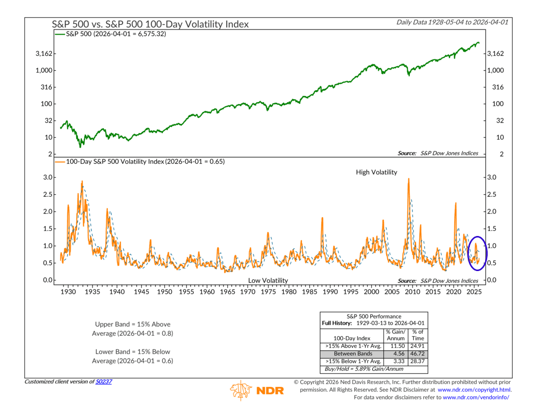
This week’s indicator shows why. It compares the S&P 500 stock index to a measure of its own (realized) 100-day volatility, then looks at that volatility reading relative to where it has been over the past year. Specifically, it draws two bands around the trailing one-year average: an upper band sitting 15 percent above that average, and a lower band sitting 15 percent below it.
The question it’s asking is simple: is the market running hot in terms of day-to-day movement, or is it sitting unusually still?
The chart has two panels. On top, the familiar S&P 500 index. On the bottom, the 100-day volatility index shown as an orange line, with two dashed blue horizontal lines marking those upper and lower bands. When the orange line is above the upper band, volatility is elevated — the market is making large moves day after day, and fear is in the air. When it’s below the lower band, things have been unusually calm, a sign of widespread complacency.
Here’s the part that catches most people off guard. Going back to 1929, when volatility has been running above that upper band, the S&P 500 has gained about 11.5 percent per year on average. Below the lower band — when things are quiet and seemingly worry-free — returns drop to around 3.3 percent per year. The middle zone comes in at roughly 4.6 percent. Buy-and-hold over the full period? Just under 6 percent.
The takeaway is a bit counterintuitive: Fear, when it’s measurable and widespread, has actually been a decent backdrop for equities. The danger tends to show up during the calm periods.
So where are we today?
Now, this indicator moved to a Sell signal back in September, when volatility was still running quite low. For a while, the market kept grinding higher. But sure enough, the weakness over the past month or so has lifted volatility measures higher and dropped the index back to essentially where it was when the signal first fired.
With volatility returning to more normal territory, however, the setup begins to look more favorable. Expected returns improve from here, and the closer that orange line gets to the upper band, the better the historical return picture tends to look. That upper range has traditionally been where the market finds its footing and performs best.
The bottom line: it’s not a green light just yet, but the conditions for one are starting to take shape.