by NelsonCorp Wealth Management | Aug 19, 2022 | Chart of the Week
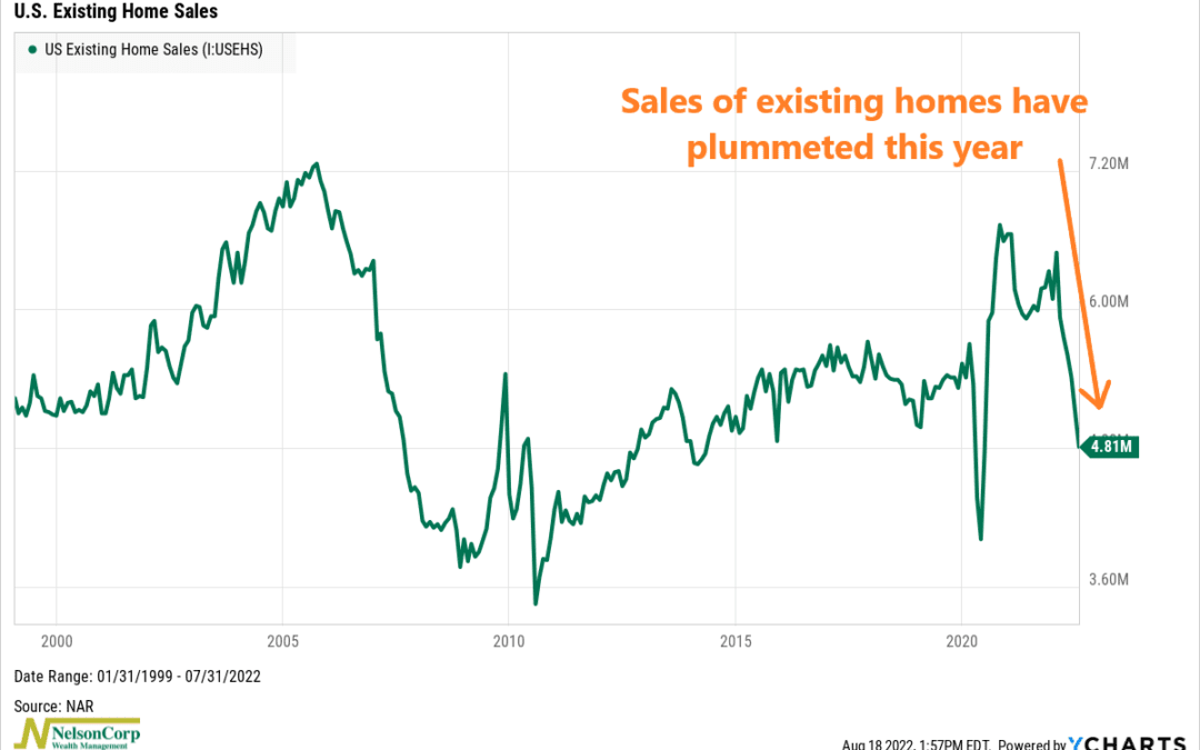
This week’s chart shows existing home sales in the United Sales going back to 1999. It tells us how many homes were sold each month—but only for homes that were already owned and occupied before coming onto the market. As you can see, they have crashed this...
by NelsonCorp Wealth Management | Aug 12, 2022 | Chart of the Week
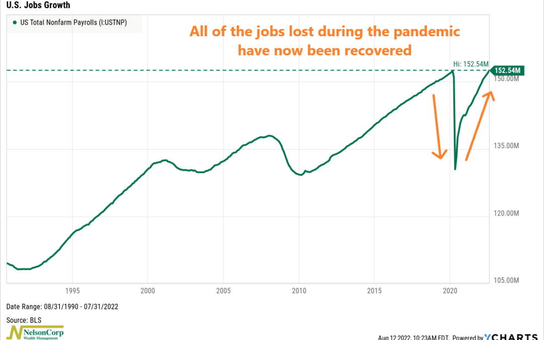
This week’s chart looks at job growth in the U.S. economy. Last month, we found out that U.S. employers added 528,000 new jobs. This was significant because it means the economy has now recovered all of the roughly 22 million jobs it lost in the early stages of...
by NelsonCorp Wealth Management | Aug 5, 2022 | Chart of the Week
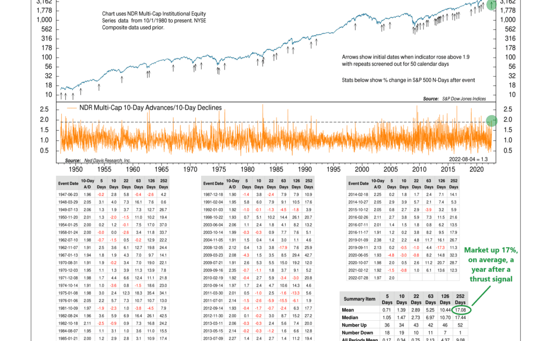
This week’s featured chart shows why the recent rally in the stock market might have some legs. The chart, shown above, is a “breadth thrust” indicator that measures the ratio of advancing stocks to declining stocks. Specifically, it takes the ratio of the...

by NelsonCorp Wealth Management | Jul 29, 2022 | Chart of the Week
This week, the Commerce Department announced that real GDP fell at a seasonally adjusted annual rate of 0.9% in the second quarter. This followed a 1.6% decline in the first quarter. Taken together, that’s two consecutive quarters of declining real GDP, which...

by NelsonCorp Wealth Management | Jul 15, 2022 | Chart of the Week
This week’s big news was the release of the June Consumer Price Index (CPI) inflation number. On a year-over-year basis, headline inflation came in at 9.1%. That’s the highest it has been in 41 years and was higher than Wall Street’s expectations. As a...
by NelsonCorp Wealth Management | Jul 8, 2022 | Chart of the Week
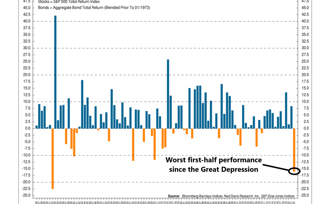
The 60/40 portfolio had a rough first half of the year. As our chart of the week above shows, it just registered its worst first-half performance since the worst one occurred during the Great Depression in 1932. So, what happened? The 60/40 balanced portfolio...
