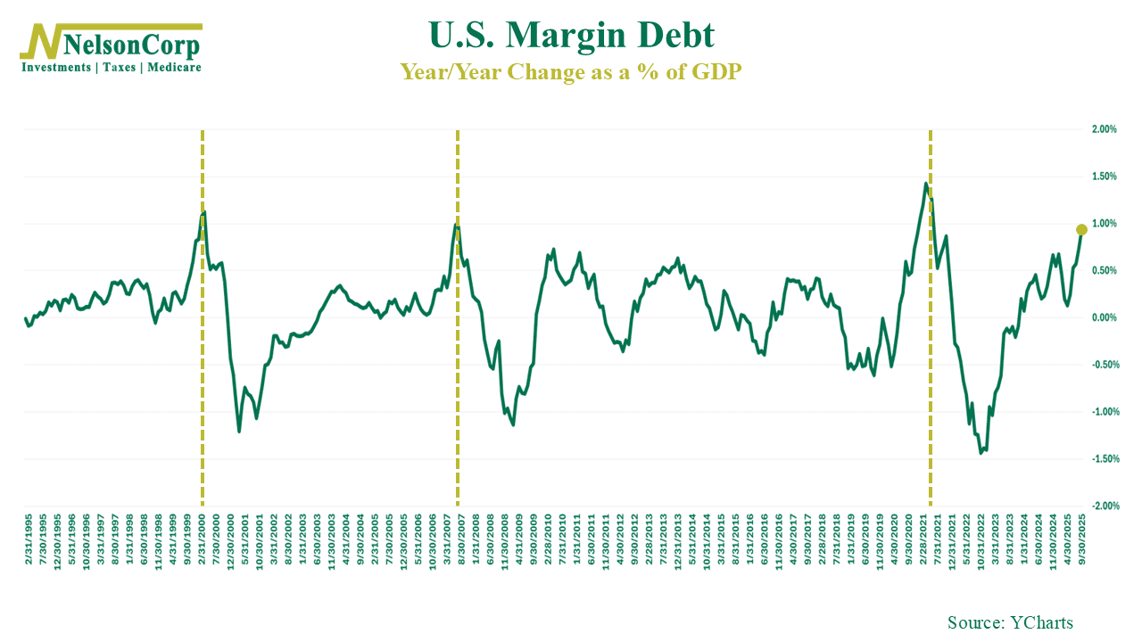
This week’s chart looks at margin debt, or how much money investors are borrowing to buy stock. In good times, it’s good. It’s a sign that investors are feeling confident and willing to lever up to buy stock. But, like anything, it can get out of hand—and when it does, it tends to coincide with tops in the stock market.
For example, the chart above shows the year-over-year change in NYSE margin debt as a percentage of U.S. GDP. This essentially tells us how quickly margin debt is rising or falling relative to the size of the economy. The big takeaway—as you can see—is that margin debt is currently growing at one of the fastest clips we’ve seen in years. This is worrisome because similar spikes in the past—like the late 1990s, 2007, and 2021—lined up closely with major market peaks.
Does this mean the marking is destined for a major crash? Not necessarily. But when we see borrowing accelerate this quickly over a 1-year time frame, it should at least give off some warning lights. As always, our advice is to stay disciplined, keep an eye on positioning, and avoid getting swept up in the madness of the crowd.
This is intended for informational purposes only and should not be used as the primary basis for an investment decision. Consult an advisor for your personal situation.
Indices mentioned are unmanaged, do not incur fees, and cannot be invested into directly.
Past performance does not guarantee future results.