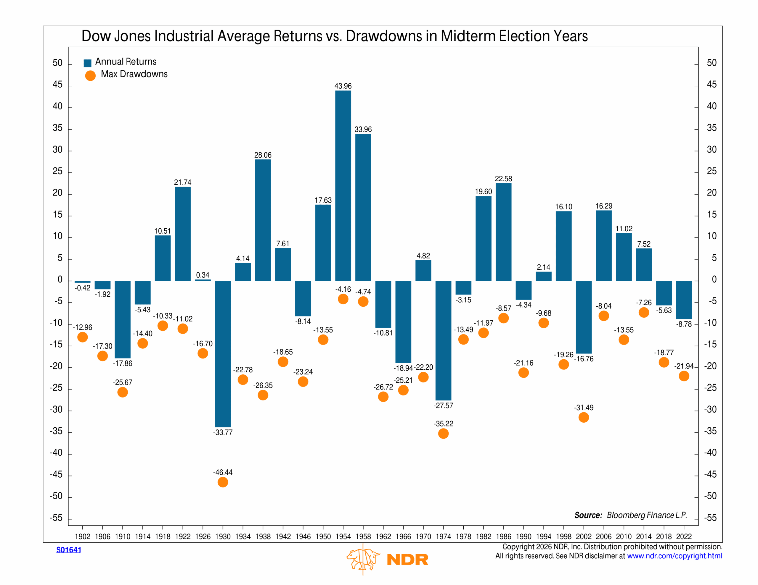
This week’s chart looks at how the Dow Jones Industrial Average has typically behaved during midterm election years. There have been 31 midterm elections since 1902. Each blue bar on the chart represents the annual return for that midterm year, while the orange dots show the maximum drawdown experienced during the year.
A few things stand out. For one, there is a wide range of outcomes. The average annual gain has been about 8.5%, but returns have varied dramatically, from deep losses in years like 1930, 1974, and 2002 to very strong gains in 1954, 1958, and 1986.
The other key takeaway is that most midterm years experience a meaningful drawdown, even when the market ultimately finishes the year higher. Drawdowns tend to cluster in the −15% to −30% range, with a few extreme outliers, most notably during the Great Depression and in 1974.
The takeaway? Historically, investors have usually been paid for enduring volatility during midterm election years, but the ride has rarely been smooth. This is probably a useful concept to keep in mind as we move through the rest of the year.
This is intended for informational purposes only and should not be used as the primary basis for an investment decision. Consult an advisor for your personal situation.
Indices mentioned are unmanaged, do not incur fees, and cannot be invested into directly.
Past performance does not guarantee future results.
The Dow Jones Industrial Average (DJIA) is a price-weighted index composed of 30 widely traded blue-chip U.S. common stocks.