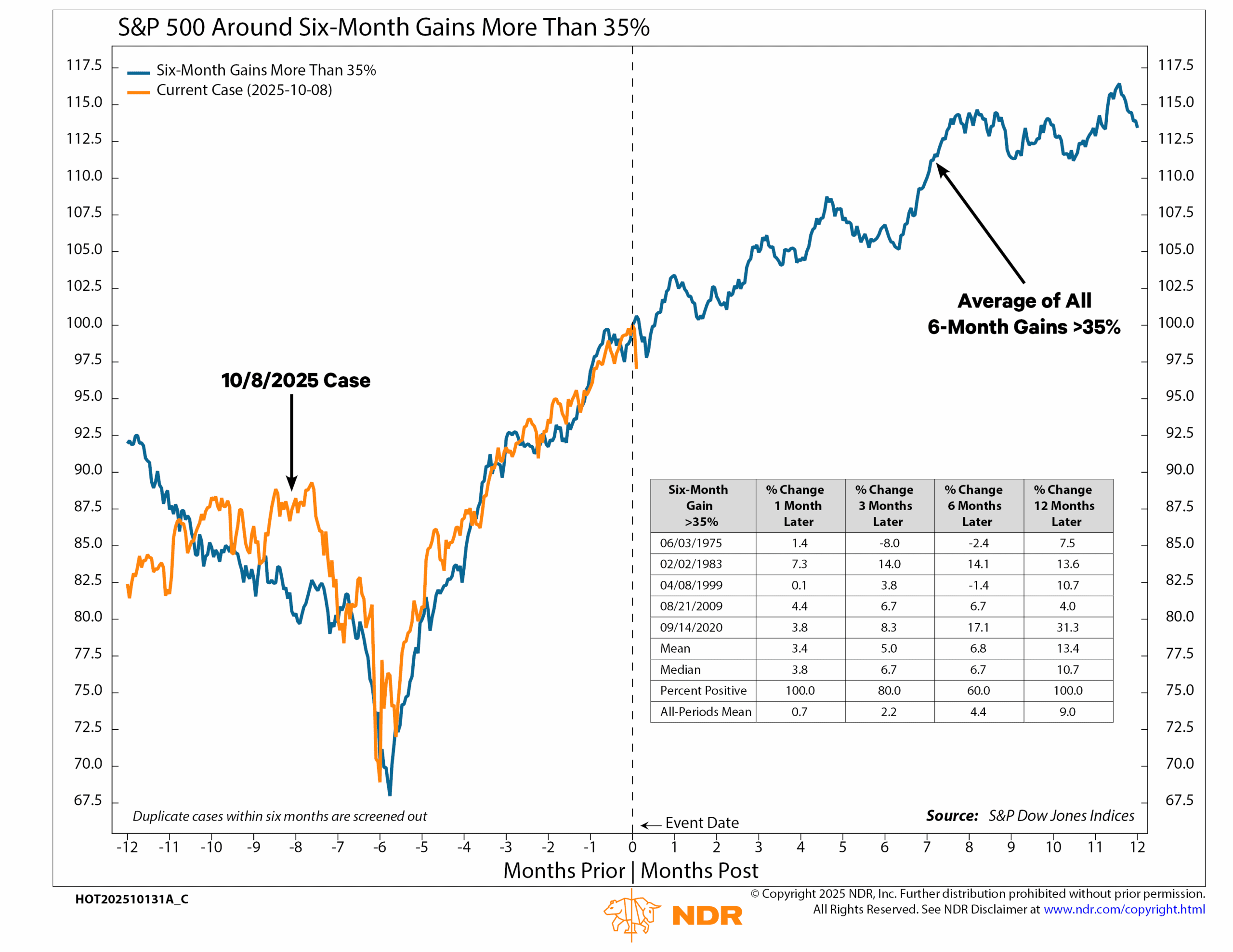
I’ve got an interesting chart for folks this week. It shows how the stock market (S&P 500 Index) has historically performed, on average, after a 6-month rally of at least 35%. That’s the blue line—the average.
Why is that interesting? Because the orange line shows our current case. October 8th marked six months since the so-called post-Liberation Day low. Over that period, the S&P 500 climbed 35.5%, its biggest six-month gain since September 2020, after the Covid Crash bottom.
So what usually happens next? Well, as the chart shows, the market has typically kept climbing. On average, the S&P 500 gained another 7% over the next six months and about 13% a year later. Not bad, considering how far it’s already come.
I will note, however, that 2025 is a bit different from the other cases included in this chart because it isn’t coming after a “true” bear market. Back in April, we didn’t see a 20% drop, so it didn’t meet the technical definition of a bear market. It hardly matters, though. From a technical perspective, the post-Liberation Day crash produced the required oversold condition to generate a rally.
The main takeaway? History suggests strong rallies after extreme oversold conditions, like the one we’re currently experiencing, tend to go on. But the data also suggests that the rally tends to be more modest over the ensuing 12 months—more of a jog, than a sprint—so that’s something to keep in mind.
This is intended for informational purposes only and should not be used as the primary basis for an investment decision. Consult an advisor for your personal situation.
Indices mentioned are unmanaged, do not incur fees, and cannot be invested into directly.
Past performance does not guarantee future results.
The S&P 500 Index, or Standard & Poor’s 500 Index, is a market-capitalization-weighted index of 500 leading publicly traded companies in the U.S.
