Lately, there’s been a buzz about something called “stagflation” in the global economy. Stagflation happens when a country’s economy gets stuck in a slump with slow growth and high inflation – definitely not a good situation.
But should we worry about this happening in the United States? Well, according to this week’s chart, the answer is: No.
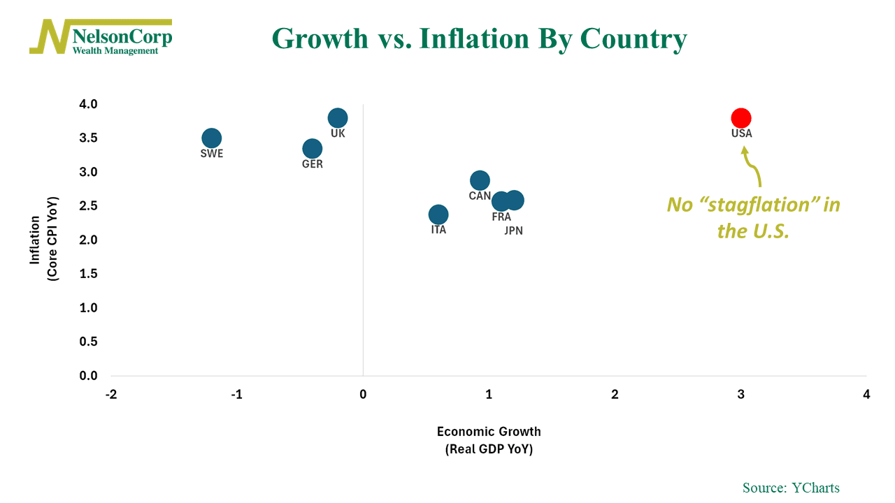
Our chart shows where several major Western economies stand in terms of economic growth versus inflation. On the chart, the vertical axis represents inflation, or the year-over-year growth rate in the core CPI (Consumer Price Index) for different countries. Meanwhile, the horizontal axis represents the year-over-year growth rate in real GDP (Gross Domestic Product), indicating economic growth.
To be in stagflation, a country’s “dot” on the chart would need to be in the top left corner, showing slow growth and high inflation. While a few countries fit this description right now, the United States isn’t one of them. In fact, compared to other countries, the U.S. stands out for having pretty strong economic growth, even though its inflation is higher than desired.
So, while we should keep an eye out for growth and inflation getting worse, this chart reminds us that the United States is actually doing pretty well compared to other developed countries.
This is intended for informational purposes only and should not be used as the primary basis for an investment decision. Consult an advisor for your personal situation.
Indices mentioned are unmanaged, do not incur fees, and cannot be invested into directly.
Past performance does not guarantee future results.
