
It’s the four most dangerous words in investing: This time is different.
Sometimes, in the heat of a bull market, investors get into this habit of thinking that the old rules no longer apply. With each new market cycle, we get some new compelling story justifying why valuations can remain high forever. Sometimes it’s the internet. Sometimes it’s easy money. Today, it’s artificial intelligence.
Now, we don’t like to get too “doom and gloom” over things like valuations. Sometimes things really do change. Companies and the way they generate earnings can be different than they were in the past. The environment changes. There’s no doubt about that.
But what doesn’t change all that much is human psychology, so we think it’s still important to look at things like valuations—or how much investors are willing to pay for stocks and their underlying earnings.
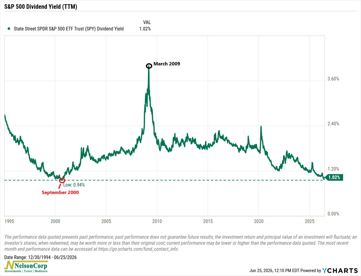
So, for this week’s chart I want to highlight one of those simple metrics that investors don’t typically focus on but that can tell us something really important: the S&P 500 dividend yield.
It’s pretty simple. Companies pay dividends, and as stock prices rise faster than the dividends companies pay, dividend yields fall.
In other words, lower dividend yields generally signal a more expensive market.
As you can see above, the S&P 500’s dividend yield currently sits at around 1.02%, one of the lowest readings on record. The only time we’ve seen a lower level was during the height of the dot-com bubble in September 2000.
Does that mean another major correction is right around the corner?
Not necessarily.
One of the hardest lessons in investing is that markets can remain expensive for much longer than most people expect. Some of the biggest gains often occur late in a bull market, when investors become increasingly convinced that “this time is different.”
But history also tells us that periods of extreme optimism rarely last forever. Eventually, expectations become too high and a shakeout happens. The challenge, though, is that valuation metrics are a poor timing tool. They can tell us that future risks are increasing, but they can’t tell us whether that reckoning arrives next month or two years from now.
So, the bottom line is that today’s market is undeniably expensive by several historical measures, and this chart is another reminder of that reality. That doesn’t mean investors should abandon stocks or try to predict the next correction. Instead, it serves as a reminder to stay disciplined, maintain realistic expectations, and remember that while every cycle feels unique in the moment, markets have a long history of proving that human behavior rarely is.
This is intended for informational purposes only and should not be used as the primary basis for an investment decision. Consult an advisor for your personal situation.
Indices mentioned are unmanaged, do not incur fees, and cannot be invested into directly.
Past performance does not guarantee future results.
The S&P 500 Index, or Standard & Poor’s 500 Index, is a market-capitalization-weighted index of 500 leading publicly traded companies in the U.S.