Supply and demand. It’s probably the oldest idea in economics. When buyers outnumber sellers, prices go up. When sellers outnumber buyers, prices fall. It’s intuitive enough that most people learned it long before they ever thought about investing.
But here’s the thing: how do you actually measure which side is winning in the stock market on any given day? You can’t always rely on price alone. Volume matters, too.
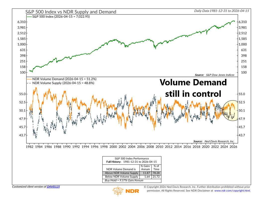
The NDR Supply and Demand indicator, shown above, tackles exactly that problem.
Rather than just tracking where prices are going, it tracks how much trading activity is happening on each side. Volume Demand measures the smoothed total volume of stocks that are advancing—in other words, the volume behind the buyers. And Volume Supply does the same for declining stocks—the volume behind the sellers. The concept is simple: when more market activity is flowing into rising stocks than falling ones, buyers are in control. When the reverse is true, sellers are running the show.
The chart has two panels. The top tracks the S&P 500 Index going back to 1982. And the bottom panel is where you’ll find our indicator: the orange line is NDR Volume Demand, and the dashed line is NDR Volume Supply. When the orange line sits above the dashed line, demand is outpacing supply—a bullish setup. But when it falls below the dashed line, supply has taken over—and history suggests that’s a much less favorable environment for stocks.
Here’s what the historical record looks like. Going back to the early 1980s, when Volume Demand has been running above Volume Supply, the S&P 500 has gained an average of 11.87% per year—and that’s been the case about 78% of the time. But when Volume Supply has been in the lead, the annual gain drops all the way down to 1.64%.
That’s a pretty big difference, and it reinforces a key investment insight: rising volume on rising stocks is a sign of a healthy market. Rising volume on falling stocks is a warning.
So where are we today?
Well, over the past several weeks, we did see some wobble in this indicator. Volume Demand started slipping lower while Volume Supply edged higher, narrowing the gap between the two lines. The S&P 500 sure felt it—the market pulled back as headlines turned cautious, and for a moment it looked like the two lines might cross.
But the crossover never happened. Volume Demand held above Volume Supply throughout the dip, and the buyers reasserted themselves. Sure enough, the S&P 500 has since rebounded sharply—now sitting back near 7,023, right at all-time high territory. As of April 15th, Volume Demand stands at 51.2% compared to Volume Supply at 48.8%.
In other words, the orange line is still above the dashed line. The sellers tried to gain control, but they failed. Volume Demand is holding the line, and the stock market is following its lead back to new highs. For now, the buyers are back in control—and this has helped swing the weight of the evidence back into the bullish column.
This is intended for informational purposes only and should not be used as the primary basis for an investment decision. Consult an advisor for your personal situation.
Indices mentioned are unmanaged, do not incur fees, and cannot be invested into directly.
Past performance does not guarantee future results.
The S&P 500 Index, or Standard & Poor’s 500 Index, is a market-capitalization-weighted index of 500 leading publicly traded companies in the U.S.