
This week, I want to step outside the stock and bond markets and talk about the U.S. dollar.
The dollar doesn’t tend to get the same attention as the stock market, but it touches almost everything in a portfolio. A weaker dollar tends to help international stocks, commodities, and gold. It can also raise the cost of imported goods. A stronger dollar does the opposite. So it pays to know which way the dollar is leaning, even if you never trade a currency in your life.
This week’s indicator approaches that question from an angle I think is pretty intuitive: relative economic growth.
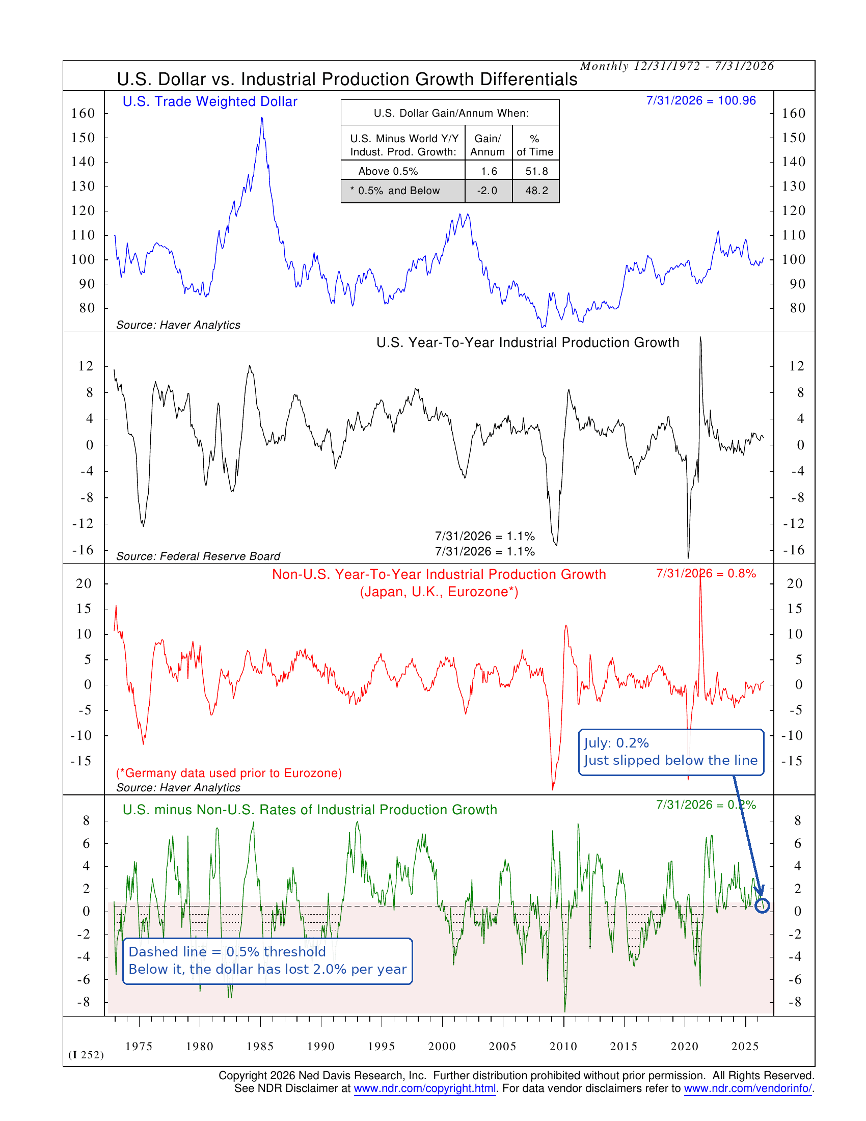
Here’s how it works. The top section of the chart above shows the U.S. Trade Weighted Dollar. It measures the dollar against the currencies of our major trading partners. The second section shows the year-over-year growth in U.S. industrial production, a broad measure of factory, mining, and utility output. The third section shows the same thing for Japan, the U.K., and the Eurozone.
The bottom section is where it all comes together. It subtracts foreign industrial production growth from U.S. growth. When the line is above the dashed 0.5% threshold, the U.S. economy is outgrowing its peers by a good margin. When it is below, the U.S. is barely keeping pace, or simply falling behind.
Why does that matter for the dollar? Because money tends to flow toward growth. When the U.S. is outgrowing the rest of the world, it attracts investment and supports higher interest rates relative to other countries. That makes the dollar more appealing to hold. When the growth advantage fades, so does some of the dollar’s appeal.
The history backs that up. Going back to 1972, when the U.S. growth advantage has been above 0.5%, the dollar has gained at a 1.6% annualized rate. When it has been at 0.5% or below, the dollar has lost ground at a 2.0% annualized rate. That’s not a huge spread, but it has been consistent. And each zone has been in effect roughly half the time.
So where are we now? This is why I picked this indicator this week. As of the July reading, U.S. industrial production was growing at 1.1% year-over-year. The non-U.S. group was growing at 0.8%. That puts the differential at roughly 0.2%, which means the indicator just slipped below the 0.5% threshold and into its dollar-bearish zone.
In other words, the U.S. growth advantage that has supported the dollar for much of the past few years has narrowed to almost nothing.
That said, one month below the line is just one signal. The differential has crossed back and forth over 0.5% a few times in recent years, and the dollar responds to plenty of other forces, from interest rates to trade policy. This indicator is one piece of the puzzle.
But it is a meaningful piece, and it lines up with what we’ve been seeing elsewhere. When the case for the dollar weakens, the case for diversifying outside the U.S. gets stronger. International stocks become more attractive, and hard assets like gold tend to benefit as well.
The bottom line? The dollar has enjoyed a long stretch of support from an economy that was simply growing faster than everyone else’s. This indicator suggests that advantage is fading. That doesn’t mean the dollar is about to fall apart. But it does mean a tailwind is turning into a headwind, and that matters for portfolios.
This is intended for informational purposes only and should not be used as the primary basis for an investment decision. Consult an advisor for your personal situation.
Indices mentioned are unmanaged, do not incur fees, and cannot be invested into directly.
Past performance does not guarantee future results.
The U.S. Trade Weighted Dollar Index measures the value of the U.S. dollar against a basket of the currencies of the United States’ major trading partners, weighted by the volume of trade with each.