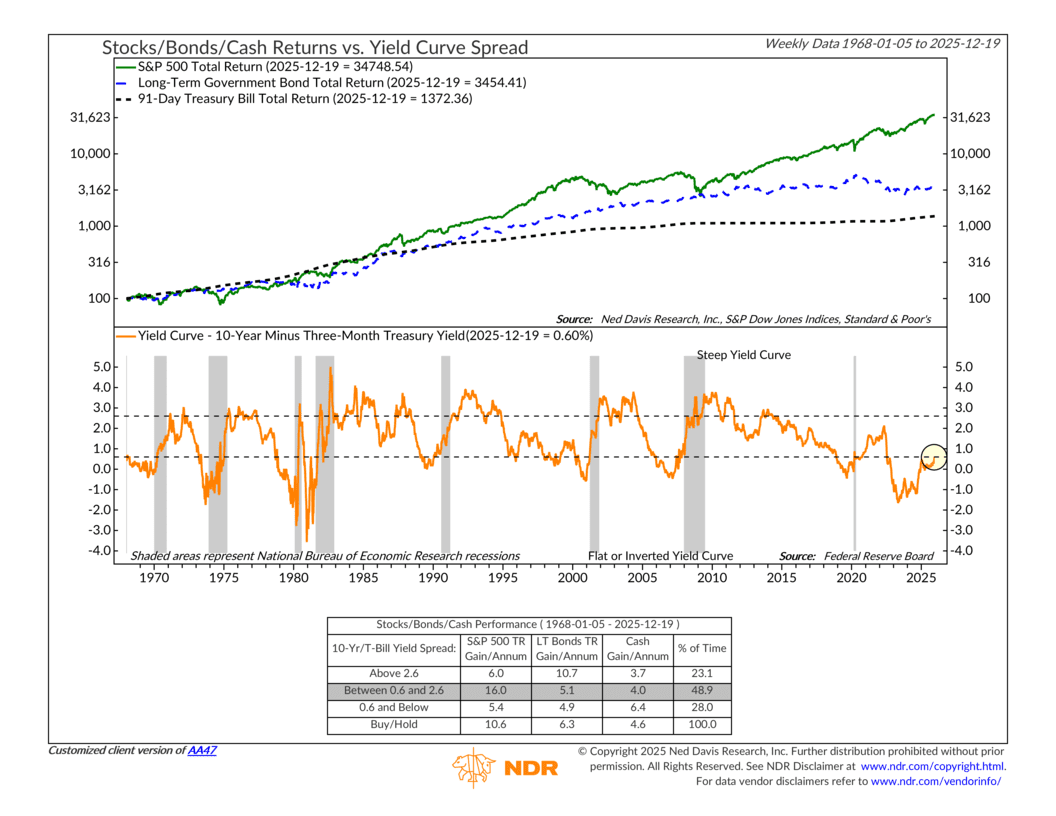
For this week’s indicator, we’re looking at a simple but powerful signal from the bond market called the yield curve. Don’t let the name scare you off. At its core, this indicator just compares two interest rates: the yield on a 10-year U.S. Treasury bond and the yield on a 3-month Treasury bill. The difference between those two rates is shown as the orange line in the lower part of the chart above.
Most of the time, longer-term interest rates are higher than short-term rates. That’s normal. Investors usually demand a higher return to lend money for ten years than they do for three months. When the yield curve looks like that, sloping gently upward, the economy is generally on solid footing. Historically, that middle zone has been a good environment for stock returns.
Sometimes, though, that gap shrinks. Short-term and long-term rates move closer together, and the curve “flattens.” And in rarer cases, short-term rates actually rise above long-term rates. That’s called an inverted yield curve, and it’s when the orange line drops below the lower bracket on the chart.
Why does that matter? Because history shows that when the curve inverts, both stocks and bonds have tended to struggle, while cash has held up better. The table at the bottom of the chart highlights this. Inverted yield curves don’t cause recessions, but they’ve often shown up ahead of economic slowdowns.
The reason has a lot to do with expectations. Investors are always looking ahead. When they start to worry about the economy’s long-term prospects, they tend to buy longer-term government bonds for safety. That buying pushes long-term interest rates down. At the same time, short-term rates are heavily influenced by the Federal Reserve. When inflation has been a concern, the Fed has kept short-term rates high to cool things off. Put those two forces together and you can end up with short-term rates above long-term rates.
That’s exactly what we saw over the past couple of years. The yield curve stayed inverted for an unusually long stretch, reflecting tight Fed policy and growing concerns about future growth.
Recently, though, that picture has started to change. The curve has moved back into positive territory. Today, the 10-year Treasury yields about 0.6 percentage points more than the 3-month Treasury. That means the curve is no longer inverted, but it’s still fairly flat by historical standards.
This is an important distinction. A positive yield curve doesn’t automatically mean the economy is in the clear or that markets are off to the races. Often, the real warning comes during the inversion itself. The period after inversion, when the curve begins to steepen again, can still come with slower growth and market volatility.
The bottom line is that this indicator is improving, but it’s not flashing an all-clear signal yet. We’ll continue to watch how the yield curve behaves and, more importantly, how it lines up with other economic and market indicators. As always, this is one piece of a much bigger picture that helps guide how we think about risk, opportunity, and portfolio positioning over time.
This is intended for informational purposes only and should not be used as the primary basis for an investment decision. Consult an advisor for your personal situation.
Indices mentioned are unmanaged, do not incur fees, and cannot be invested into directly.
Past performance does not guarantee future results.
The total return on 91-day Treasury bills reflects the performance of short-term U.S. Treasury securities with maturities of approximately three months, including interest income.