
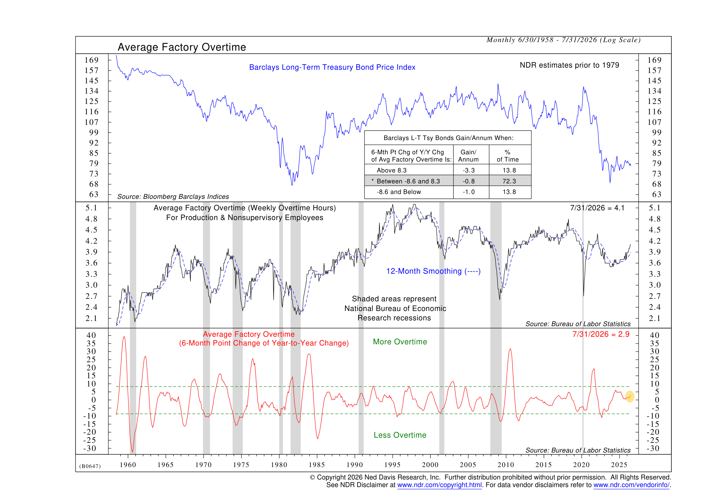
This week, I want to highlight a different sort of indicator than we usually talk about. It has to do with overtime work and how it relates to bond prices.
Why overtime?
Because overtime is something almost everyone understands. When business is good and demand is strong, companies often ask employees to work a few extra hours. When business starts to slow, overtime is usually one of the first things to get cut.
That simple relationship between overtime and economic activity is what makes this week’s indicator so intuitive.
The middle section of the chart above tracks average weekly factory overtime for production and nonsupervisory employees, along with a 12-month smoothed trend. The shaded areas represent recessions. Looking back through history, overtime has tended to rise as the economy strengthens and fall as conditions weaken.
That makes economic sense.
But the indicator in the bottom section takes things one step further. Rather than simply asking whether workers are putting in more or fewer overtime hours, it measures the six-month change in the year-over-year change in factory overtime. In simpler terms, it is trying to determine whether the momentum behind overtime is getting stronger or weaker.
Why does that matter for bonds?
Well, think about the economic chain reaction. If factories are increasing overtime, it usually means demand is strong enough that businesses need more production. Stronger economic activity can put upward pressure on wages and inflation and reduce the need for easier monetary policy. Those forces can push interest rates higher—and because bond prices move inversely to yields, that can create a tougher environment for long-term bonds.
However, when overtime momentum weakens, the process works in reverse. Slower production signals a cooling economy, easing inflation pressures, and eventually lower interest rates, which can provide a tailwind for bond prices.
Now, that relationship has been surprisingly consistent over the indicator’s history, which stretches back to 1958. The most important signal comes when overtime momentum gets particularly strong. When the indicator has risen above 8.3, long-term Treasury bonds have lost an average 3.3% annualized. That compares with relatively modest annualized losses of 0.8% when the indicator is in its middle range and 1.0% when it falls below -8.6.
In other words, bond prices have experienced something of a slow bleed during most environments, but the losses have become considerably more pronounced when overtime momentum is especially strong. That makes this indicator especially useful as a warning signal. When overtime momentum moves above that upper threshold, history suggests economic strength may be creating a particularly difficult backdrop for long-term bonds.
Today, the indicator sits at 2.9, putting it in the neutral middle zone. That does not provide a particularly strong signal for long-term bond prices right now, but it’s not the worst-case scenario either.
The bottom line? The beauty of the indicator is its simplicity. Before economic weakness shows up in headlines or official recession data, businesses may already be responding to changing demand by adjusting the number of hours their employees work. Watching those changes can give us another real-time window into the strength of the economy—and, in turn, the environment facing the bond market.
This is intended for informational purposes only and should not be used as the primary basis for an investment decision. Consult an advisor for your personal situation.
Indices mentioned are unmanaged, do not incur fees, and cannot be invested into directly.
Past performance does not guarantee future results.
The Barclays Long-Term Treasury Bond Price Index is a market-value-weighted index that tracks the price performance of U.S. Treasury securities with long-term maturities, excluding the impact of interest income and coupon reinvestment.