by NelsonCorp | May 2, 2025 | Chart of the Week
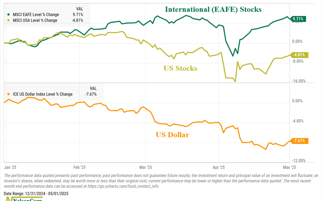
One of the more interesting developments this year is the strength in international stocks. For a long time, they’ve trailed the U.S., often by a wide margin. When it came to international diversification, many investors asked themselves: why bother? But...
by NelsonCorp Wealth Management | Apr 25, 2025 | Chart of the Week
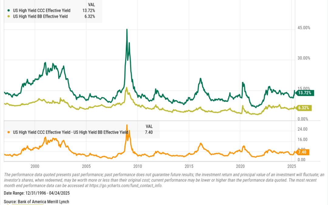
When markets get shaky, the weakest links usually show it first—and nowhere is that more obvious than in junk bonds. This week’s chart is a favorite of DoubleLine’s Jeffrey Gundlach. It compares the yields on CCC-rated bonds—the riskiest junk out there—with...
by NelsonCorp Wealth Management | Apr 18, 2025 | Chart of the Week
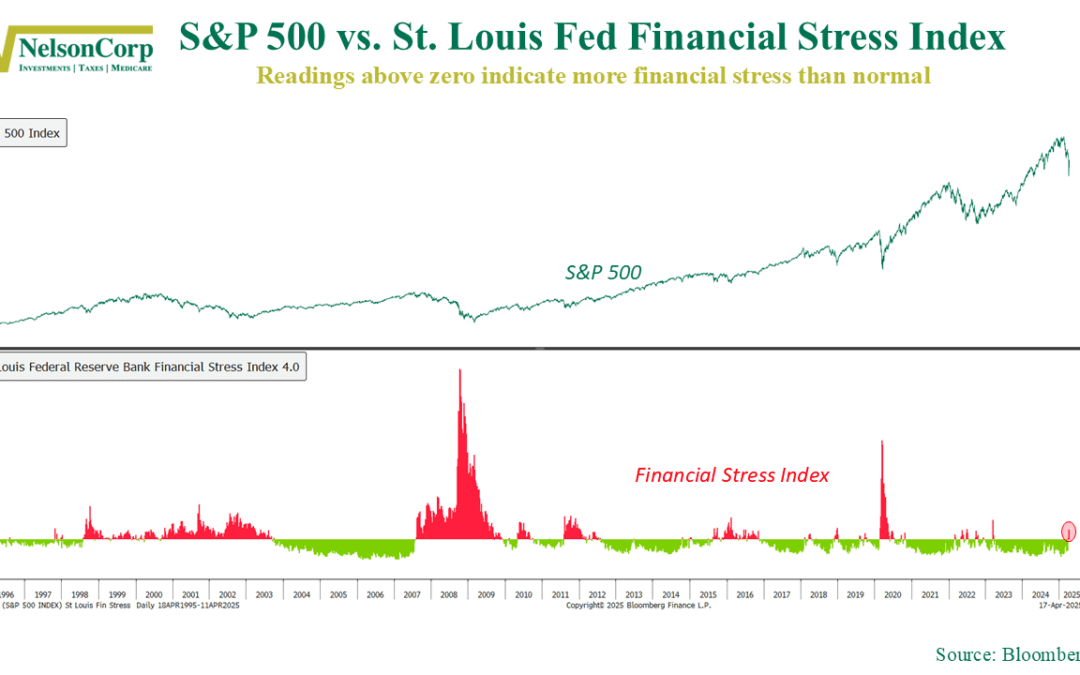
After more than two years of calm, financial stress is creeping back into the market. The chart above shows the St. Louis Fed Financial Stress Index (bottom panel) plotted against the S&P 500 (top panel). The index tracks 18 different weekly data...
by NelsonCorp Wealth Management | Apr 11, 2025 | Chart of the Week
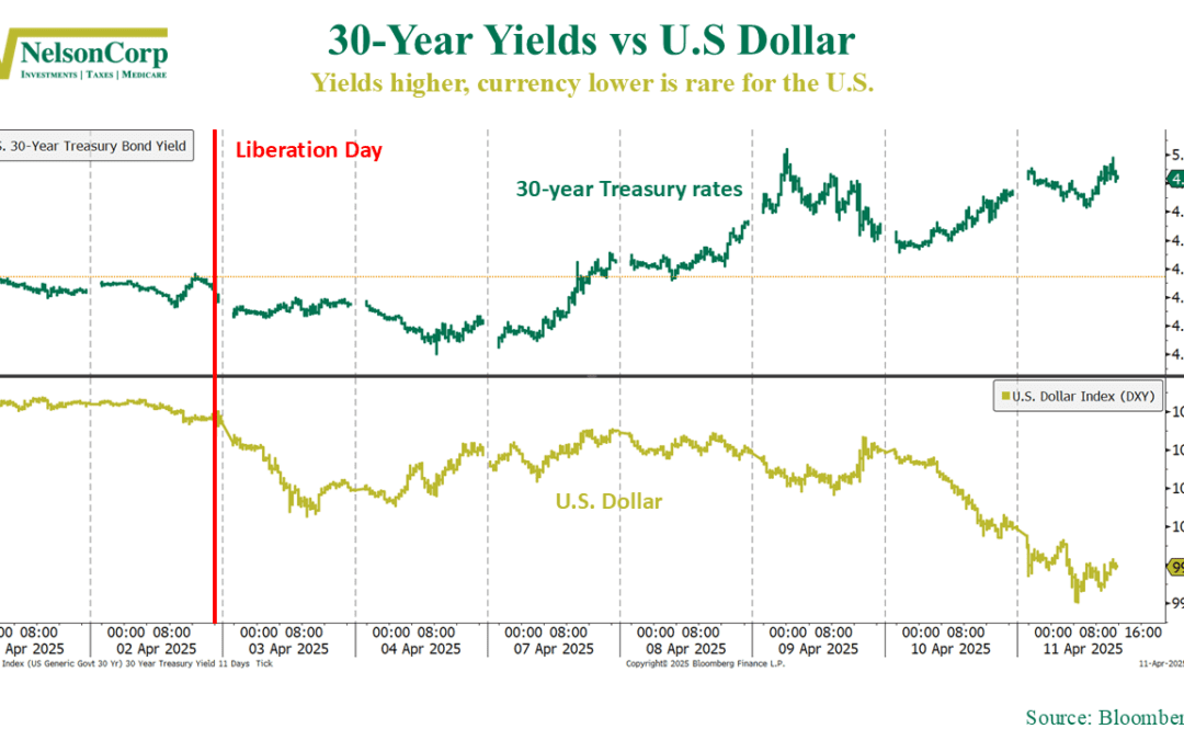
It was another rollercoaster week in the markets. Volatility was high, and stock prices swung wildly. But beyond the headline-grabbing moves in equities, there was a deeper, more telling story unfolding under the surface—one that many non-market watchers likely...
by NelsonCorp Wealth Management | Apr 4, 2025 | Chart of the Week
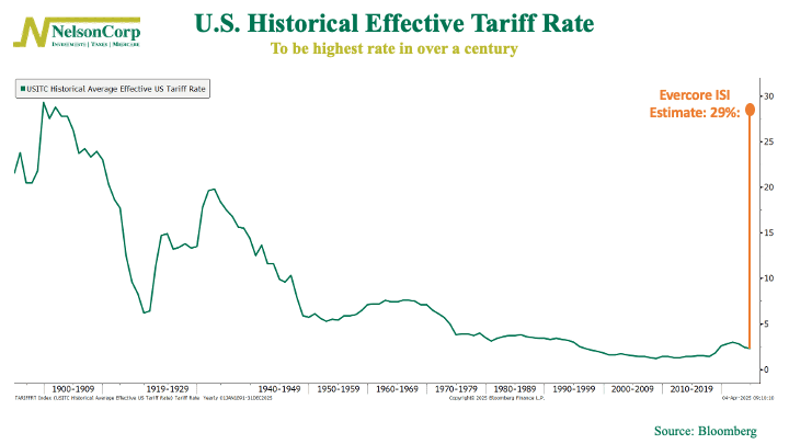
If you thought tariffs were a relic of early American economic policy, think again. Under President Trump’s proposed “Liberation Day” policy, the U.S. is set to see its effective tariff rate hit 29%, the highest level in over a century. That’s...
by NelsonCorp Wealth Management | Mar 28, 2025 | Chart of the Week
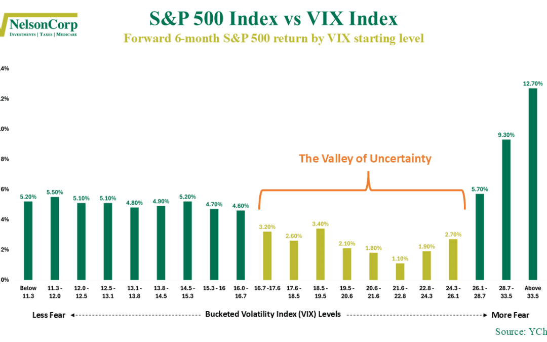
If you’ve felt like the market’s been spinning its wheels lately, this week’s featured chart might explain why. It looks at the VIX Index—Wall Street’s so-called “fear gauge”—and shows how the S&P 500 tends to perform over the next six months depending on...
