
by NelsonCorp Wealth Management | Feb 3, 2023 | Chart of the Week
The stock market is acting like it’s in the early stages of a bull market. That’s the message from the Early Cycle Composite, shown on the chart above. This chart looks at the stocks and sectors that tend to lead in the early stages of a bull market—call these...

by NelsonCorp Wealth Management | Jan 27, 2023 | Chart of the Week
This week, I want to spotlight a research tool that does a great job of telling us where the stock market is likely headed next. It’s called the Leading Indicator Model. As the name implies, the model consists of 10 indicators with a history of leading the...

by NelsonCorp Wealth Management | Jan 20, 2023 | Chart of the Week
Bond yields are finally looking more appealing. Our featured chart above shows that the yield on the Bloomberg U.S. Aggregate Bond Index—widely considered one of the best total bond market indices—has climbed to roughly 4.2%, its highest level in over a decade....

by NelsonCorp Wealth Management | Jan 13, 2023 | Chart of the Week
We’ve gotten some good news on the inflation front lately. The latest consumer price index release confirmed that inflation cooled for a sixth straight month. Additionally, last Friday’s employment report revealed a surprising decline in the year-over-year...
by NelsonCorp Wealth Management | Jan 6, 2023 | Chart of the Week
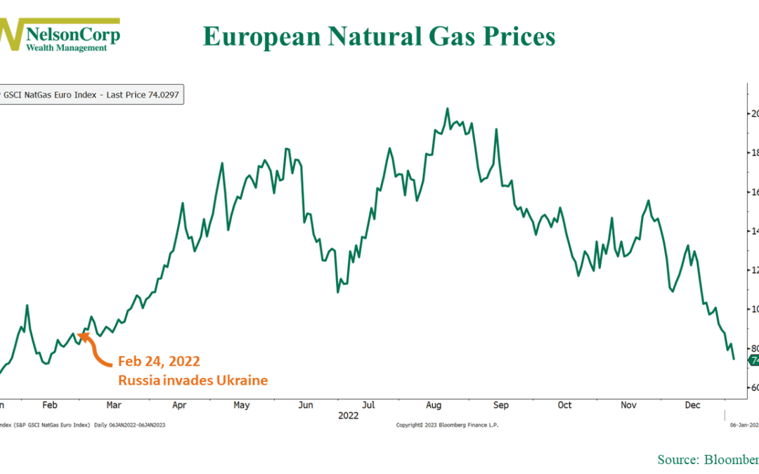
2022 was a wild year. We witnessed a surge in global inflation unlike anything we had seen in decades, and various commodities saw significant price increases. One of those commodities was natural gas. As our chart of the week above shows, natural gas prices...
by NelsonCorp Wealth Management | Dec 30, 2022 | Chart of the Week
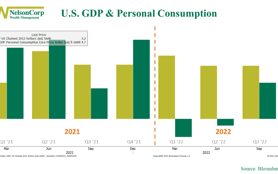
Our chart of the week above shows that the US economy faced a contraction in the first half of 2022 as GDP (green bars) declined in the first and second quarters, leading to concerns about a potential recession. However, as the gold bars reveal, consumer...
