
by NelsonCorp Wealth Management | Nov 4, 2022 | Chart of the Week
This week’s featured chart compares the annualized returns of two of the most popular stock mark indexes in the United States: The NASDAQ Composite and the Dow Jones Industrial Average. The blue line represents the annualized returns of the NASDAQ composite...

by NelsonCorp Wealth Management | Oct 28, 2022 | Chart of the Week
Well, it finally happened. Of all the leading indicators flashing red for the economy, the 3-month/10-year Treasury yield curve was one of the few to remain positive—until now. As our featured chart shows, the 3-month/10-year Treasury yield curve...

by NelsonCorp Wealth Management | Oct 21, 2022 | Chart of the Week
This week’s chart looks at mortgage rates and how their sharp rise this year has led mortgage applications to drop to their lowest level since 1997. Specifically, the top half of the chart shows the average rate for a 30-year fixed mortgage, going back to the...
by NelsonCorp Wealth Management | Oct 14, 2022 | Chart of the Week
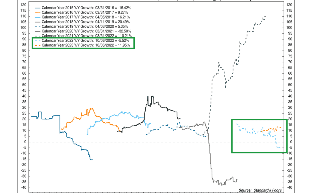
Third quarter earnings season is upon us. So, for this week’s featured chart, we show the consensus estimates for year-over-year growth in S&P 500 reported earnings per share by calendar year. The two lines I want to focus on are the light blue and orange...

by NelsonCorp Wealth Management | Oct 7, 2022 | Chart of the Week
For this week’s featured chart, we want to highlight a theme that’s dominated the stock market this year. It has to do with the Fed, its rate-hiking cycle, and how that affects stock market returns. The chart shows that, historically, the speed at which the Fed...

by NelsonCorp Wealth Management | Sep 30, 2022 | Chart of the Week
The British pound—the currency of the United Kingdom—was the star of the show of the financial world this week. It made the news because the leaders of the U.K.’s new government laid out a plan to cut taxes and pay for it by borrowing roughly £45 billion over...
