by NelsonCorp Wealth Management | Feb 25, 2022 | Chart of the Week
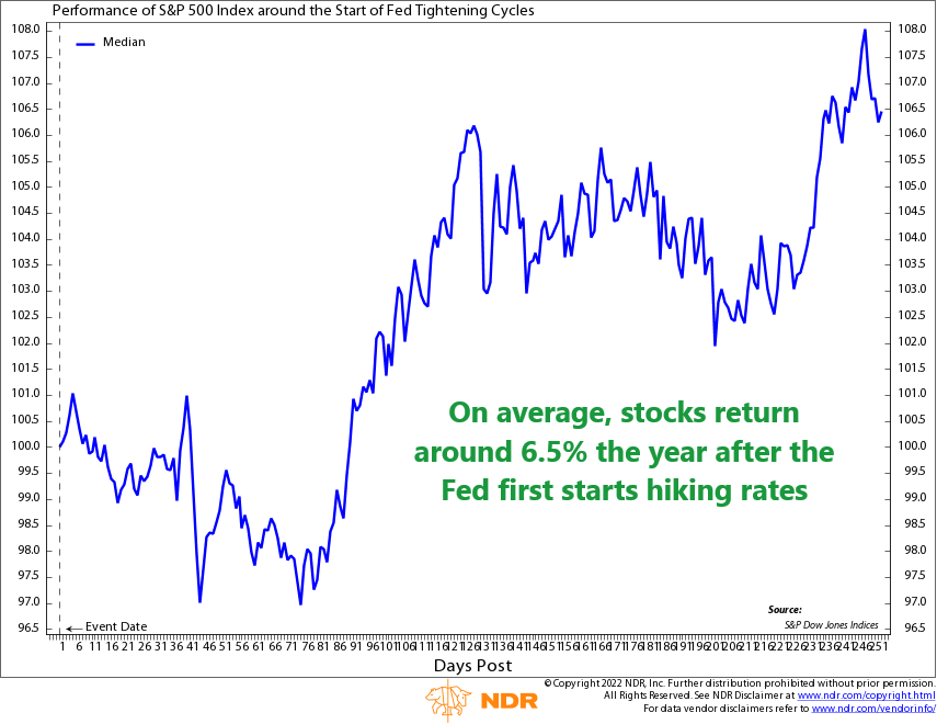
This week’s chart shows the average performance of the S&P 500 index a year after the Federal Reserve first starts a new monetary tightening cycle. What is a tightening cycle, you might ask? It’s the opposite of an easing cycle, meaning instead of lowering...
by NelsonCorp Wealth Management | Feb 18, 2022 | Chart of the Week
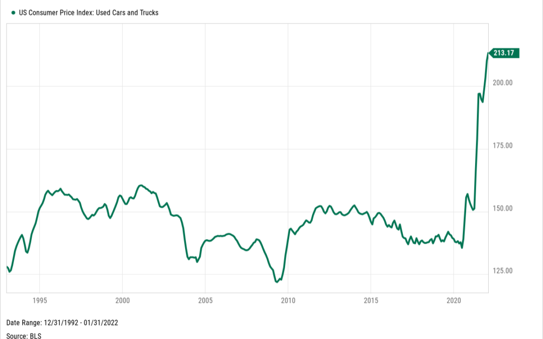
You’ve heard the saying before: your car depreciates in value the moment you drive it off the lot. But, while that is still true in general, the pandemic has challenged that notion in recent years. According to the Used Cars and Trucks component of the US...
by NelsonCorp Wealth Management | Feb 11, 2022 | Chart of the Week
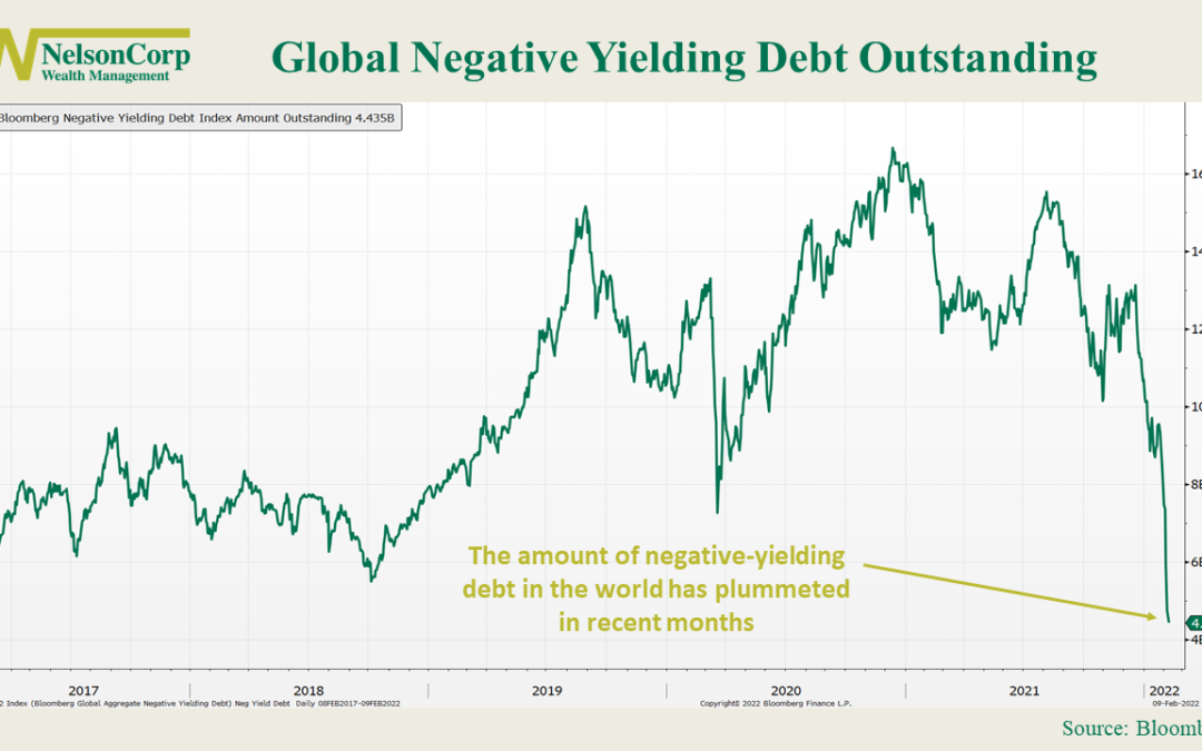
It looks like an era of easy money is coming to an end. One of the most visible indications of this is the recent rapid decline in the amount of negative-yielding bonds globally. As you can see on the chart above, the amount now stands around $4.9 trillion,...
by NelsonCorp Wealth Management | Feb 4, 2022 | Chart of the Week
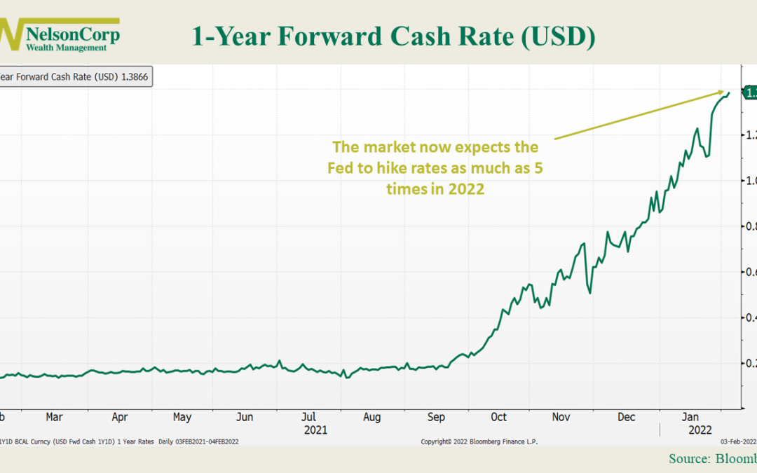
This week, we’ll take a look at a chart from the interest rate markets: the 1-year forward cash rate. The cash rate (or fed funds rate) is the interest rate that banks charge to lend to each other on an overnight basis. This is the rate that the Federal Reserve...
by NelsonCorp Wealth Management | Jan 28, 2022 | Chart of the Week
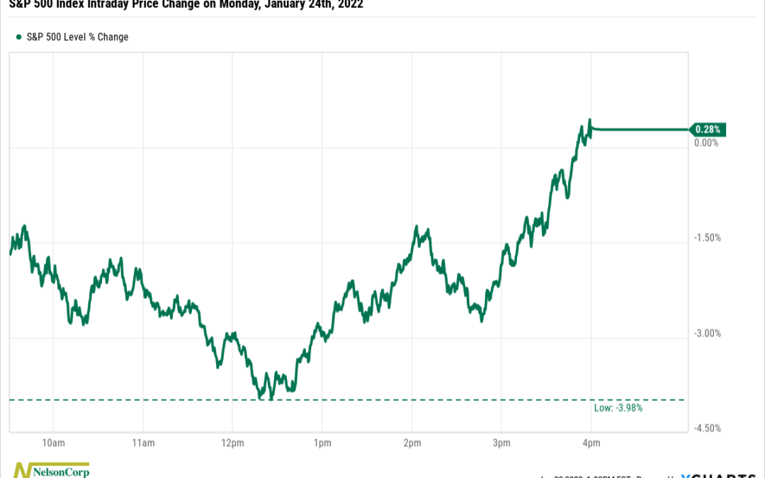
This past Monday, the S&P 500 index gained 0.28%. That seemed like a pretty normal day—nothing to write home about there. However, like a duck frantically kicking its legs under the surface of the pond, the S&P 500 had to stage quite the comeback...
by NelsonCorp Wealth Management | Jan 21, 2022 | Chart of the Week
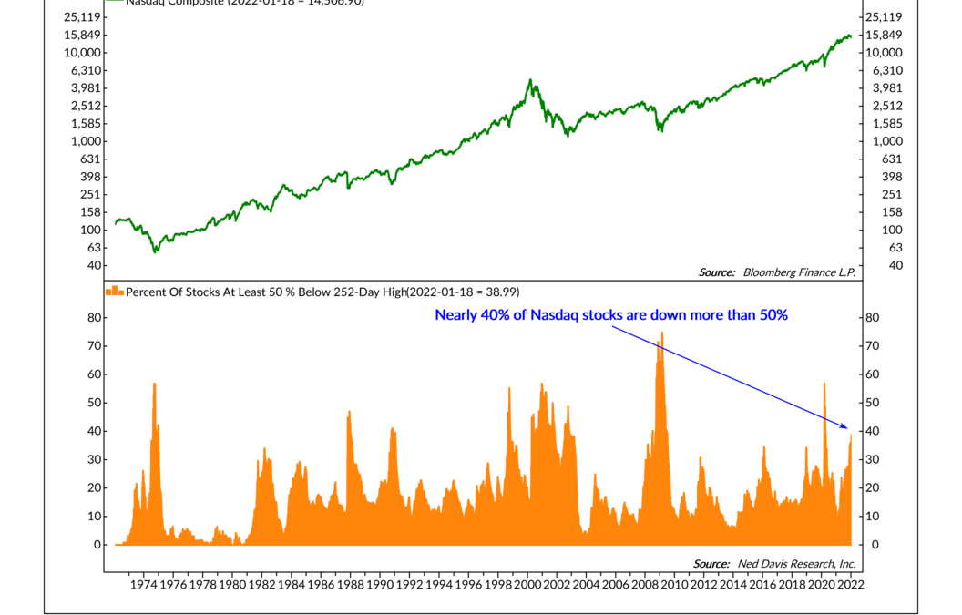
Here’s a remarkable fact that might be surprising to some: Nearly 40% of the stocks in the Nasdaq Composite are down at least 50% from their one-year high. And yet, the Nasdaq itself was only down about 7% at the start of the week. That’s a pretty big...
