by NelsonCorp Wealth Management | Apr 9, 2021 | Chart of the Week
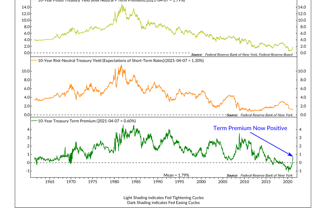
For this week’s chart, we focus on the bond market and what is called a “term premium.” But before I describe the term premium, I’ll explain the layout of this chart. In the top clip of the chart, we show the yield of the U.S. 10-year Treasury note. In the...
by NelsonCorp Wealth Management | Apr 2, 2021 | Chart of the Week
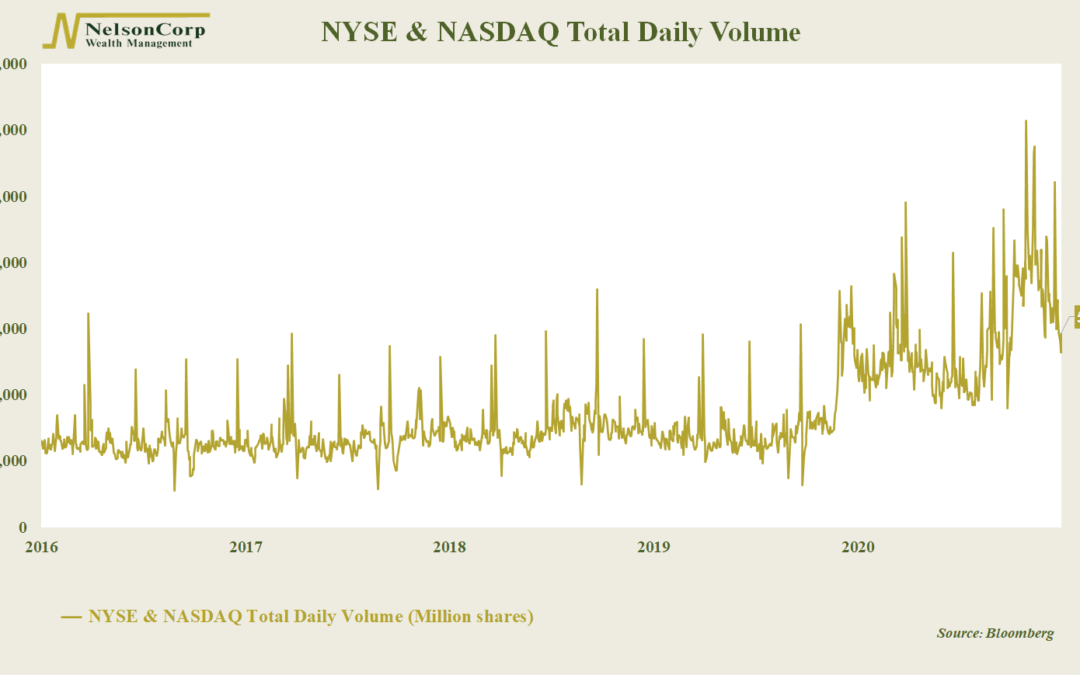
For this week’s Chart of the Week, we look at the daily volume of shares traded on the two major U.S. stock market exchanges: the New York Stock Exchange (NYSE) and the NASDAQ stock exchange. Whenever a share of stock gets bought and sold on one of these...
by NelsonCorp Wealth Management | Mar 26, 2021 | Chart of the Week
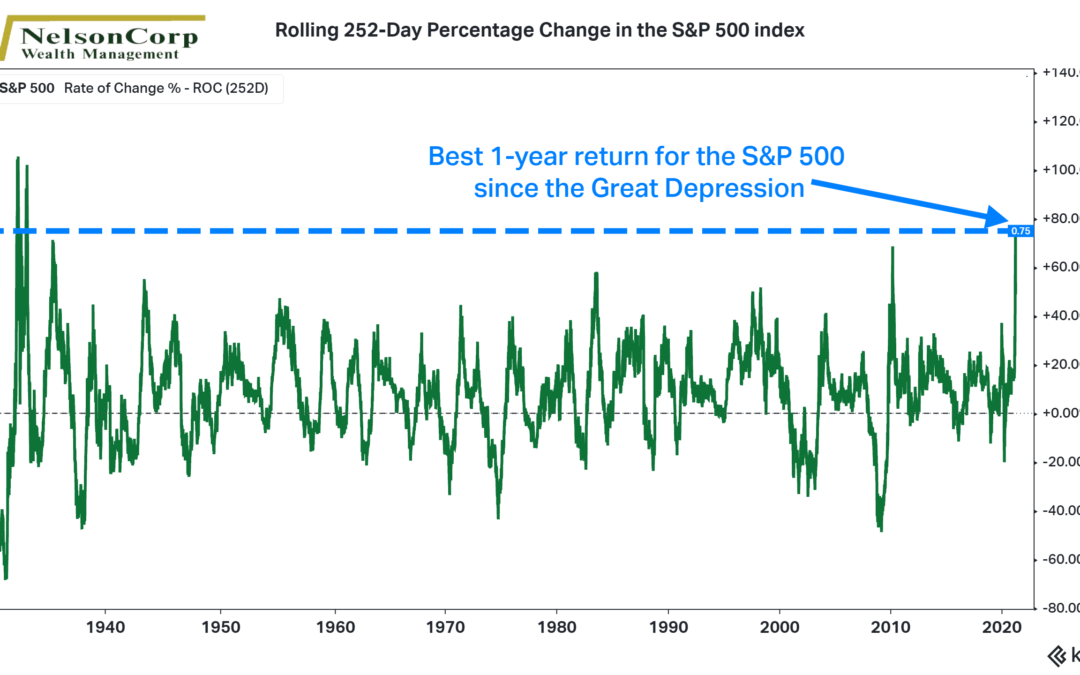
Earlier this week, on March 23rd, we wrapped up the best 1-year return in the history of the S&P 500. After stocks bottomed on March 23rd, 2020, the S&P 500 index returned nearly 75% one year later. As our featured chart above shows, that is the best...
by NelsonCorp Wealth Management | Mar 19, 2021 | Chart of the Week
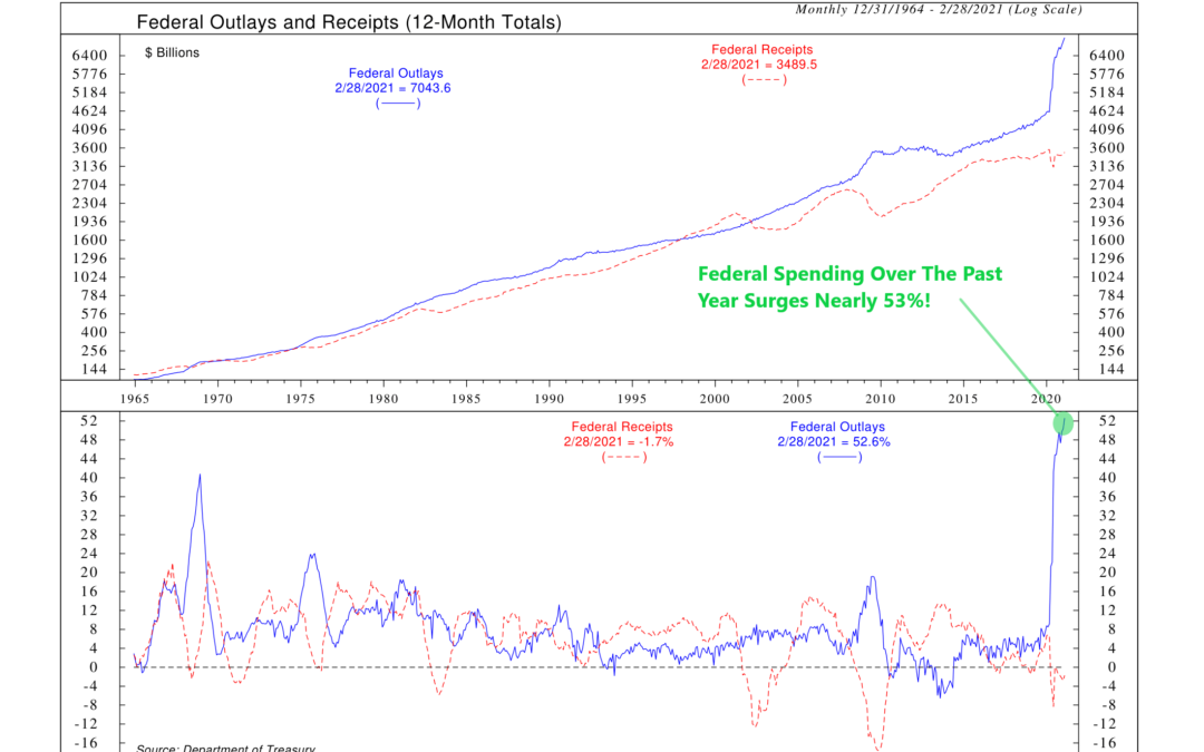
The U.S. federal government is pumping money into the economy at an extraordinary rate lately. As the top half of our featured chart shows, federal outlays (how much the government spent) reached over $7 trillion on a 12-month total basis last month. By...
by NelsonCorp Wealth Management | Mar 12, 2021 | Chart of the Week
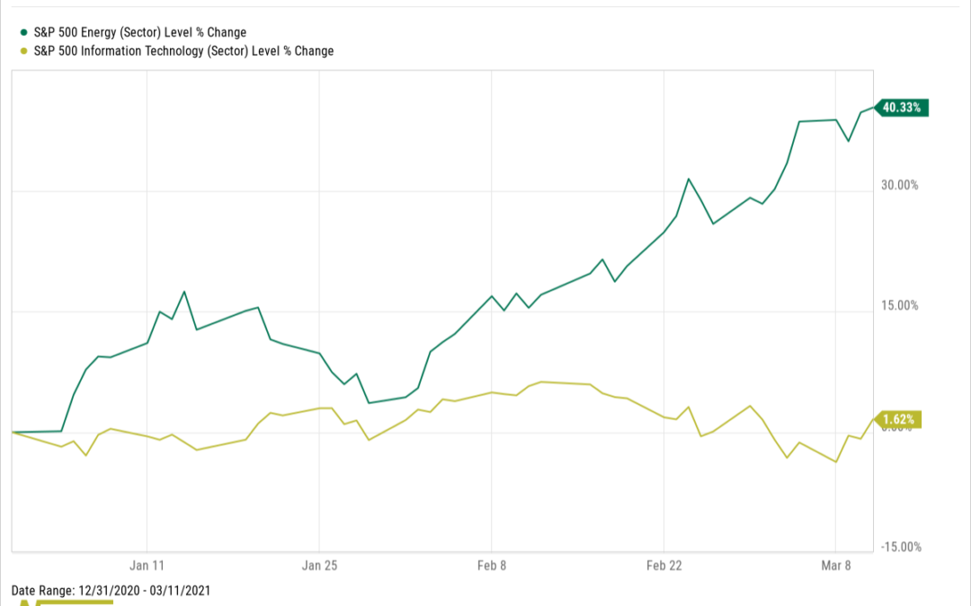
2020 was not kind to energy stocks. The Information Technology (Tech) sector of the S&P 500 was up over 40% last year, beating the socks off the Energy sector, which fell roughly -37%. However, in a big turn of events, Energy has made a comeback in 2021....
by NelsonCorp Wealth Management | Mar 5, 2021 | Chart of the Week
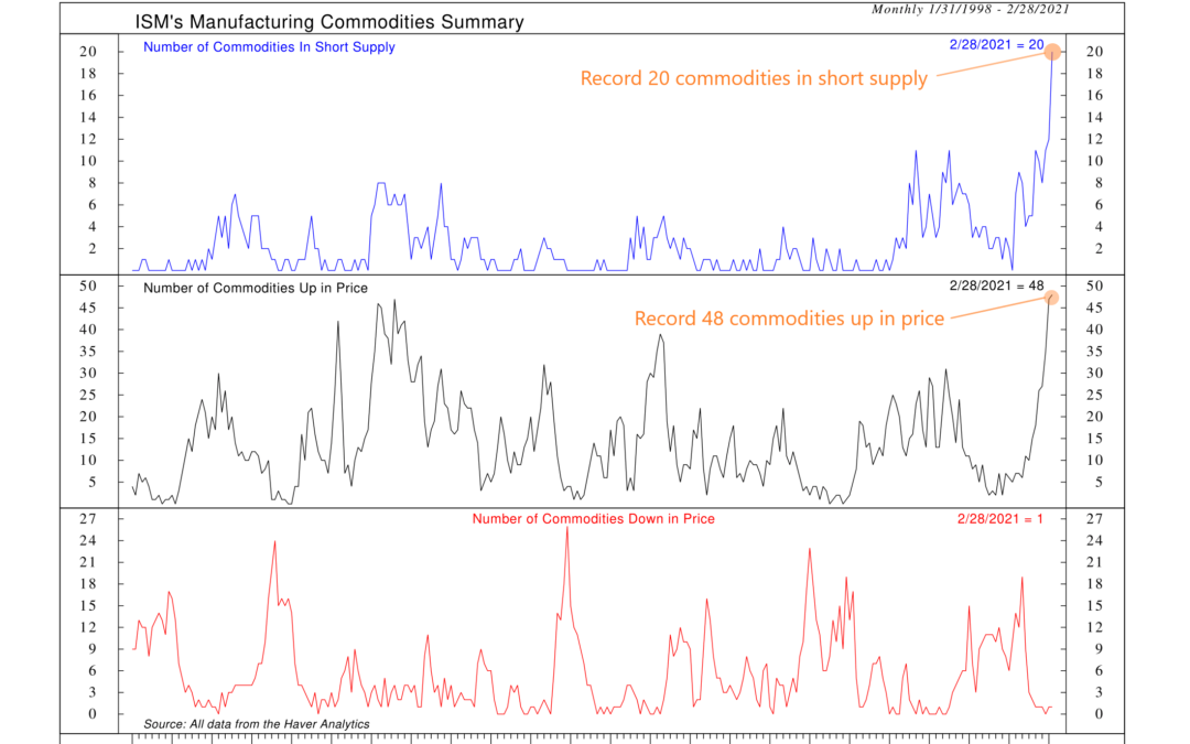
The latest Manufacturing ISM Report On Business revealed that economic activity in the manufacturing sector grew again in February, its ninth consecutive month of growth. Demand for manufactured goods has remained high since the reopening of the economy first...
