by NelsonCorp Wealth Management | May 21, 2021 | Chart of the Week
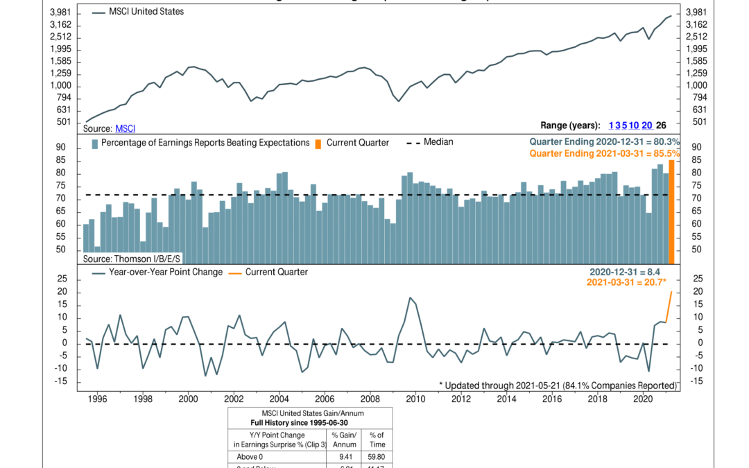
For this week’s chart, we look at the percentage of U.S. stocks that are beating their quarterly earnings expectations. Every quarter, financial analysts forecast what they believe companies will report for revenues and profits at the end of the quarter. If the...
by NelsonCorp Wealth Management | May 14, 2021 | Chart of the Week
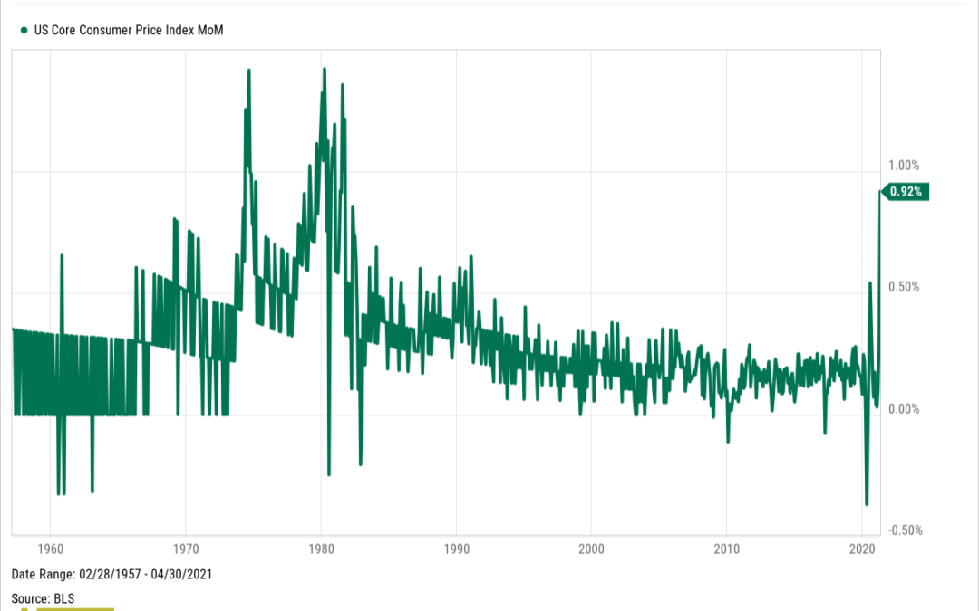
Inflation was the big topic of discussion in the financial world this week. So, for this week’s featured chart, we show the monthly change in the U.S. Core Consumer Price Index (CPI). The CPI is a commonly followed metric for inflation based on a survey...
by NelsonCorp Wealth Management | May 6, 2021 | Chart of the Week
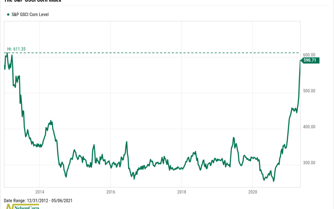
Corn is the focus of our featured chart this week, something we Midwesterners are plenty familiar with. If you haven’t noticed, its price has been on a tear lately: going from a low of about $3.1 per bushel in August of last year to about $7.50 per bushel...
by NelsonCorp Wealth Management | Apr 30, 2021 | Chart of the Week
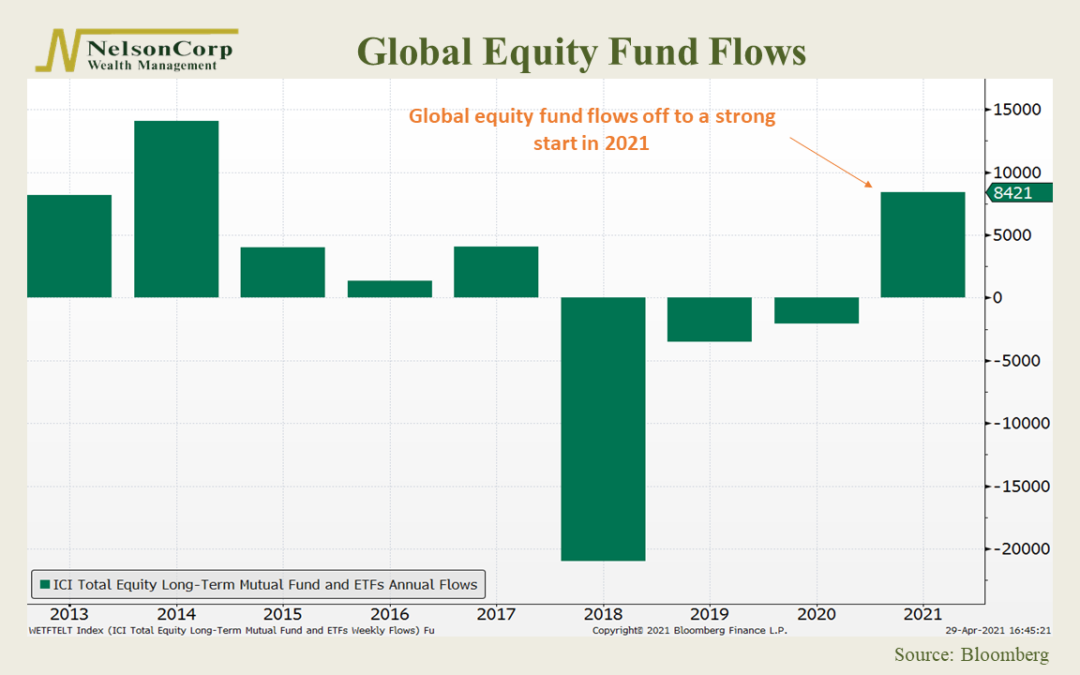
The week’s featured chart shows the total annual flows into global equity (stock) funds going back to 2013. Fund flows are simply the net cash inflow into a fund (purchases) or net cash outflow from a fund (redemptions), regardless of performance. When an...
by NelsonCorp Wealth Management | Apr 23, 2021 | Chart of the Week
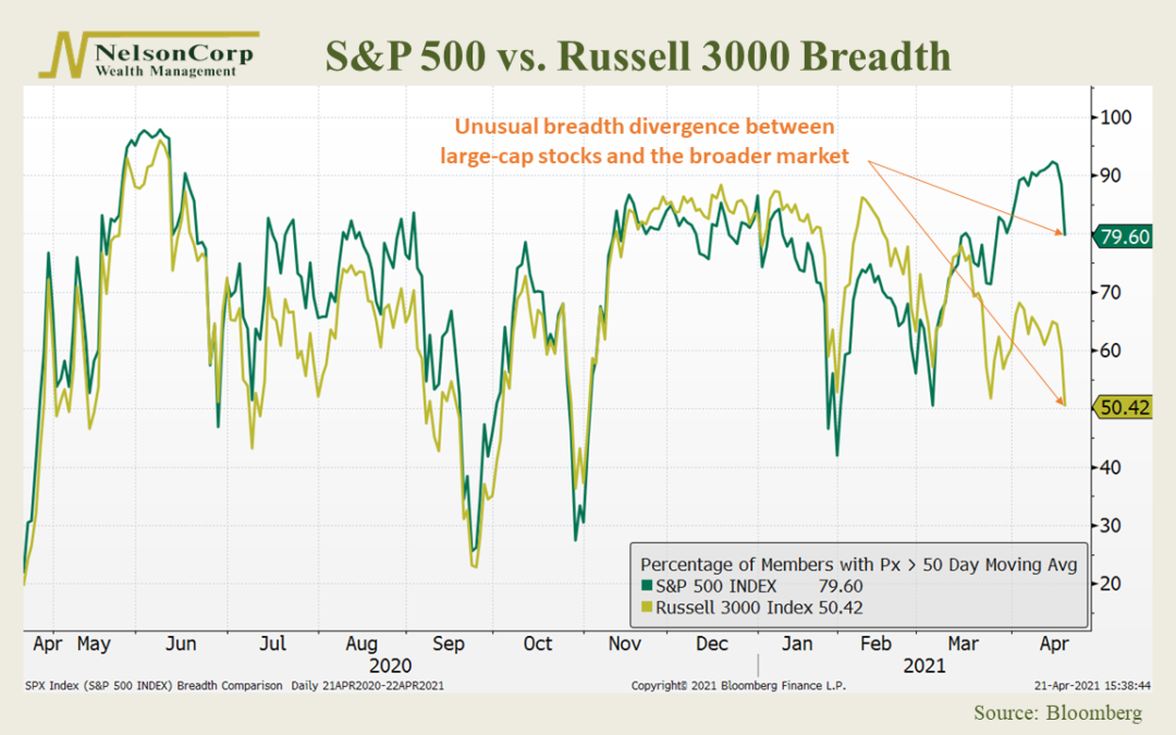
This week’s featured chart looks at stock market breadth in the United States. Specifically, we focus on two major U.S stock indices. You may already be familiar with the first, the S&P 500, representing the 500 largest stocks by market capitalization in...
by NelsonCorp Wealth Management | Apr 16, 2021 | Chart of the Week
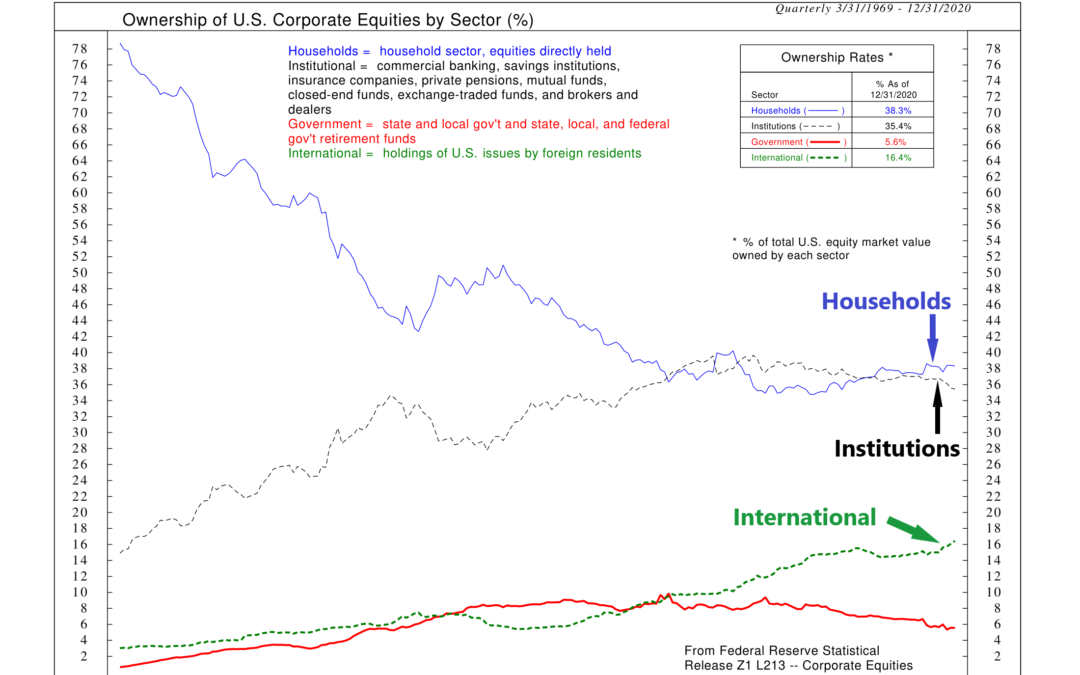
Move aside institutions; the individual investor is taking over. That’s the message from our featured chart this week, which shows the ownership of U.S. stocks broken down by sector. Although the Federal Reserve divides the ownership of U.S. stocks into 14...
