by NelsonCorp Wealth Management | Jan 22, 2021 | Chart of the Week
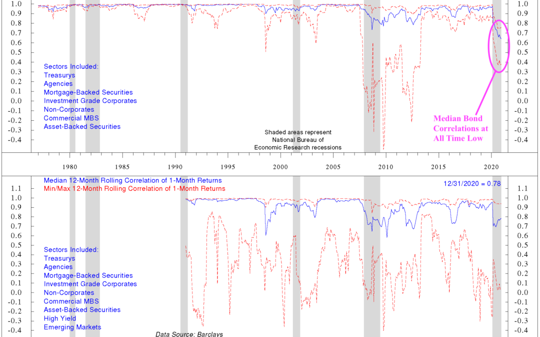
For this week’s chart, we look at the correlations of different bond sectors. Often when we talk about bonds, we lump them altogether. However, just like stocks have different industries, sectors, styles, etc., there are many different types of bonds. We are...
by NelsonCorp Wealth Management | Jan 15, 2021 | Chart of the Week
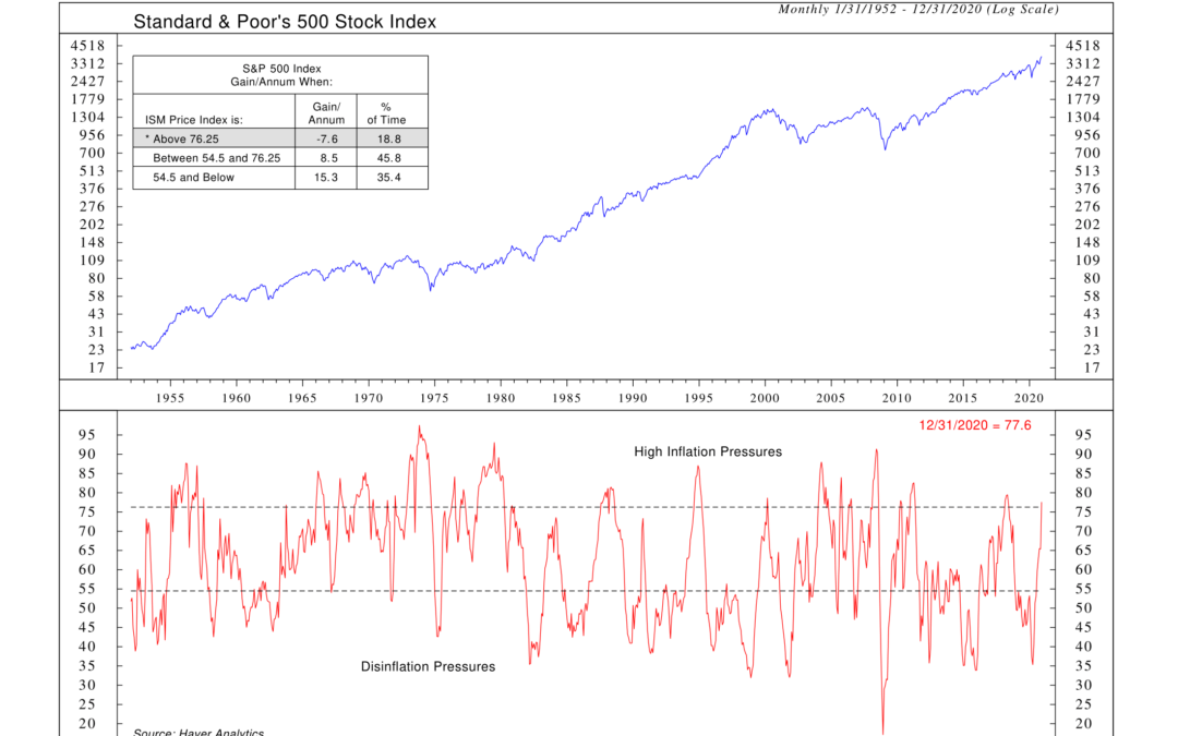
For this week’s chart, we take a peek at the Prices Paid component of the ISM Manufacturing Index. Every month, the Institute of Supply Management (ISM) conducts surveys of purchasing managers at more than 300 manufacturing firms in the U.S. and compiles the...
by NelsonCorp Wealth Management | Jan 7, 2021 | Chart of the Week
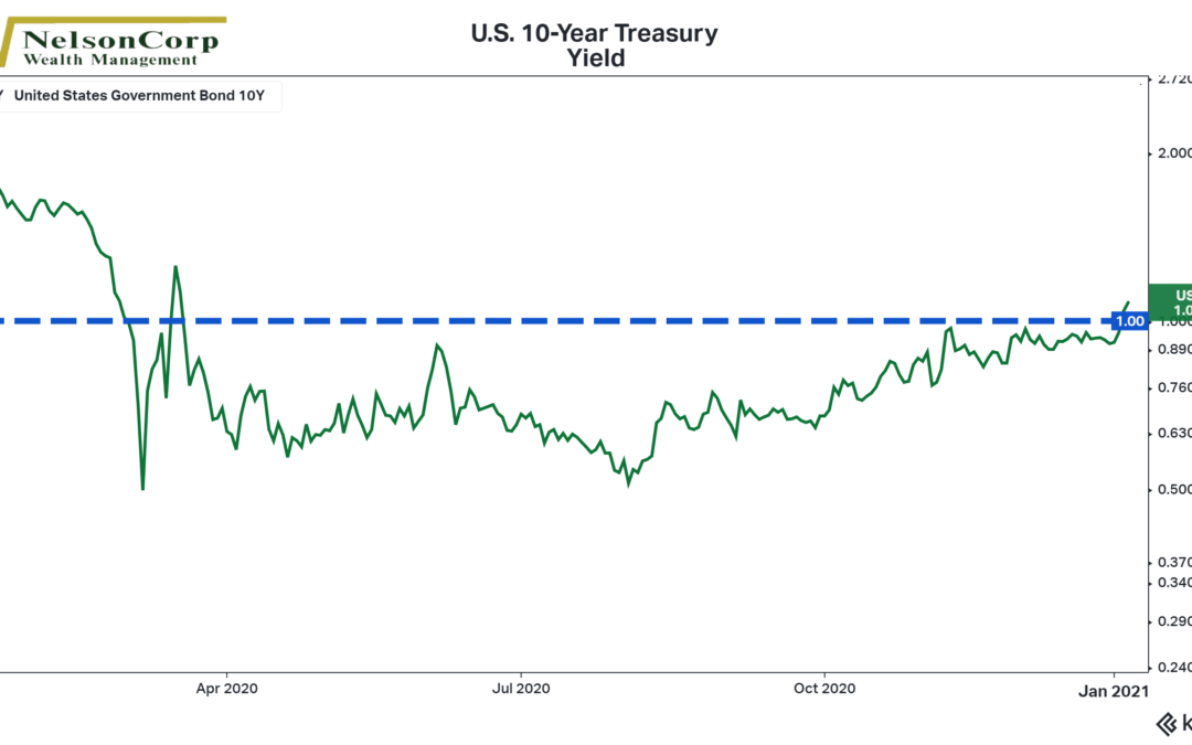
For this week’s featured chart, we look at the yield of the U.S. 10-year Treasury note. This yield represents the return investors require to lend to the U.S. government for the next ten years. The 10-year Treasury yield not only serves as a benchmark for...
by NelsonCorp Wealth Management | Dec 30, 2020 | Chart of the Week
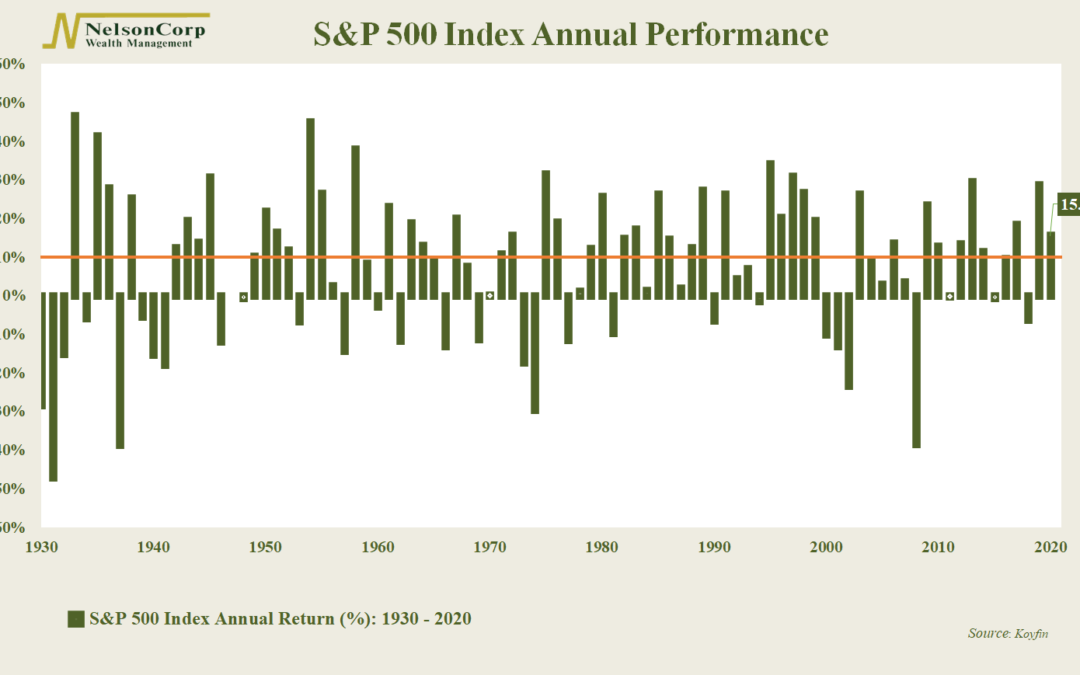
This week’s featured chart looks at the annual performance of the S&P 500 index going back 90+ years. Each green bar represents the annual return of stocks by year, and the orange line marks a gain of 10% or more. Oddly enough, despite this tumultuous year,...
by NelsonCorp Wealth Management | Dec 23, 2020 | Chart of the Week
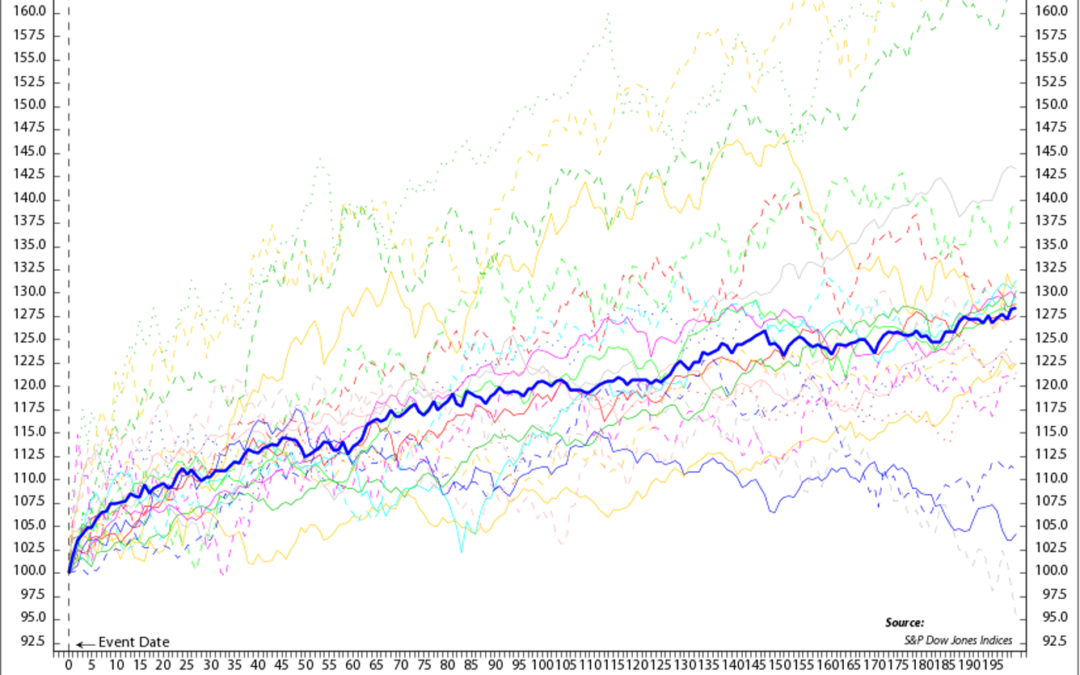
This week’s chart looks at the S&P 500 index’s performance during the first 200 trading days of every cyclical bull market going back to the end of World War II. The dark blue line shows that the S&P 500 has gained about 28% on average during the first...

by NelsonCorp Wealth Management | Dec 17, 2020 | Chart of the Week
Loose. Easy. Accommodative. These are just a few of the terms one could use to describe financial conditions in the U.S right now. According to an index compiled by Goldman Sachs, financial conditions are now the loosest on record. The index, which dates back...
