by NelsonCorp Wealth Management | Dec 11, 2020 | Chart of the Week
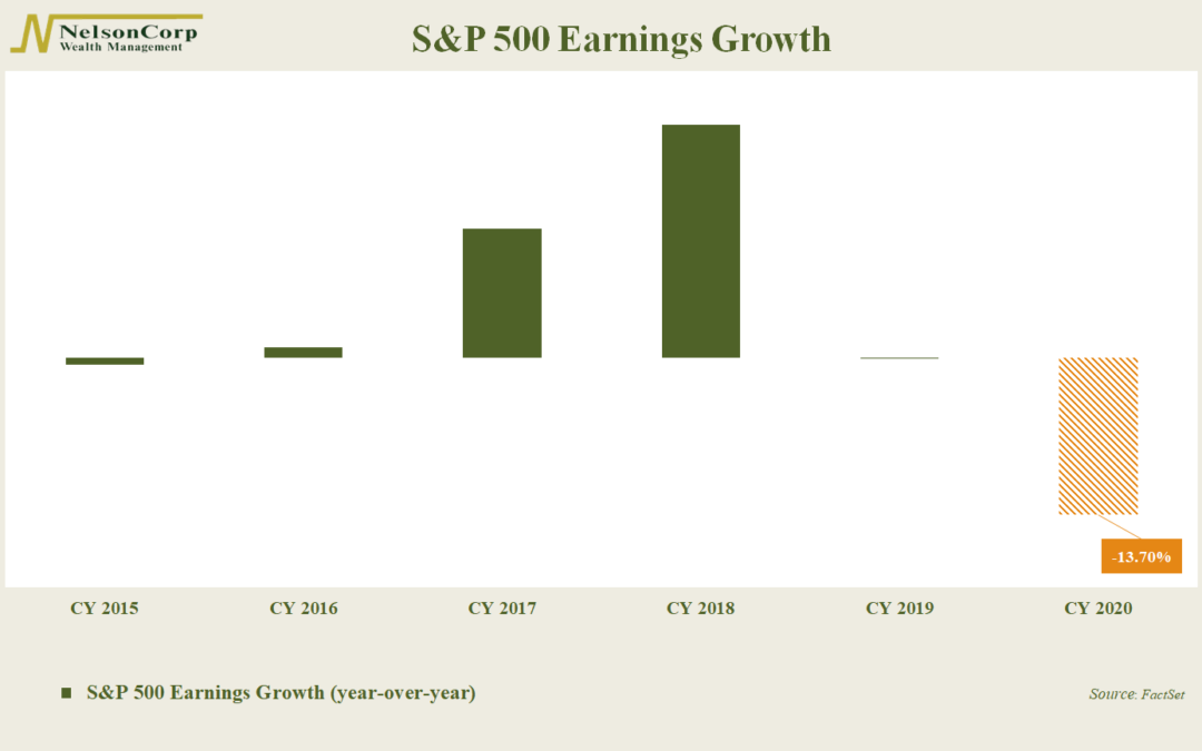
This week’s chart shows the year-over-year earnings growth rates for the S&P 500 over the past five years, plus an estimate for the decline in 2020. According to FactSet, earnings are expected to fall by a hefty -13.7% this year. This is far below the...
by NelsonCorp Wealth Management | Nov 25, 2020 | Chart of the Week
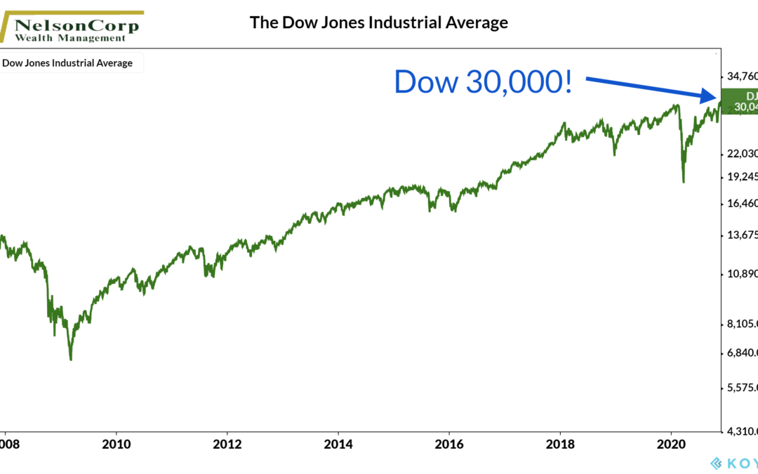
Whether you follow the stock market or not, you have probably heard of the Dow Jones Industrial Average, or simply the Dow. When people refer to the “stock market,” they are likely referencing the Dow, which represents 30 of the largest, most well-known...
by NelsonCorp Wealth Management | Nov 20, 2020 | Chart of the Week
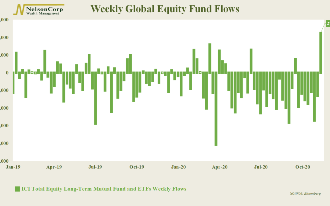
This week’s chart looks at the amount of money flowing into global stock funds on a weekly basis, as compiled by the Investment Company Institute. For most of the year, money has been flowing out of stocks—to the tune of about $9.5 billion a week. However,...
by NelsonCorp Wealth Management | Nov 13, 2020 | Chart of the Week
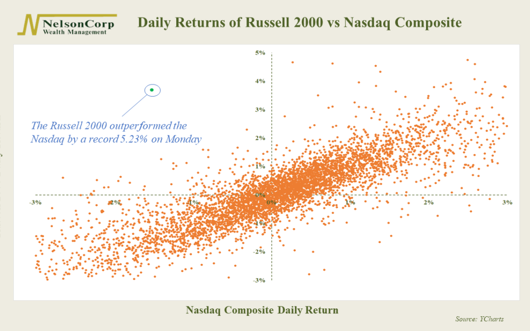
This week’s featured chart is a scatterplot of the daily returns of the Russell 2000 Index versus the Nasdaq Composite. These are two very different measures of the stock market. The Russell 2000 Index is comprised of the 2,000 smallest companies in the United...

by NelsonCorp Wealth Management | Nov 6, 2020 | Chart of the Week
For this week’s chart, we show the weekly returns of the S&P 500 Index over the past three months. Each bar on the graph represents the total return of the stock index for that week. As expected, returns were quite volatile heading into the election. The...
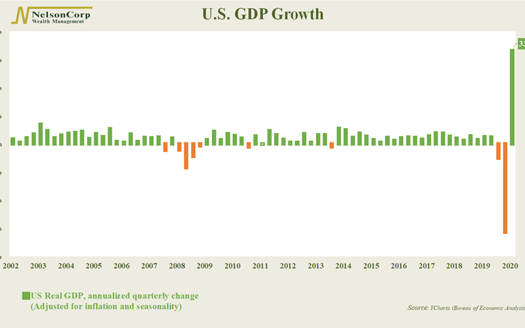
by NelsonCorp Wealth Management | Oct 29, 2020 | Chart of the Week
The Covid-19 pandemic has done a number on quite a few economic charts this year. GDP is its latest victim. GDP—Gross Domestic Product—is simply the market value of all goods and services produced in a country over a specific period. It is a crude but useful...
