The More the Merrier
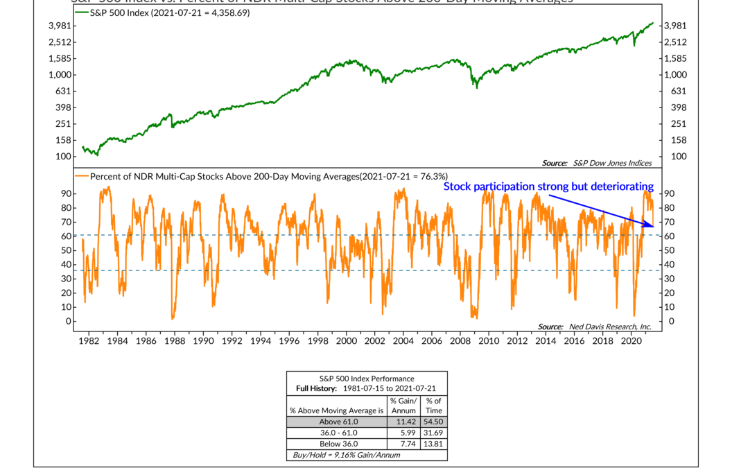
This week’s indicator is based on the idea that the more stocks participating in a rally, the better. To find this level of participation or breadth, we use a technical tool called a 200-day moving average. When applied to the price of a stock, for example, the...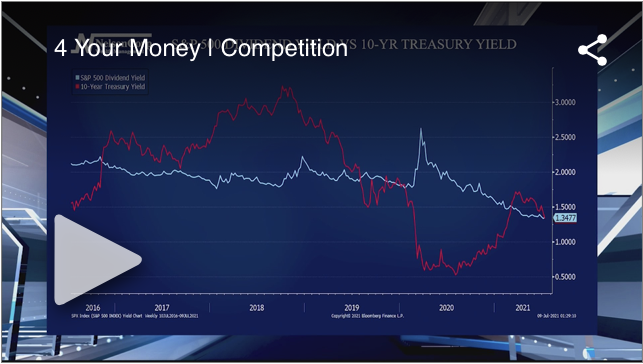
Competition
All year we have been hitting on the reflation theme and discussing higher inflation plus rising interest rates. John Nelson joins the Local 4 News team to share how these recent trends have come under pressure.
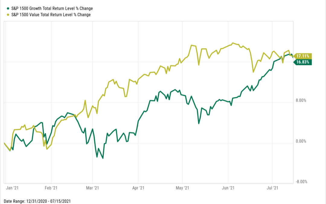
When Slower Growth is Good for Growth
OVERVIEW U.S. stocks ended the week lower, with the S&P 500 dropping 0.97%, the Dow falling 0.52%, and the Nasdaq bringing up the rear with a 1.87% decline. The worst of the sell-off was centered around small-cap stocks, down 4.6%, and value stocks, which...