
by NelsonCorp Wealth Management | Nov 24, 2023 | Chart of the Week
This week’s chart is called a percentage drawdown or percentage off high chart. It’s a visual representation of the decline in the value of the stock market from its peak to its lowest point, expressed as a percentage. For example, the last time the S&P 500...

by NelsonCorp Wealth Management | Nov 17, 2023 | Chart of the Week
In the past year, the U.S. stock market has generally been trending upward. However, what’s interesting is that most of the gains have come from a particular kind of factor: quality. The Quality Factor Index, shown as the green line on the chart above,...

by NelsonCorp Wealth Management | Nov 13, 2023 | Chart of the Week
The latest jobs report brought some interesting insights into our economy. In October, the unemployment rate rose to 3.9%. While still low by historical standards, it is a notable increase from the 3.4% low in April. A jump this size often raises fears that a...
by NelsonCorp Wealth Management | Nov 6, 2023 | Chart of the Week
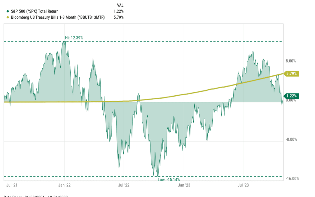
In the long run, stocks beat cash. That’s a well-established fact. But the problem with the long run is that it’s so, well… long. Over shorter periods of time, stocks can be quite volatile, like a roller coaster, and in those instances, cash can sometimes come...
by NelsonCorp Wealth Management | Oct 26, 2023 | Chart of the Week
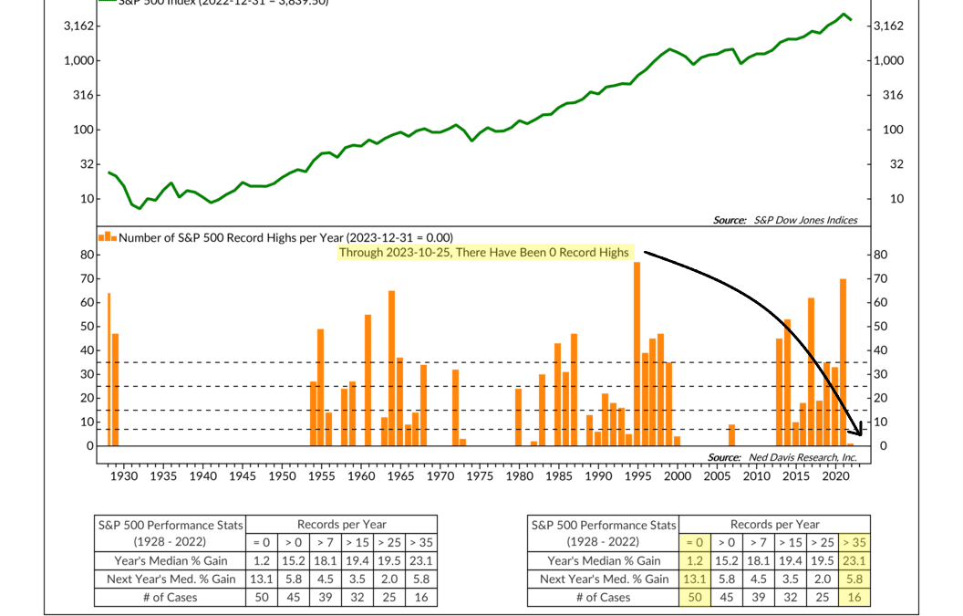
It’s been a while since the S&P 500 stock index made a record high. As our featured chart this week shows, there have been zero record highs this year; in fact, it’s been 21 months since the stock market last reached a record high, the longest streak in a...

by NelsonCorp Wealth Management | Oct 19, 2023 | Chart of the Week
Higher interest rates have been a thorn in the side of the stock market for many months now. But fortunately, relief appears to be on the way—and it’s coming in the form of improved stock market earnings. Our featured chart above shows the 12-month forward (or...
