
by NelsonCorp Wealth Management | Sep 1, 2023 | Chart of the Week
This week, we have a neat little chart that shows how much “correlation” there is in the stock market. Correlation, as applied in this case, is a statistical metric that measures how much the average stock is moving in relation to the rest of the stock market....

by NelsonCorp Wealth Management | Aug 25, 2023 | Chart of the Week
This week’s chart shows the yield on 10-year TIPS—Treasury Inflation-Protected Securities—or what is more commonly known as “real yields.” Real, in this sense, means the rate is adjusted for inflation, so it tells us whether the interest rates on government...
by NelsonCorp Wealth Management | Aug 18, 2023 | Chart of the Week
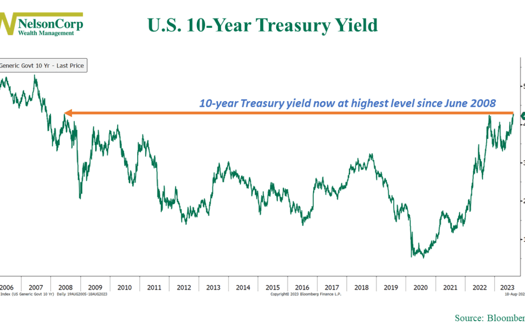
James Carville has a famous quote about the bond market. It goes, “I used to think that if there was reincarnation, I wanted to come back as the President, or the Pope, or as a .400 baseball hitter. But now, I would want to come back as the bond market. You can...

by NelsonCorp Wealth Management | Aug 11, 2023 | Chart of the Week
It’s been pretty quiet in the stock market lately. Since about mid-March, or 100 trading days ago, the S&P 500 Index has been moving steadily higher without much fanfare. Our featured chart above illustrates just how quiet this move has been. The chart’s...
by NelsonCorp Wealth Management | Aug 4, 2023 | Chart of the Week
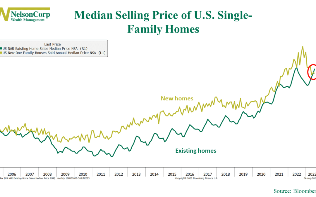
This week’s chart reveals a remarkable little fact about the current state of the U.S. housing market: new homes are just as affordable as old ones. Typically, as you can see on the chart, new homes are much more expensive than existing ones already on the...
by NelsonCorp Wealth Management | Jul 28, 2023 | Chart of the Week
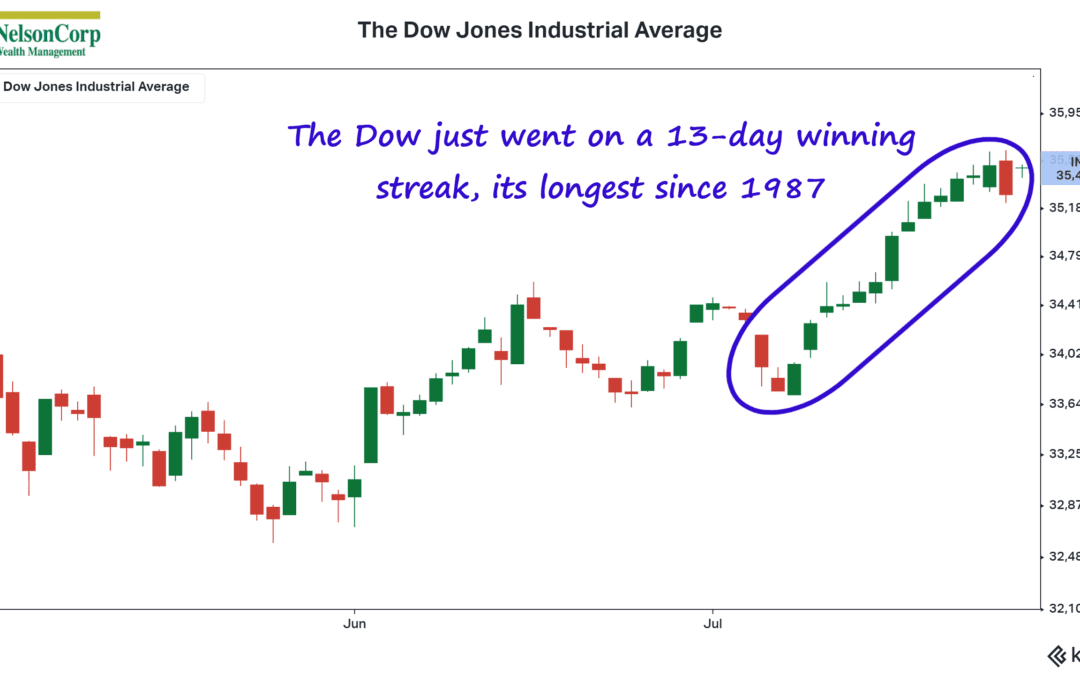
The Dow Jones Industrial Average, also known as “the Dow,” has been on a tear lately. As the consecutive green candlestick bars on the chart above shows, the Dow rose for 13 days in a row this month, finally ending the winning streak on Wednesday. That tied...
