by NelsonCorp Wealth Management | Aug 13, 2021 | Chart of the Week
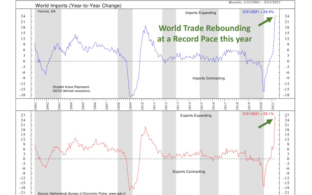
The focus of our featured chart this week is world trade. Many countries rely on imports and/or exports in order to sustain economic growth, so monitoring world trade volumes is a great way to assess the overall health of the global economy. Every month, the...
by NelsonCorp Wealth Management | Aug 6, 2021 | Chart of the Week
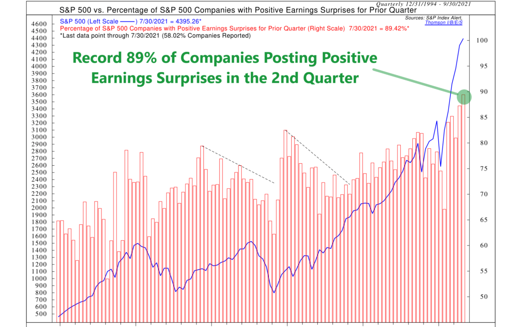
Ok, Wall Street has come around to the fact that corporate earnings will be good for the companies in the S&P 500 this year. So surely, after a record-setting number of earnings surprises in the first quarter, expectations would be better adjusted for the...
by NelsonCorp Wealth Management | Jul 30, 2021 | Chart of the Week
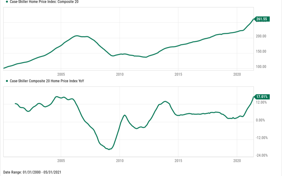
You may have noticed lately that home prices have gone up in your neighborhood—in some areas by a lot. But that’s not just true anecdotally; the national housing market data is telling a similar story. According to the Case-Shiller Composite 20 Home Price...
by NelsonCorp Wealth Management | Jul 23, 2021 | Chart of the Week
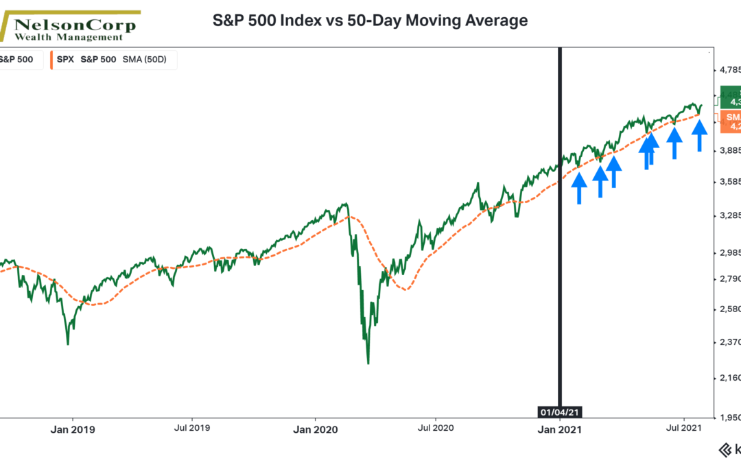
This week’s featured chart shows the S&P 500 stock index (green line) accompanied by its 50-day moving average (orange dashed line). The vertical black line demarks the start of this year. And the blue arrows mark every occurrence this year when the S&P...
by NelsonCorp Wealth Management | Jul 16, 2021 | Chart of the Week
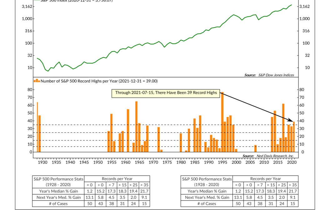
This week we have a pretty cool chart that shows the number of record highs attained by the S&P 500 stock market index per year. The calculation is fairly straightforward: Every year, you count the number of S&P 500 record highs, and that total becomes...
by NelsonCorp Wealth Management | Jul 9, 2021 | Chart of the Week
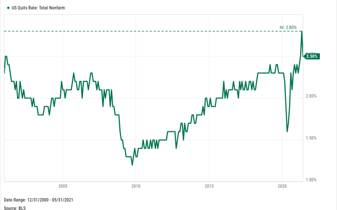
Americans are quitting their jobs at a record-setting pace. The U.S. Quits Rate—which measures the number of U.S. workers who leave their job during the month as a percentage of total employment—rose 2.8% in April and 2.5% in May. That’s the highest since the...
