by NelsonCorp Wealth Management | Jul 2, 2021 | Chart of the Week
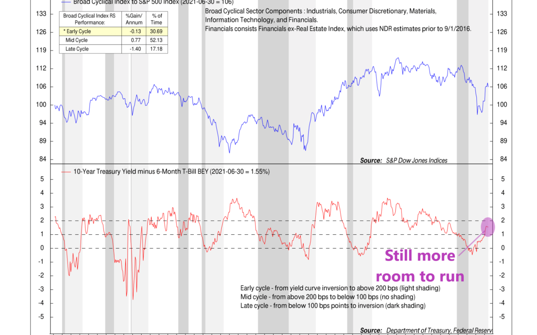
Generally, coming out of a recession like we experienced last year, the industries or sectors that are more sensitive to economic growth—Industrials, Consumer Discretionary, Materials, Information Technology, and Financials—tend to perform better than the...
by NelsonCorp Wealth Management | Jun 25, 2021 | Chart of the Week
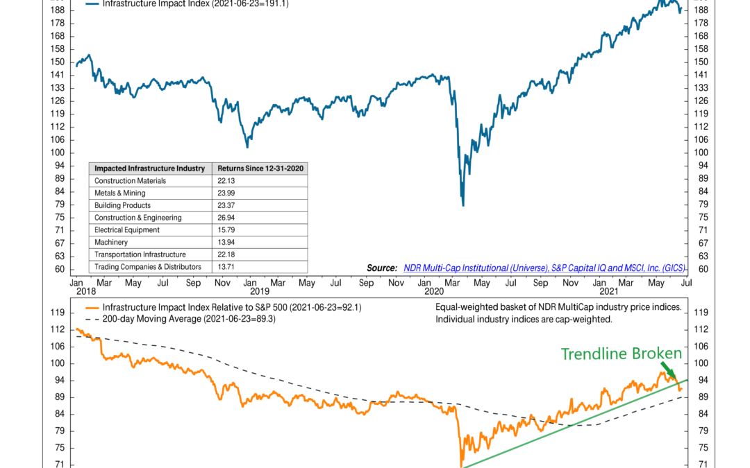
“Buy the rumor, sell the news.” This is an old Wall Street maxim that refers to the idea that one should buy a rumor in anticipation of an event, but by the time the rumor has become an actual fact, it’s time to sell. This is because, in today’s world,...
by NelsonCorp Wealth Management | Jun 18, 2021 | Chart of the Week
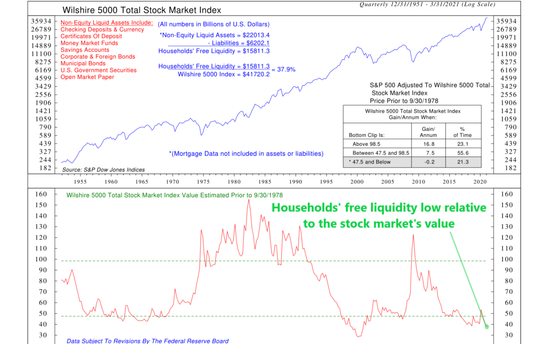
The stock market loves liquidity; it thrives when excess cash or other liquid assets are available to buy stocks. To illustrate this concept, the chart above shows a measure of household liquidity—called household free liquidity—versus the value of the stock...
by NelsonCorp Wealth Management | Jun 11, 2021 | Chart of the Week
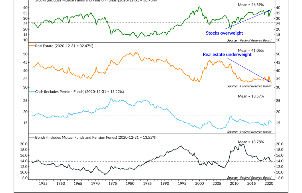
This week’s featured chart looks at how American households are slicing up their economic pie or total wealth. Using data from the Federal Reserve, we break down the overall wealth of American households into four major categories: stocks, real estate, cash,...
by NelsonCorp Wealth Management | Jun 4, 2021 | Chart of the Week
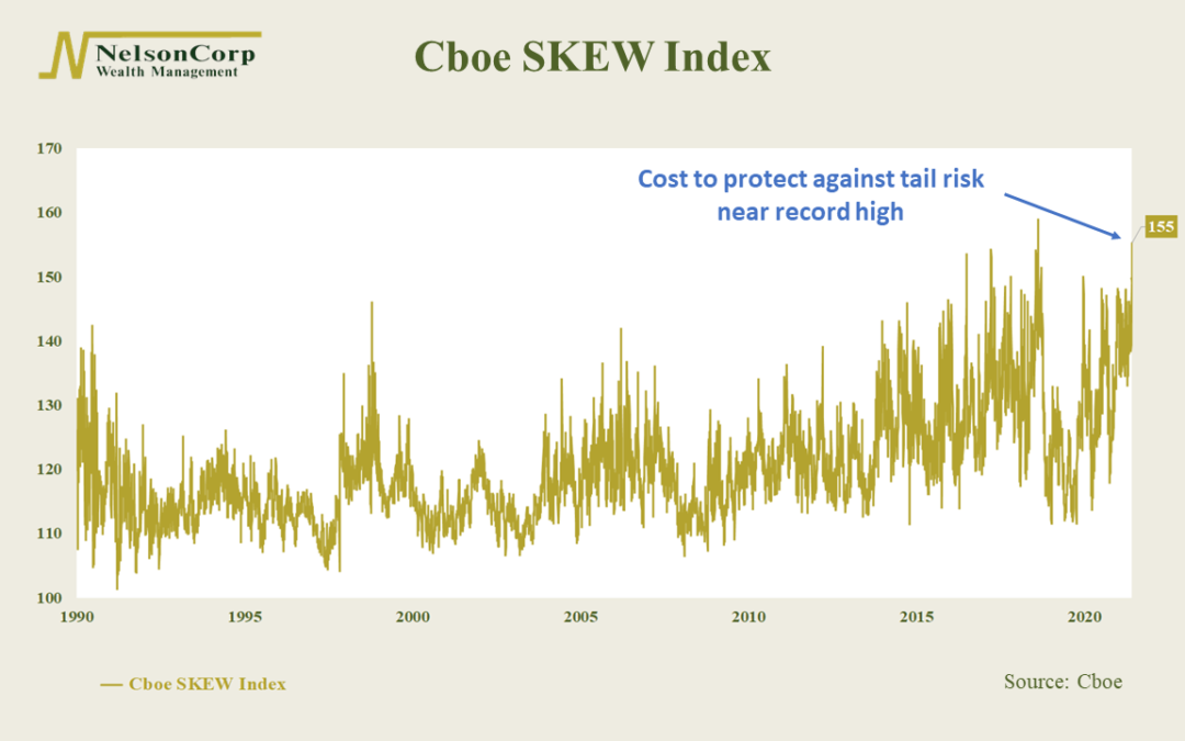
The week’s featured chart shows the Cboe SKEW Index, an option-based indicator that reflects the “cost” of protection against tail risk in the S&P 500 stock index. Broadly speaking, tail risk refers to an event with a small probability of happening. If you...

by NelsonCorp Wealth Management | May 28, 2021 | Chart of the Week
This week’s featured chart shows the performance of the S&P 500 stock index around the start of new cyclical bull markets. There have been 15 new cyclical bull markets (including the current one) over the past 50 years. Each line on the chart represents the...
