by NelsonCorp Wealth Management | Oct 22, 2020 | Chart of the Week
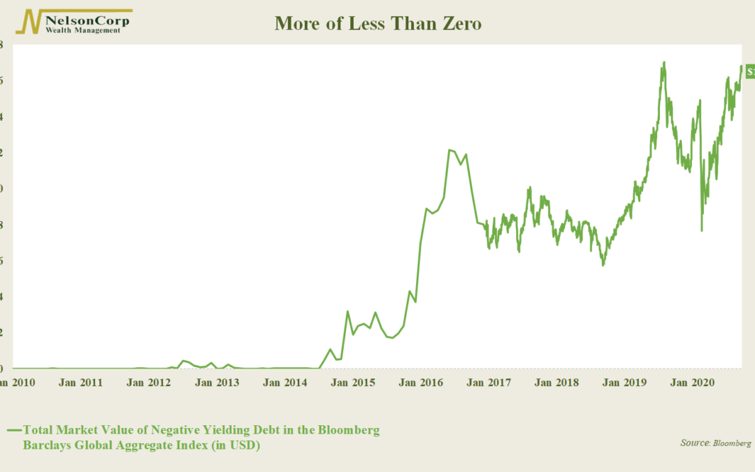
After a dip in March, investors are once again gobbling up bonds that are certain to lose money if held to maturity. This week’s chart shows the total face value of negative-yielding corporate and government debt in the Bloomberg Barclays Global Aggregate...
by NelsonCorp Wealth Management | Oct 16, 2020 | Chart of the Week
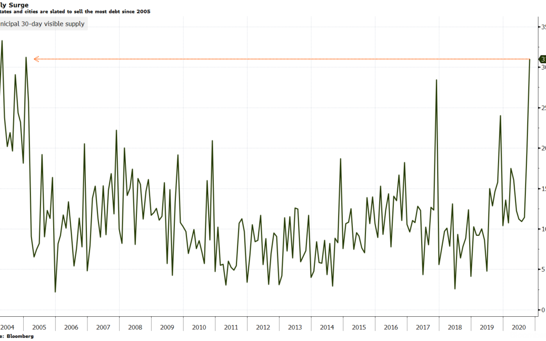
This week’s chart shows yet another sign that the pandemic continues to take it’s toll on the U.S. economy Here we are looking at the 30-day visible supply of the municipal bond market. It represents the total face value of all new debt that is...
by NelsonCorp Wealth Management | Oct 9, 2020 | Chart of the Week
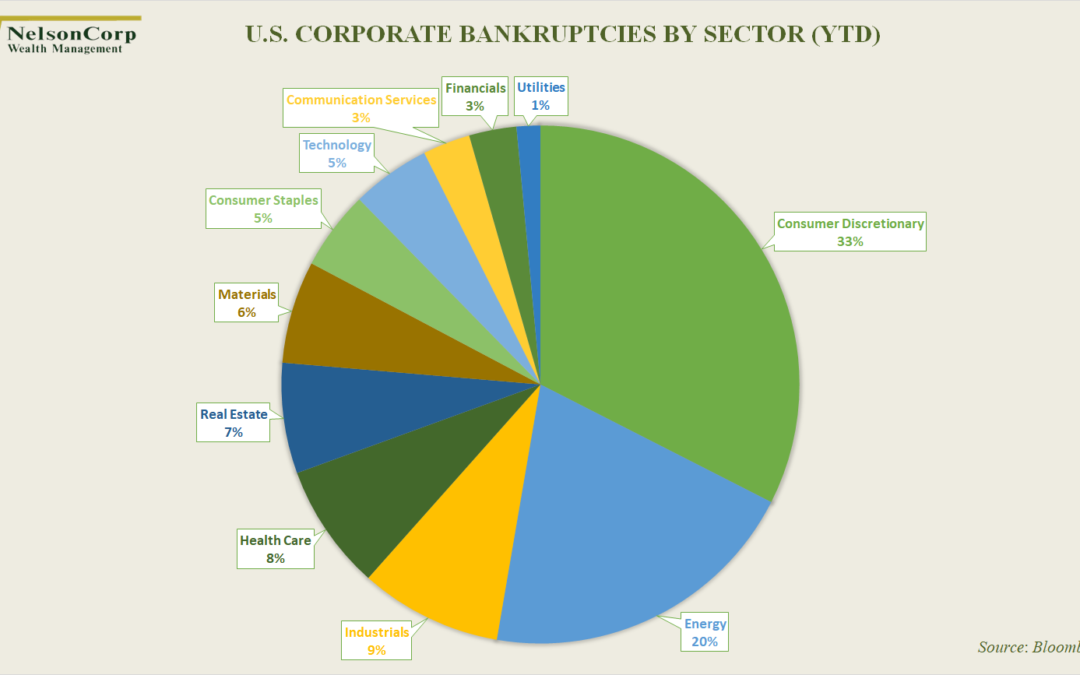
Business is hard. A study by J.P Morgan Asset Management found that roughly 40% of the publicly traded companies in the U.S. between 1980 and 2014 suffered a “catastrophic decline”—a loss of at least 70% of their value without ever recovering. That’s...
by NelsonCorp Wealth Management | Oct 1, 2020 | Chart of the Week
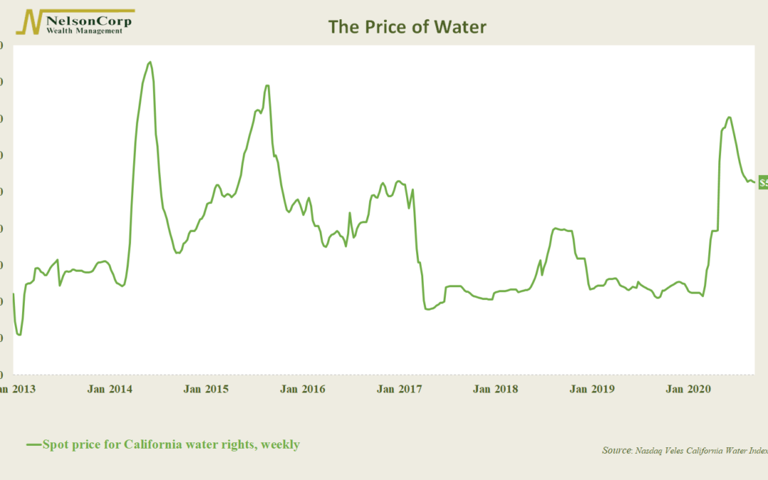
You have probably seen market prices for commodities such as corn, soybeans, and crude oil. But now, for the first time, farmers and speculators will be able to wager on the price of water. California water, to be exact. The contracts will be based on the...
by NelsonCorp Wealth Management | Sep 24, 2020 | Chart of the Week
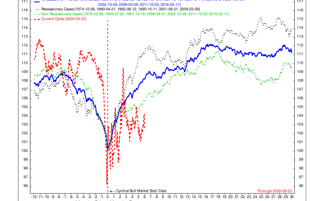
Normally, certain areas of the stock market tend to outperform when a new cyclical bull market begins. But this year is different. From Ned Davis Research, this week’s chart shows the average performance of the ten stock market areas that typically rise the...
by NelsonCorp Wealth Management | Sep 17, 2020 | Chart of the Week
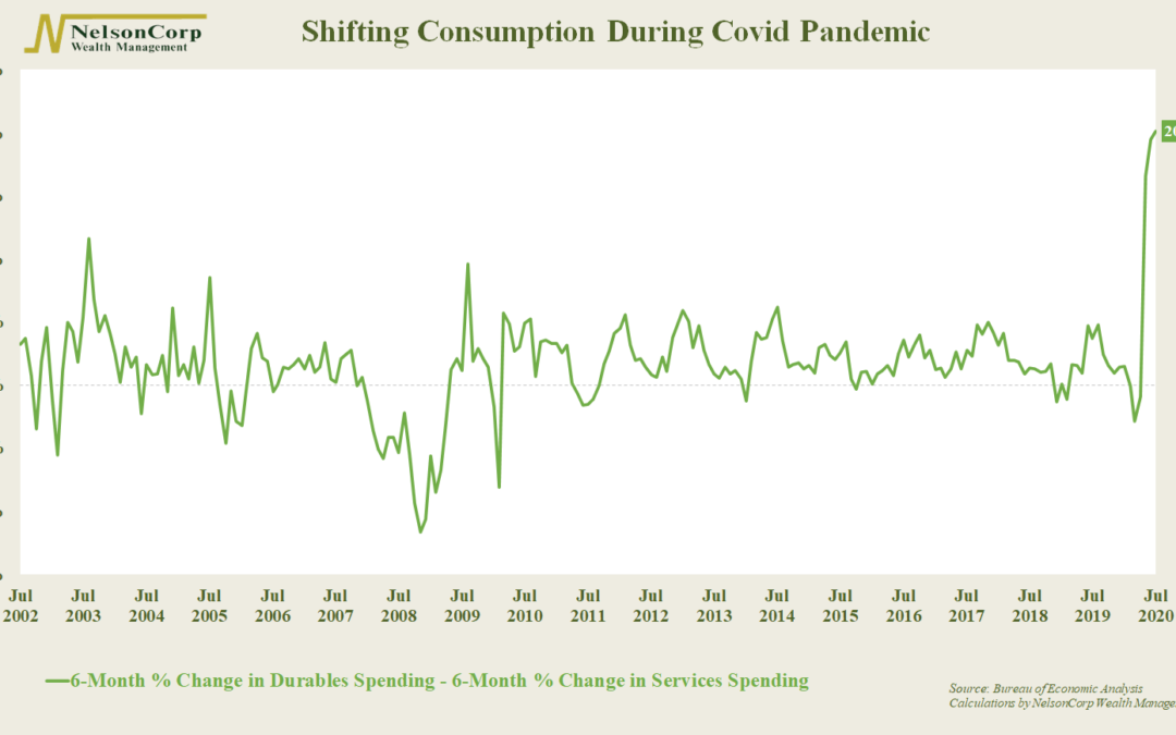
The Covid-19 pandemic has drastically changed how Americans spend their money, at least for the time being. Total consumption since the pandemic began is down around 5 percent. However, if we dig into the weeds, we see that Americans have spent about 12 percent...
