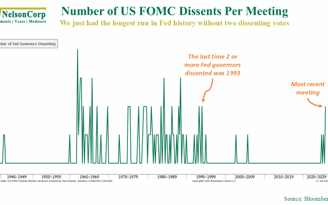
I Dissent!
Cracks are starting to show inside the Federal Reserve, with multiple members breaking from the pack for the first time in over 30 years. Check out this week’s chart for a peek at the shift starting to form inside the Fed.
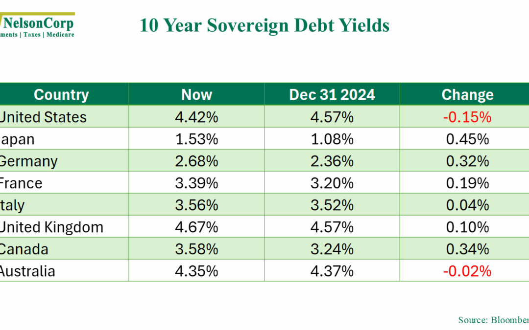
The World Reprices
Yields are up, but stocks don’t seem to care. This week’s chart unpacks the disconnect.
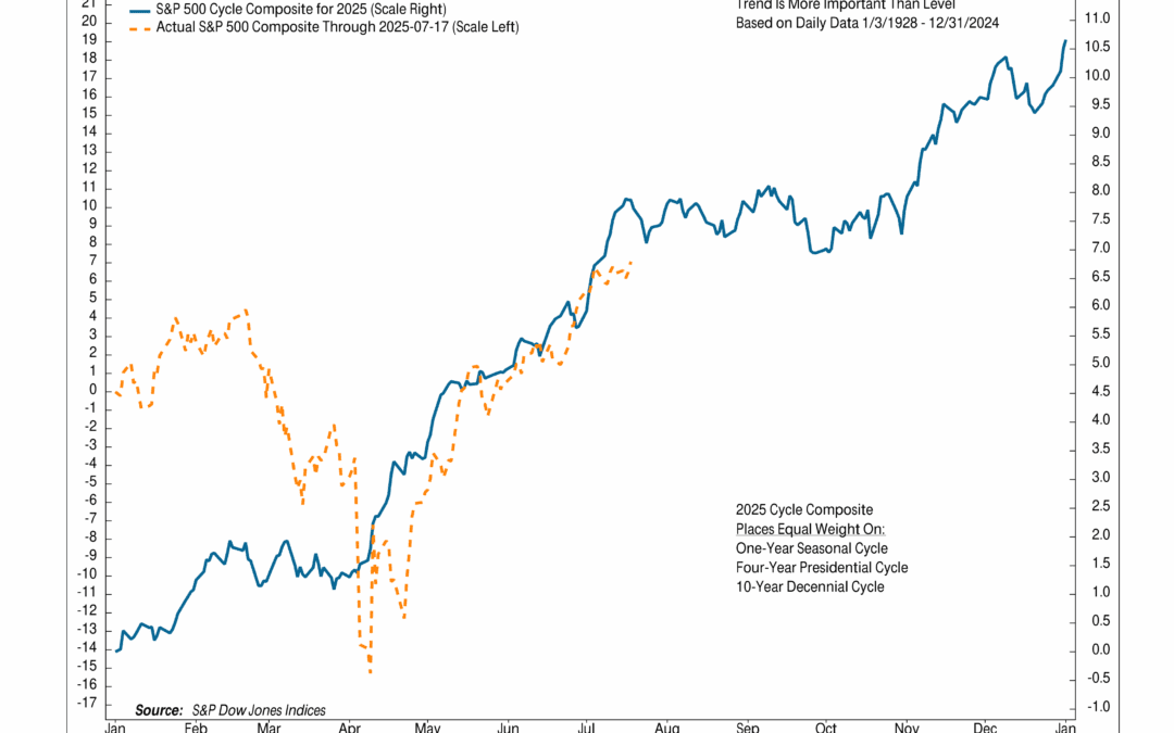
Tracking the Cycle
Can seasonality tell us anything useful about the future course of the stock market? Check out this week’s chart, where we breakdown the Cycle Composite for 2025.
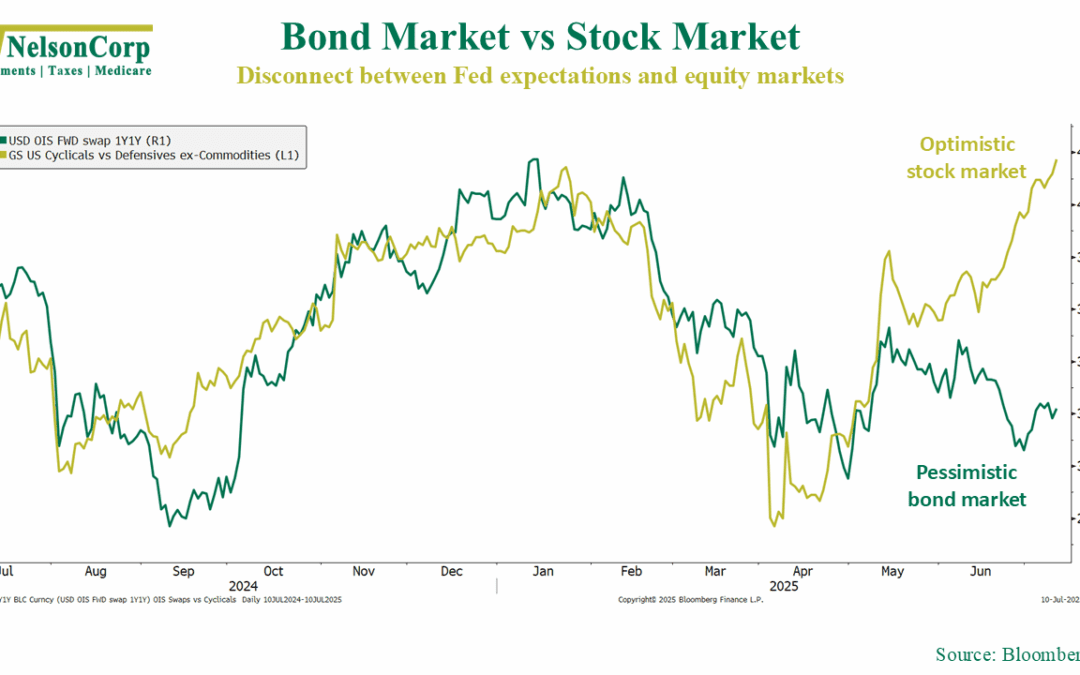
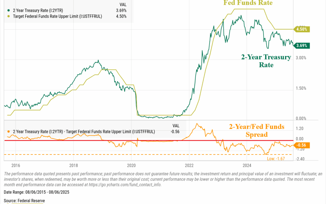
Mixed Messages
This week’s chart shows a widening split between bonds and stocks. One is bracing for cuts, the other is betting on strength—both can’t be right.