by NelsonCorp | Aug 21, 2026 | Chart of the Week
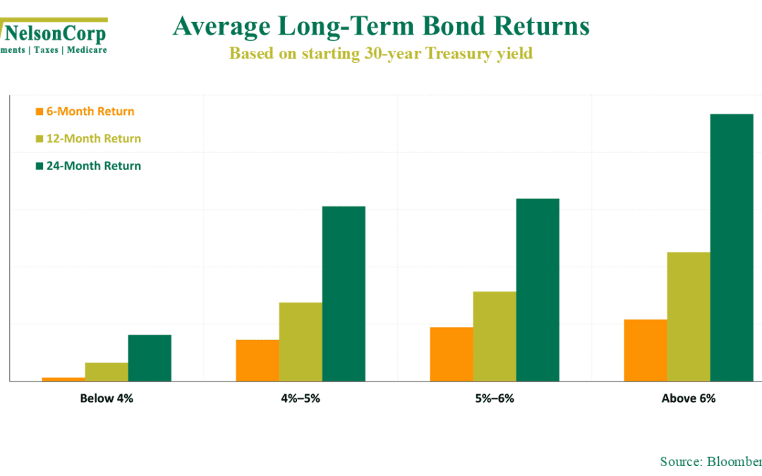
It’s been a rough stretch for the bond market lately. Long-term Treasury yields are pushing higher. The 30-year yield has climbed above 5% and recently reached levels not seen in nearly two decades. For bond investors, this can feel pretty painful. Bond prices...
by NelsonCorp | Aug 14, 2026 | Chart of the Week
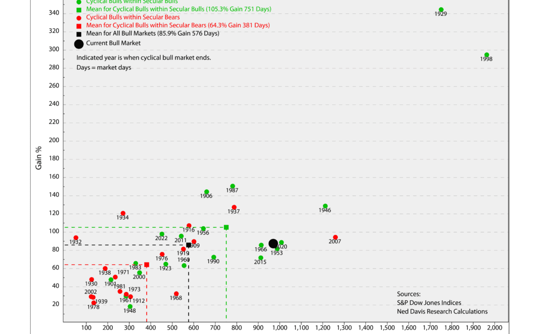
How old is too old for a bull market? It’s something you naturally start asking after stocks have been rising for a while. Surely the stock market can’t just keep going up forever, right? Eventually, a downturn must be right around the corner. Well, we dug into...
by NelsonCorp | Aug 7, 2026 | Chart of the Week
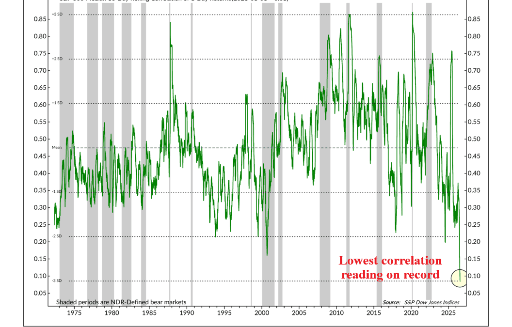
For this week’s chart, we’re looking at a topic that tends to fly under the radar of many investors: correlation. What is correlation? Simply put, it measures how closely two things move together. In the stock market, high correlation means stocks are generally...
by NelsonCorp | Jul 31, 2026 | Chart of the Week
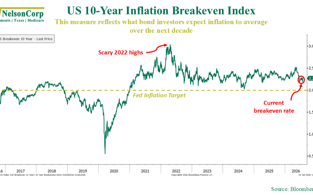
In this week’s Indicator Insights post, we talked about consumer expectations for inflation. Specifically, we looked at how interested people were in inflation based on Google Trends search data. So, for this week’s featured chart, I thought it would be useful...
by NelsonCorp | Jul 24, 2026 | Chart of the Week
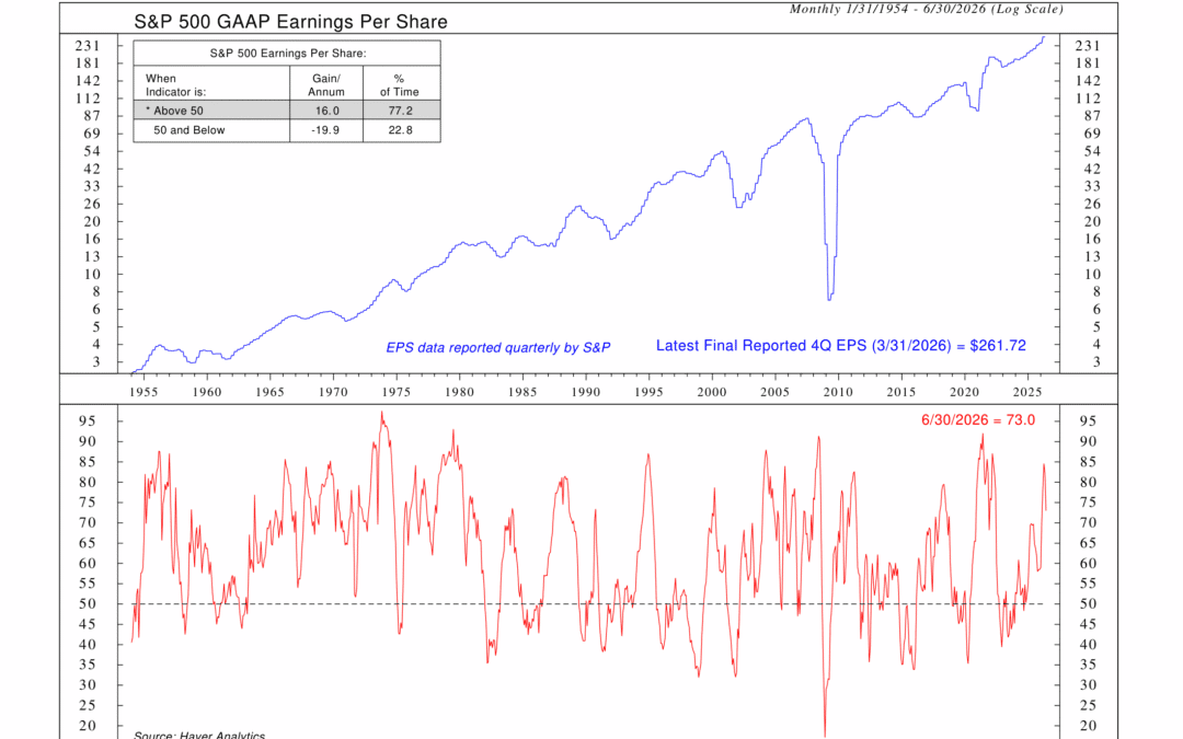
Does the economy have to be booming for corporate earnings to grow? No. Not necessarily. But history suggests manufacturing conditions tend to matter more than many investors realize. For example, this week’s chart tracks the Institute for Supply Management...
by NelsonCorp | Jul 17, 2026 | Chart of the Week
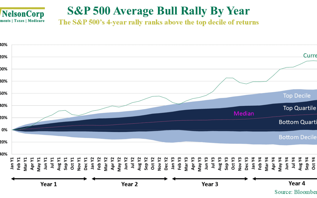
The stock market has rewarded investors handsomely over the past four years. It kind of makes you wonder: just how unusual has this rally been? The green line shows the S&P 500’s cumulative return over the current four-year rally, while the...
