by NelsonCorp Wealth Management | Nov 15, 2024 | Chart of the Week
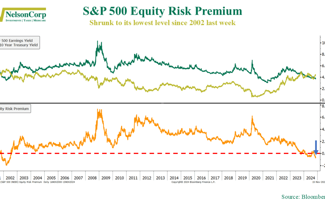
Is the stock market still worth the risk? This week’s chart paints a surprising picture. It measures something called the equity risk premium—the extra return investors expect from stocks compared to the safer 10-year U.S. Treasury bond. It’s shown as the...
by NelsonCorp Wealth Management | Nov 8, 2024 | Chart of the Week
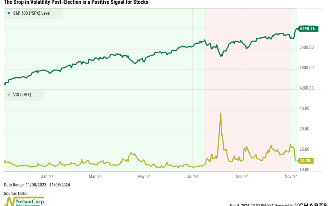
The big news this week, of course, was the election. As always, the uncertainty it brought stirred things up in the financial markets, a trend we can see clearly in this week’s featured chart. At the top of the chart, we have the S&P 500 stock index, and...
by NelsonCorp Wealth Management | Nov 1, 2024 | Chart of the Week
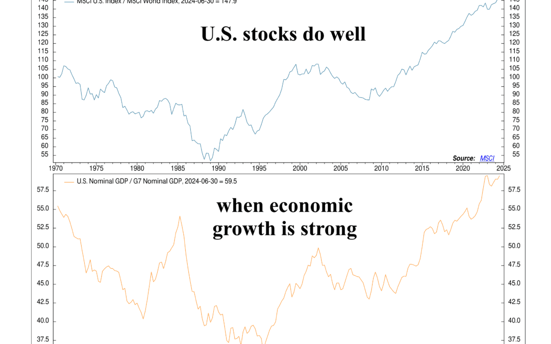
It’s perhaps no surprise to investors that America’s stock market has dominated the rest of the developed world in recent years. But have you ever wondered why U.S. stocks have outshined? This week’s chart gives a big clue: economic strength. When the U.S....
by NelsonCorp Wealth Management | Oct 25, 2024 | Chart of the Week
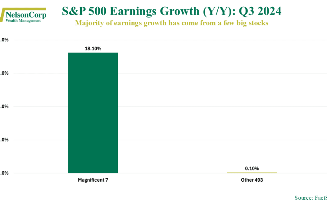
As we dive into the heart of the Q3 2024 earnings season, one big question stands out: Where are the profits coming from? As our Chart of the Week above shows, the answer is a familiar story of the Haves and the Have Nots—a stark divide between a few big...
by NelsonCorp Wealth Management | Oct 18, 2024 | Chart of the Week
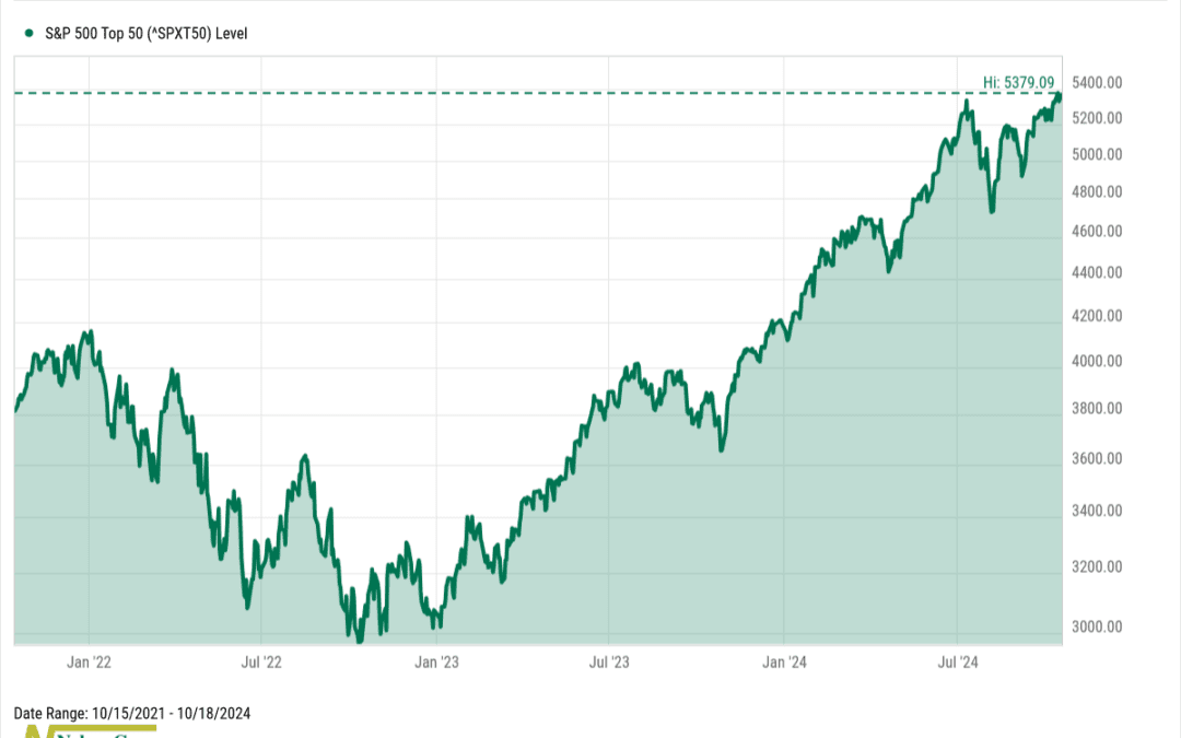
This week’s chart shows that the biggest and best of the stock market are breaking out to all-time highs. The index, shown above, is the S&P 500 Top 50 Index. It’s a subset of the broader S&P 500 Index, focusing on the 50 largest companies by market...
by NelsonCorp Wealth Management | Oct 11, 2024 | Chart of the Week
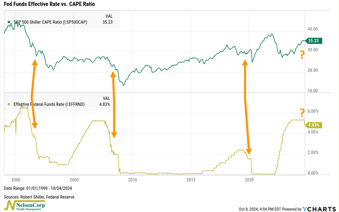
This week’s chart highlights a key connection between the Fed Funds Rate and stock market valuations, as measured by the CAPE ratio. But first, some definitions. The Fed Funds Rate is controlled by the Federal Reserve and influences all other interest rates....
